Identity Concept
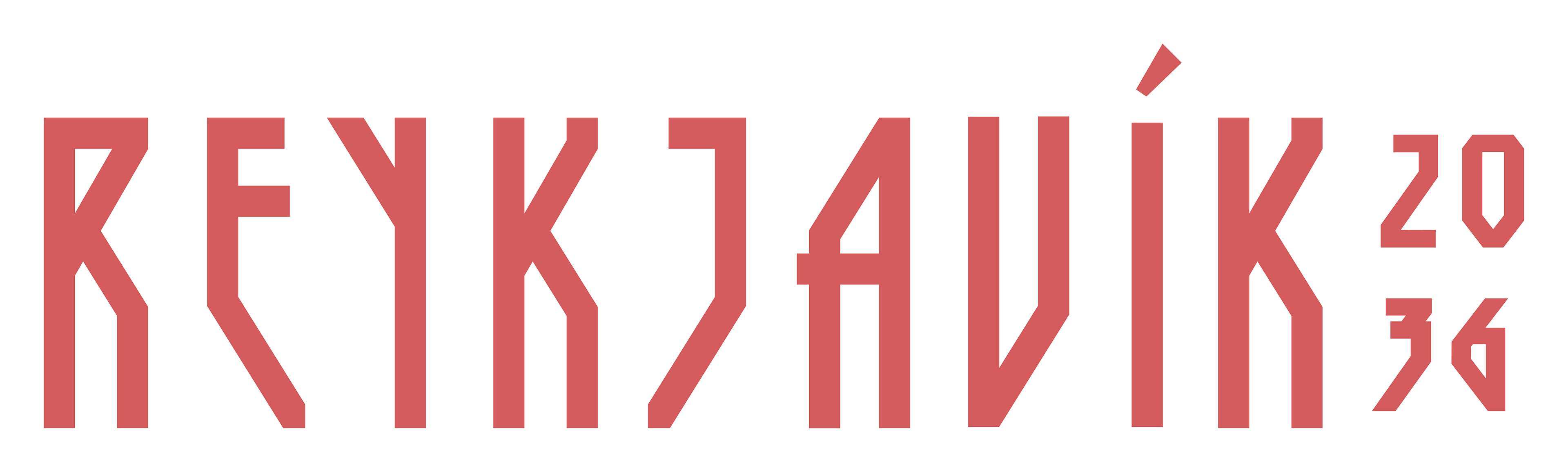
Primary Logo
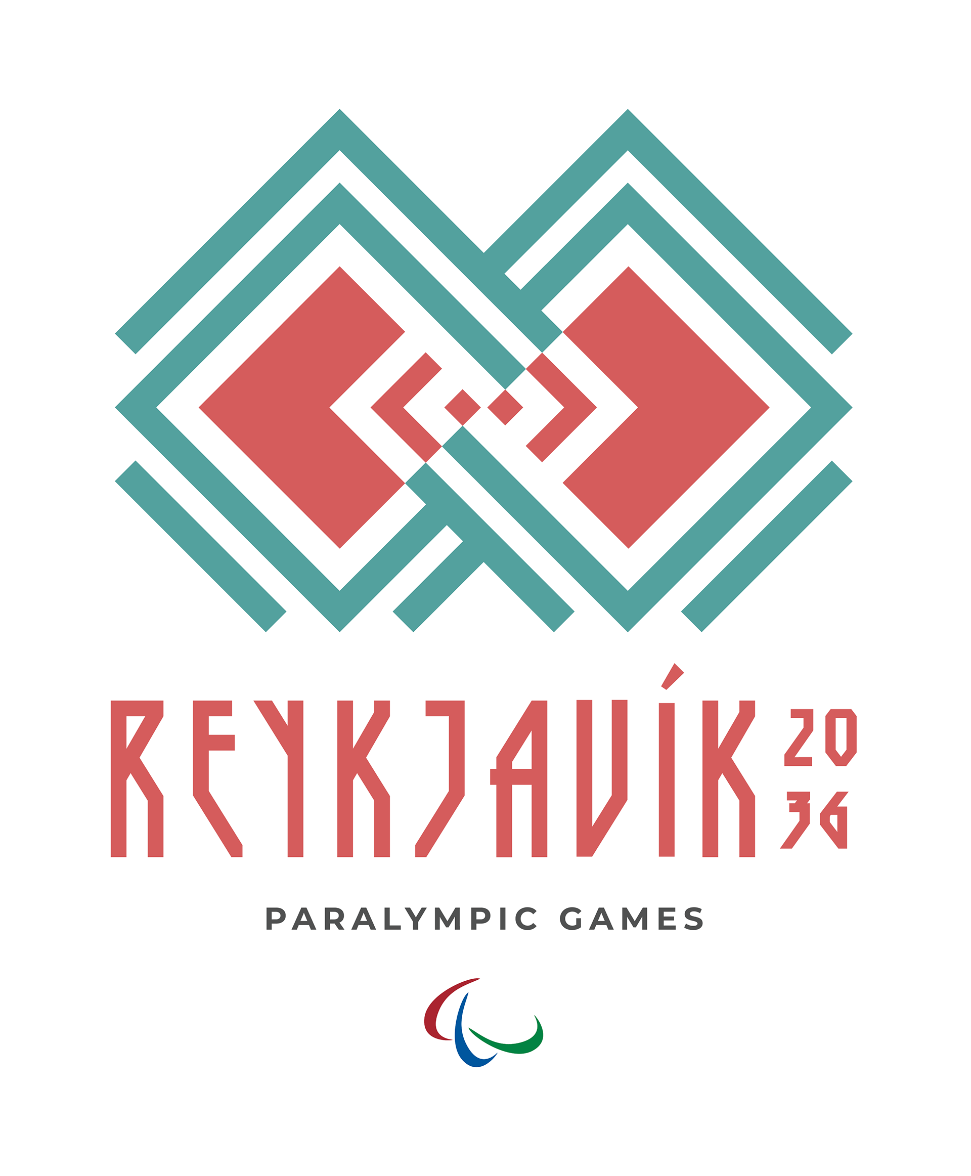
The identity draws inspiration from Icelandic patterns and Nordic geometry, creating a visual language that connects the Paralympic Games to Reykjavík's culture and landscape. Mirrored forms symbolize balance, resilience, and connection, reflecting the strength and unity of Paralympic athletes.
Alternative Logo

A horizontal lockup was developed for applications such as signage, banners, merchandise, and digital media. Its flexible composition preserves clear hierarchy while integrating the official Paralympic Agitos in a balanced and recognizable way.
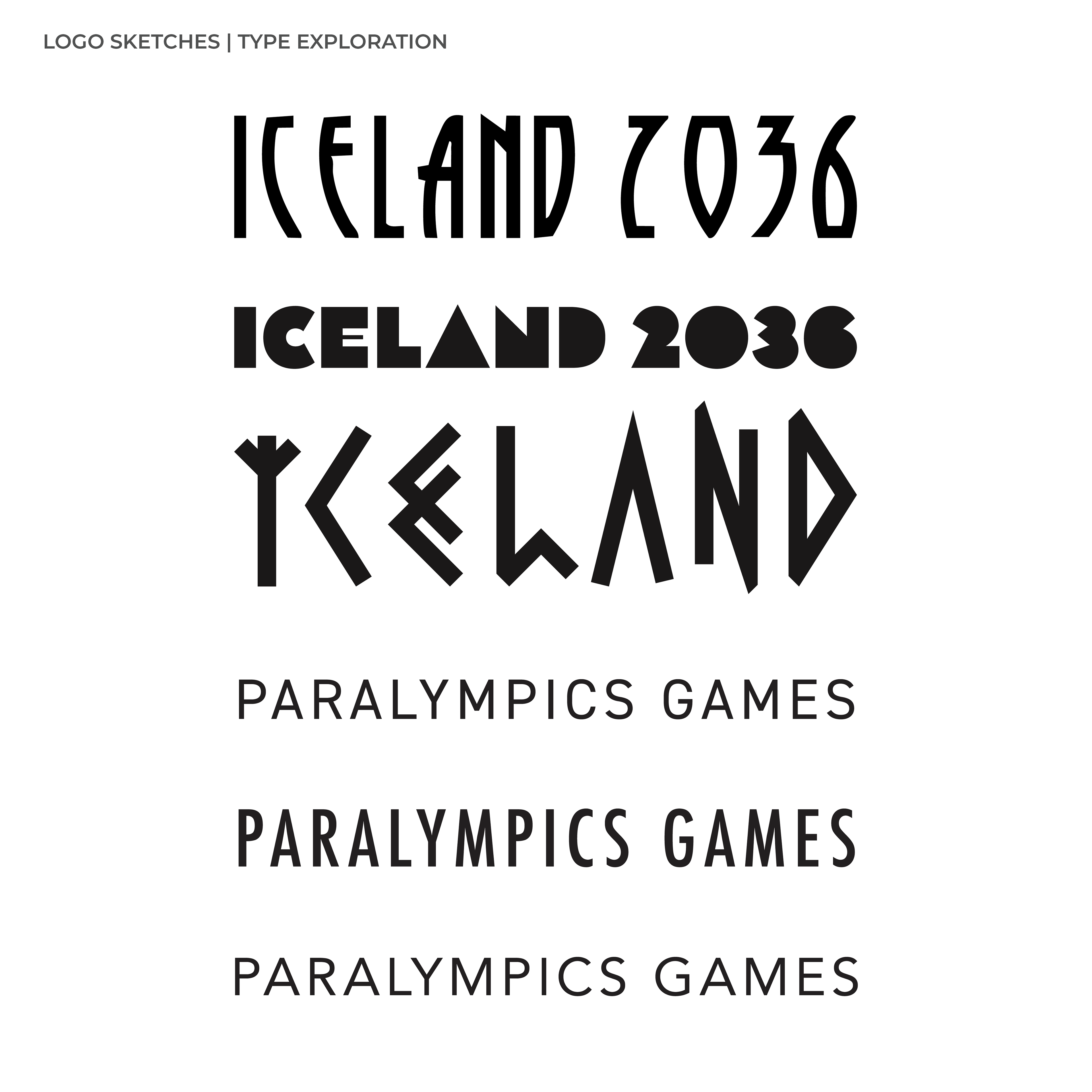
Custom Typography
Custom lettering was designed specifically for the Games, allowing the typography to echo the geometry of the logo while giving Reykjavík 2036 a unique and recognizable voice.
Visual System
The identity was designed as a flexible visual system that could scale across every Paralympic touchpoint. Comprehensive guidelines define logo usage, color, typography, and supporting graphic elements, ensuring a consistent and recognizable brand across environmental graphics, merchandise, print, and digital experiences.
The identity was designed as a flexible visual system that could scale across every Paralympic touchpoint. Comprehensive guidelines define logo usage, color, typography, and supporting graphic elements, ensuring a consistent and recognizable brand across environmental graphics, merchandise, print, and digital experiences.
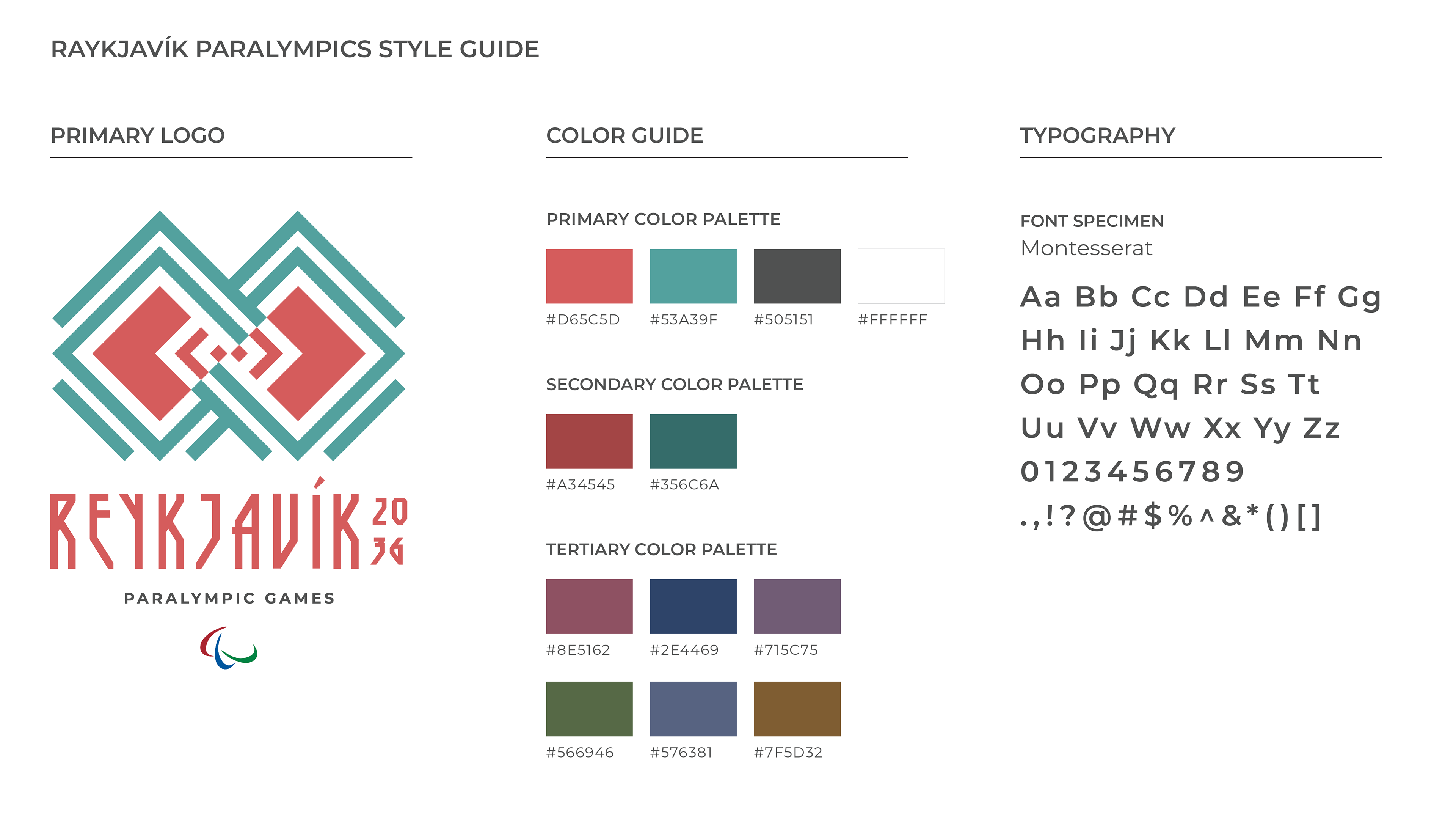
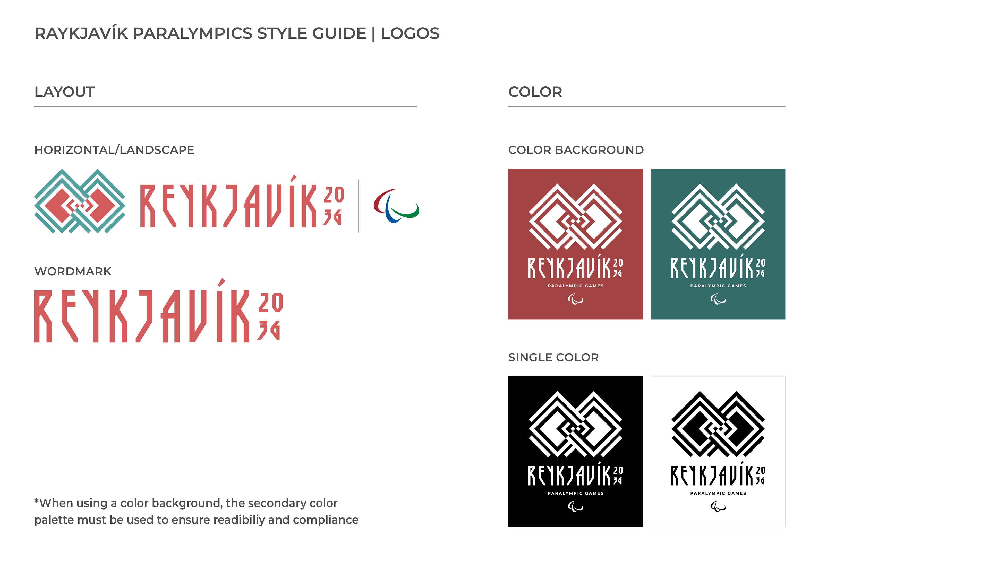
Comprehensive brand guidelines establish consistent use of the identity through logo configurations, typography, color palettes, and accessibility considerations, ensuring the brand remains recognizable across a wide range of applications.
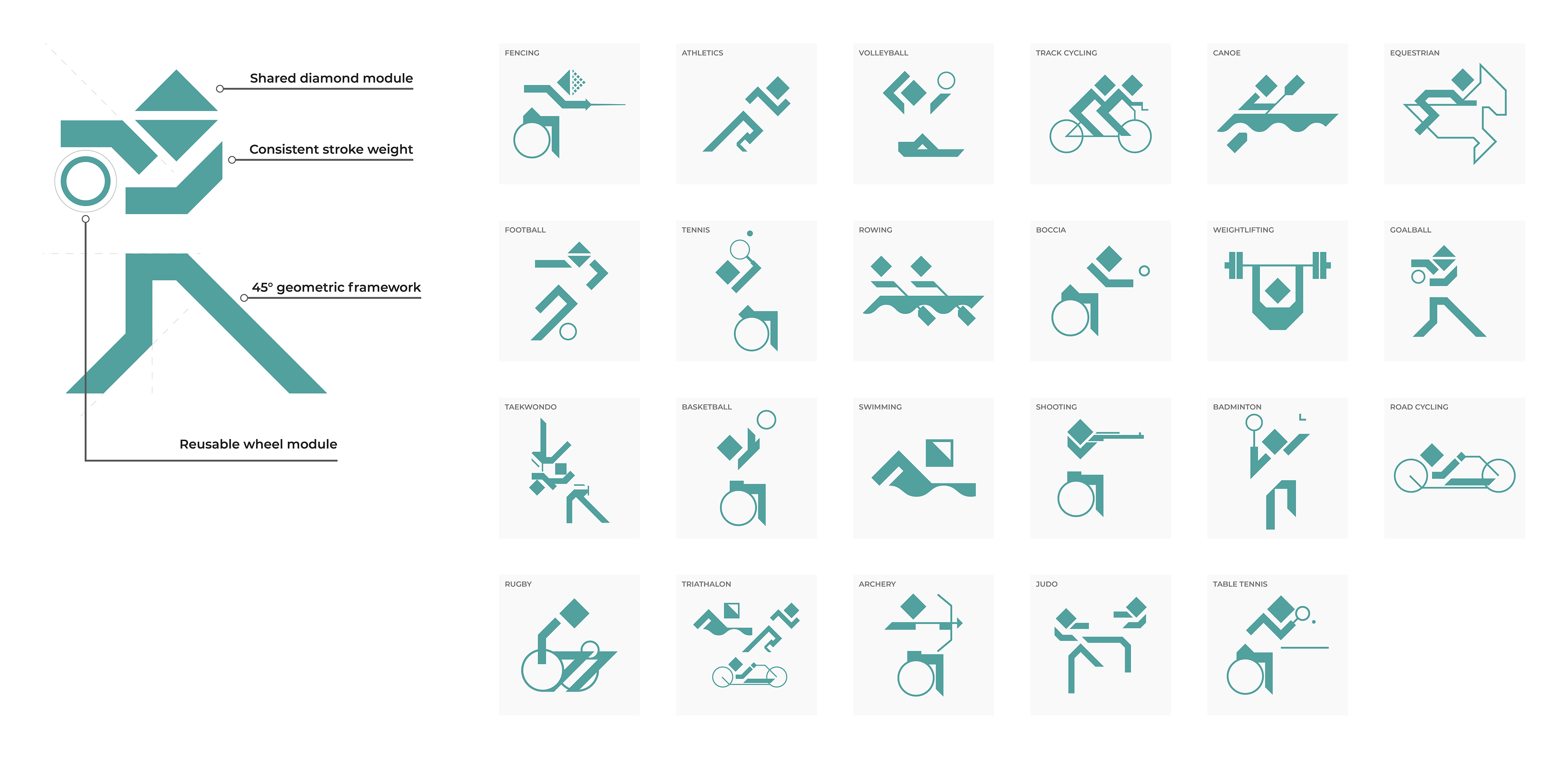
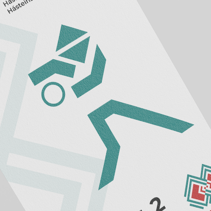
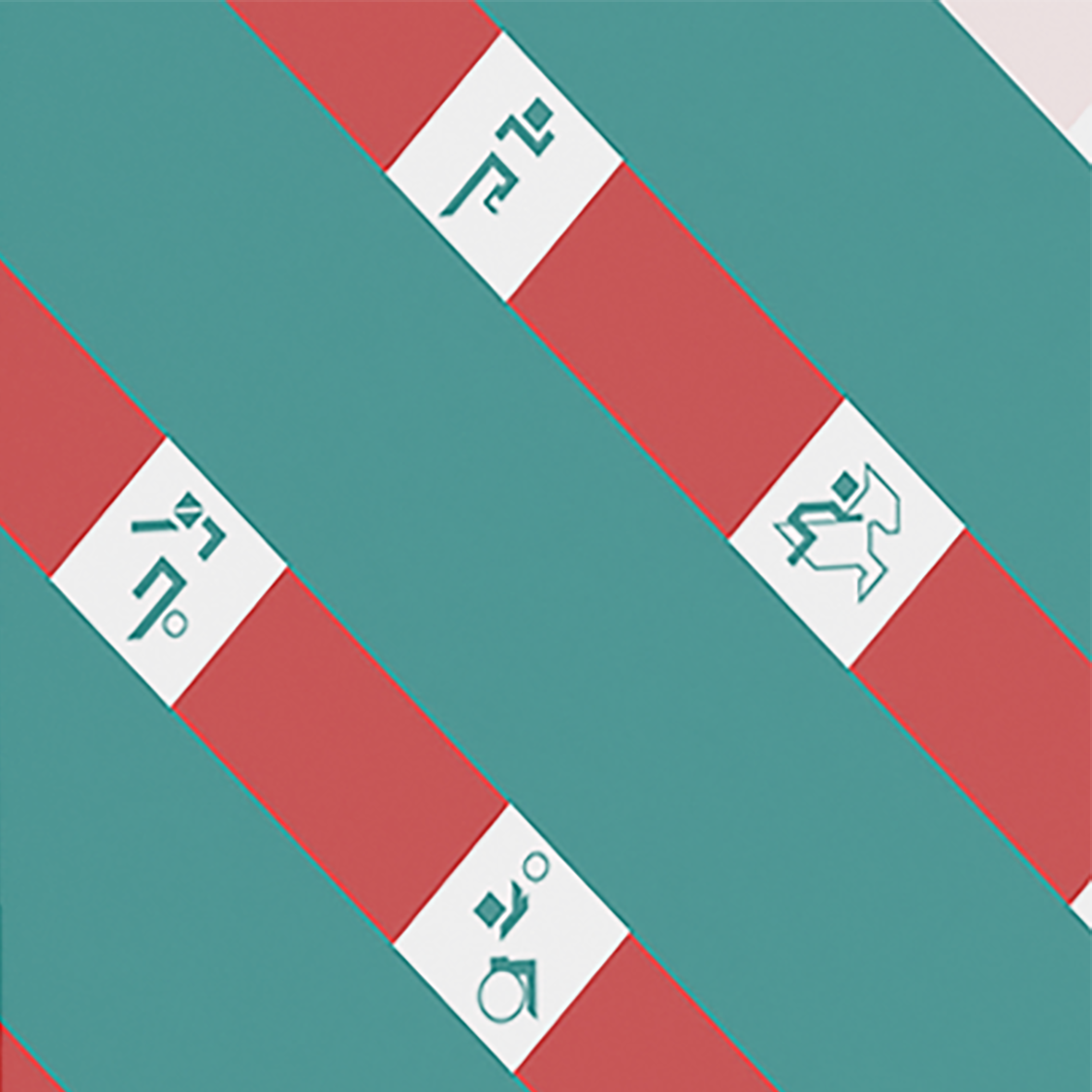
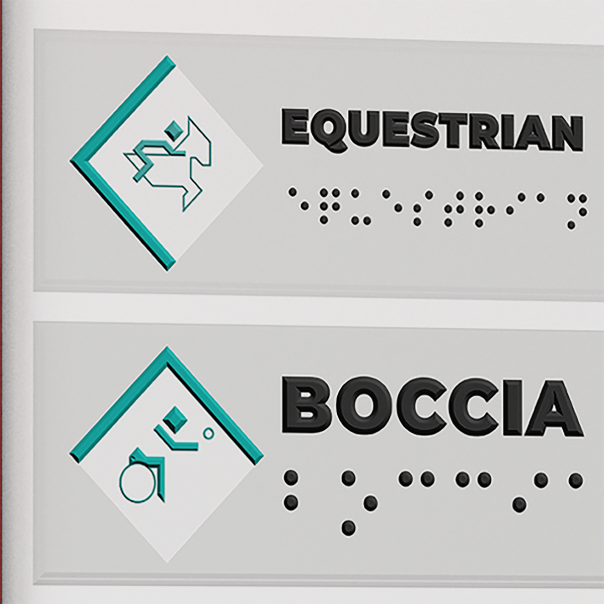
Sports Pictogram System
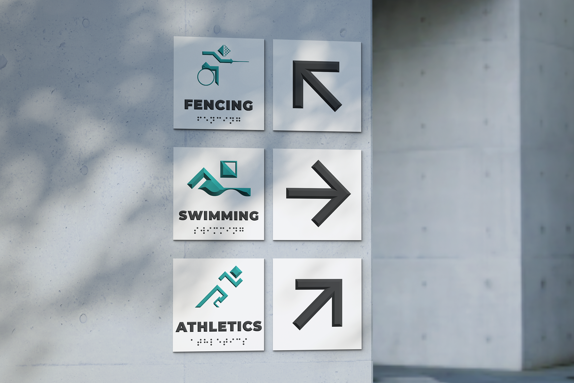
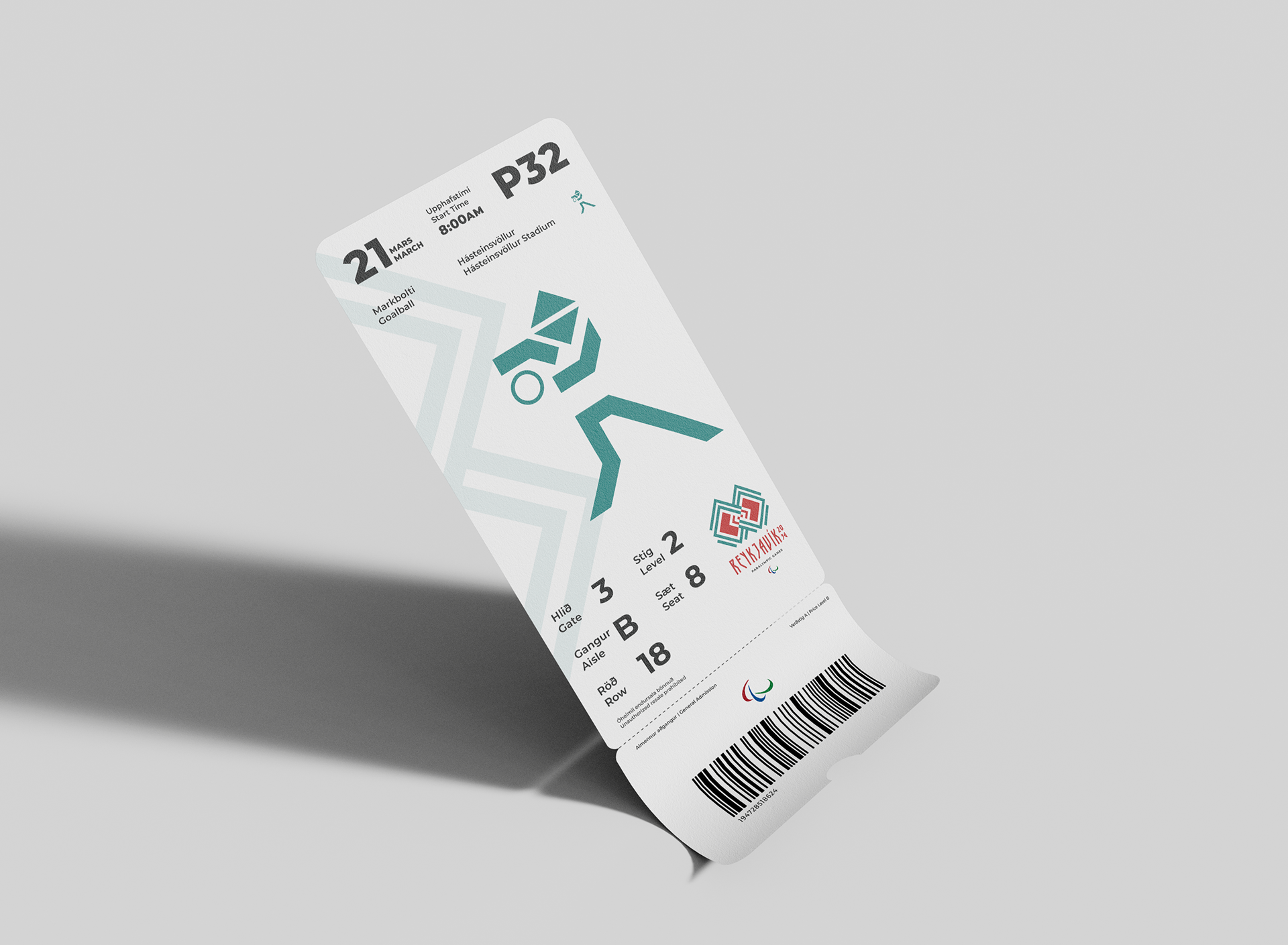
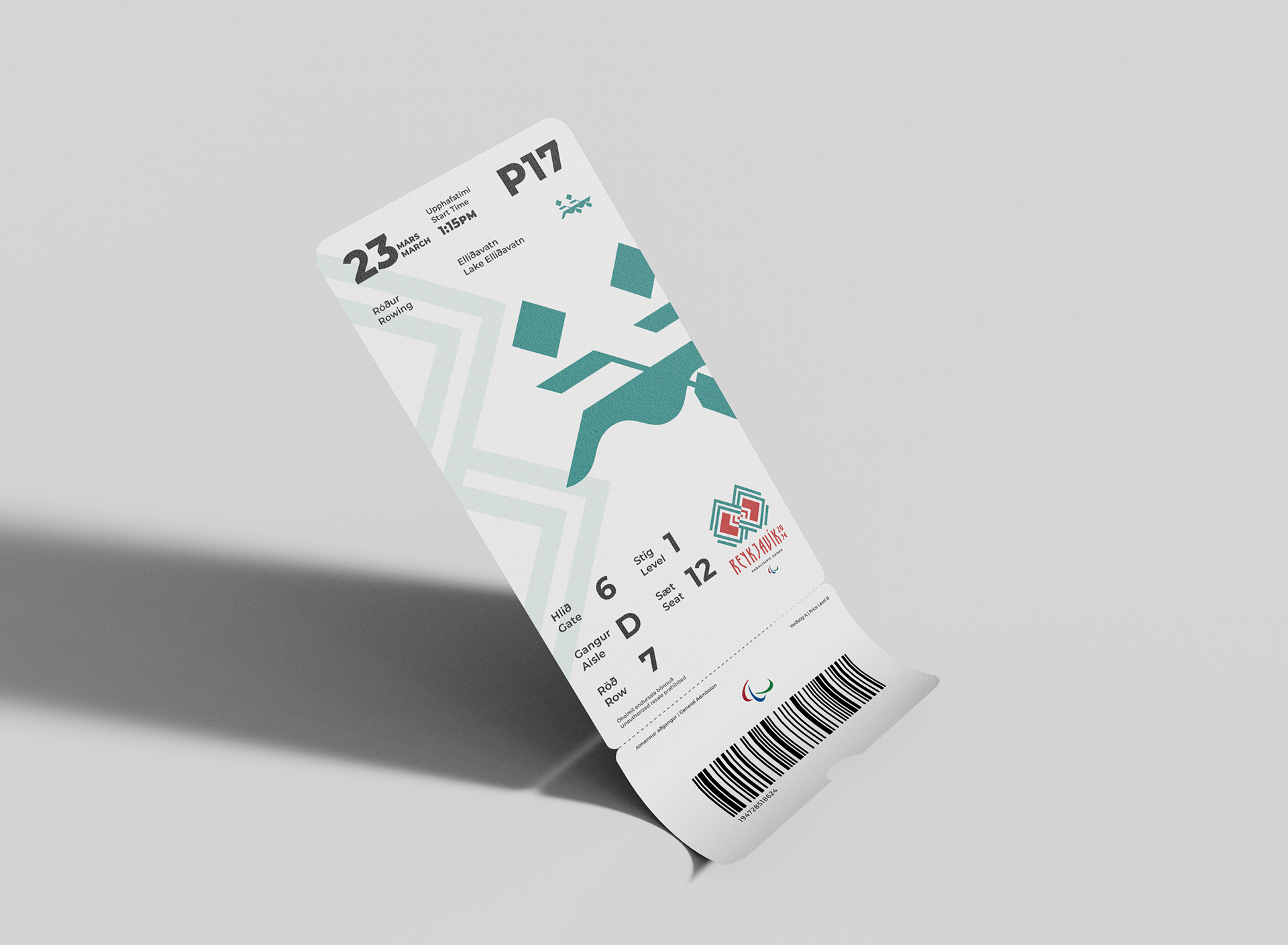
A unified pictogram system was created to represent each Paralympic sport using a shared geometric language derived from the primary identity. Consistent proportions, motion cues, and simplified forms ensure each icon is immediately recognizable while functioning cohesively as a complete system across signage, tickets, maps, and digital interfaces.
A unified pictogram system was created to represent each Paralympic sport using a shared geometric language derived from the primary identity. Consistent proportions, motion cues, and simplified forms ensure each icon is immediately recognizable while functioning cohesively as a complete system across signage, tickets, maps, and digital interfaces.
Used on ticket
Used on signage
Used on wayfinding
Applications
The visual system extends seamlessly into wayfinding, uniforms, credentials, merchandise, and event graphics, creating a cohesive experience for athletes, volunteers, and spectators.
The visual system extends seamlessly into wayfinding, uniforms, credentials, merchandise, and event graphics, creating a cohesive experience for athletes, volunteers, and spectators.
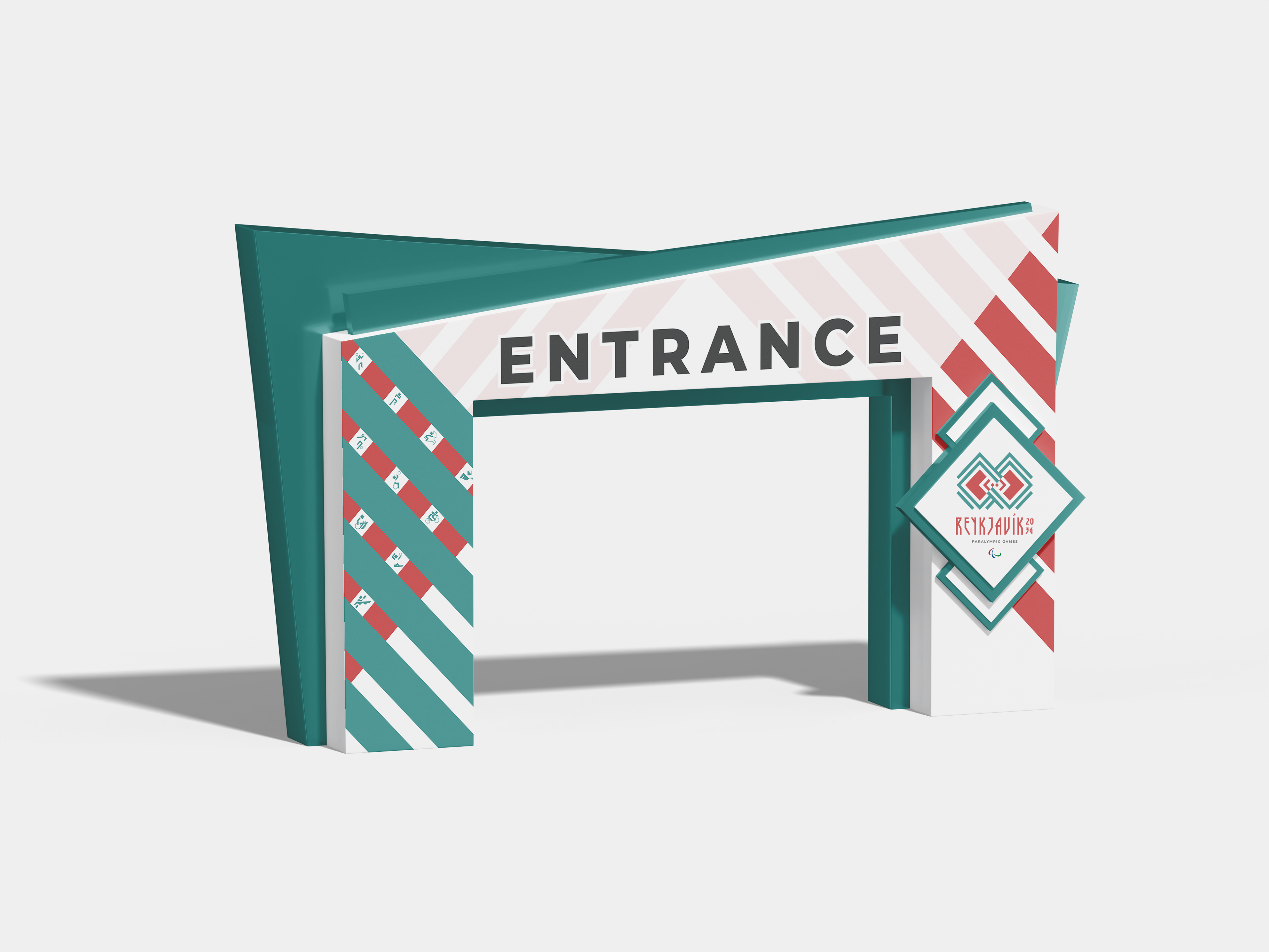
Visitor Experience
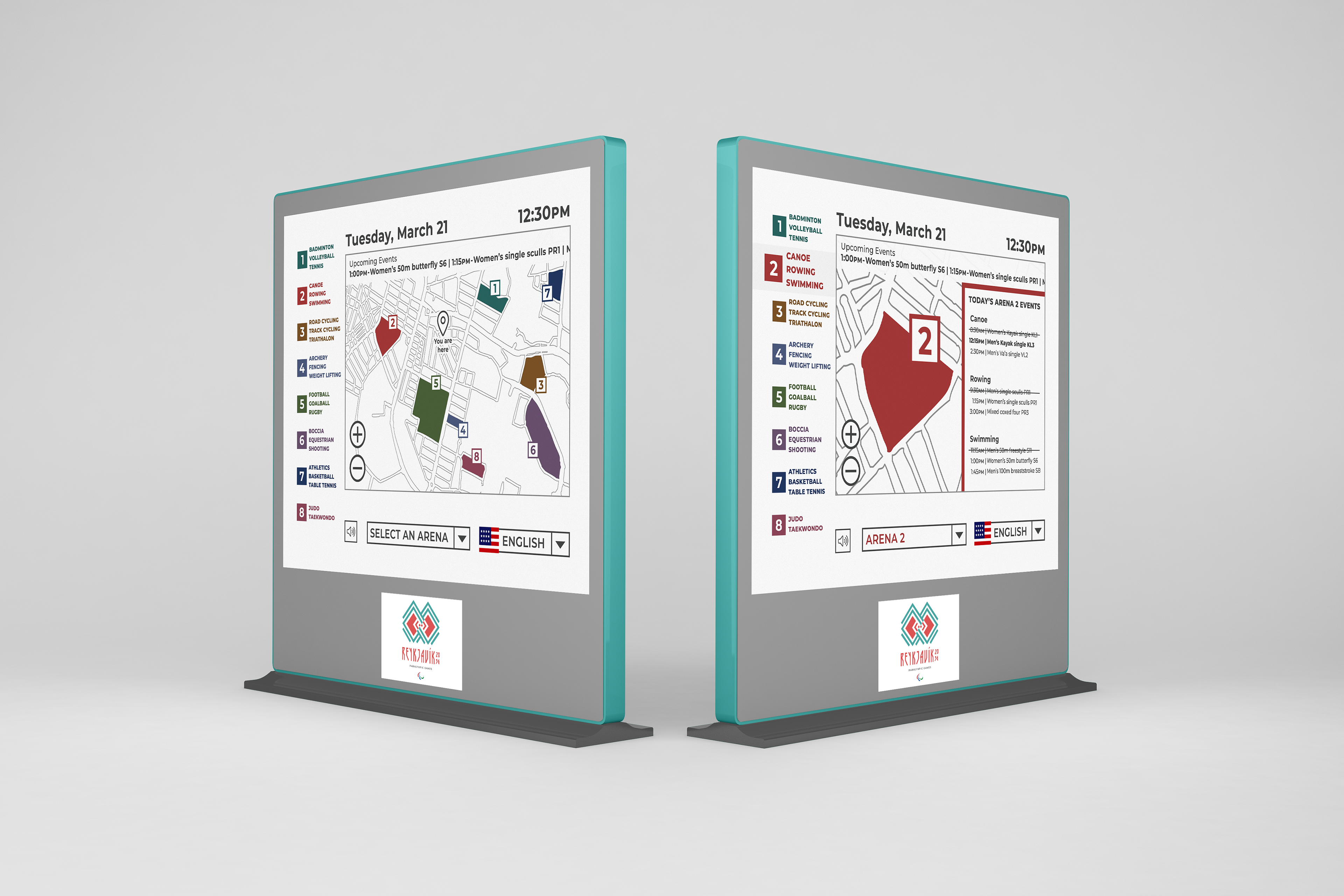
The identity extends beyond branding into the visitor experience, creating a clear, accessible system that helps attendees navigate venues, locate events, and interact confidently throughout the Games.
The identity extends beyond branding into the visitor experience, creating a clear, accessible system that helps attendees navigate venues, locate events, and interact confidently throughout the Games.
Event Entrance
Tactile Wayfinding

Interactive Map Kiosks

Event Tickets
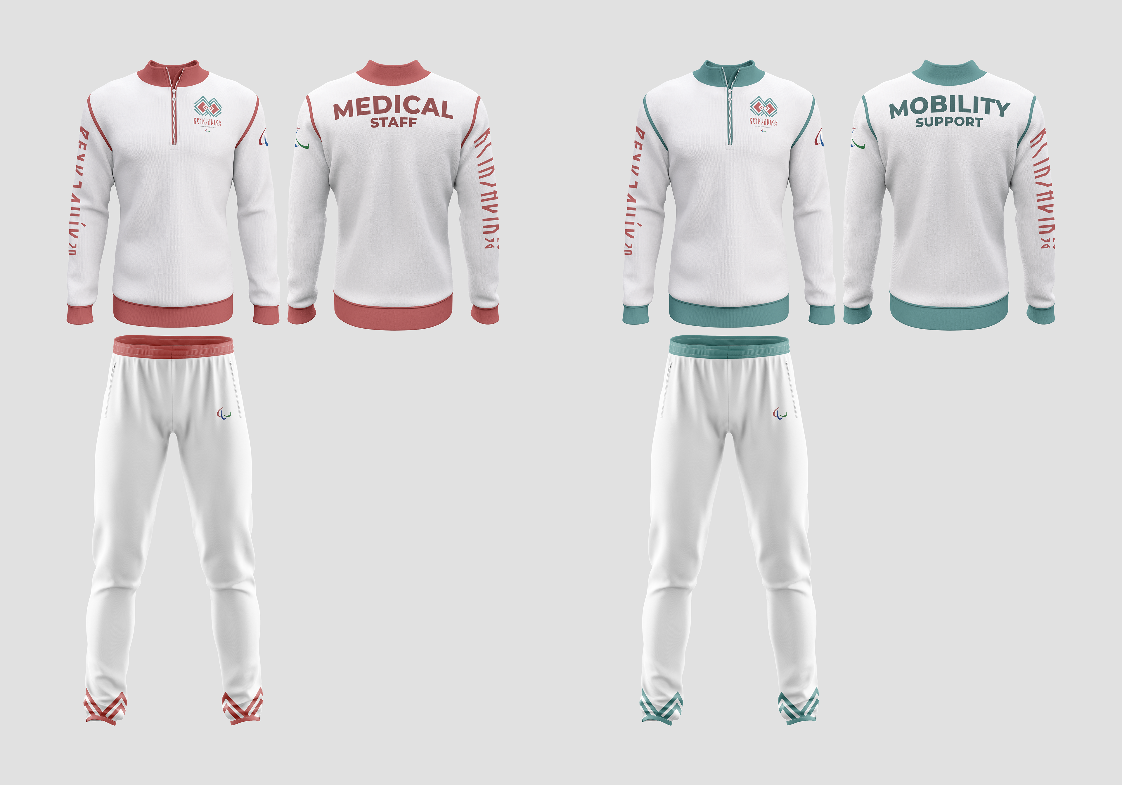
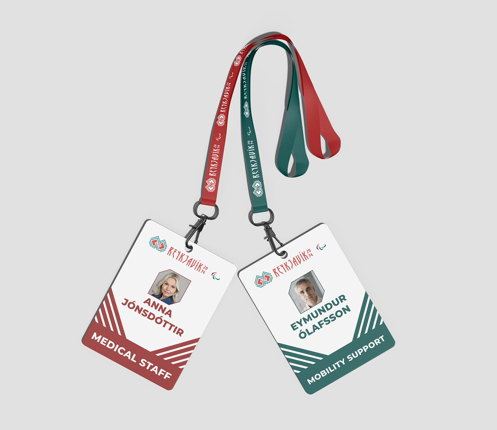
Staff and Operations
Operational materials were designed to distinguish staff roles while maintaining a consistent visual identity. Color, typography, and clear labeling improve recognition for athletes, volunteers, and visitors alike.
Operational materials were designed to distinguish staff roles while maintaining a consistent visual identity. Color, typography, and clear labeling improve recognition for athletes, volunteers, and visitors alike.
Merchandise
Merchandise extends the identity beyond the event itself, using the visual language and graphic patterns to create memorable, collectible products that reinforce brand recognition.
Merchandise extends the identity beyond the event itself, using the visual language and graphic patterns to create memorable, collectible products that reinforce brand recognition.
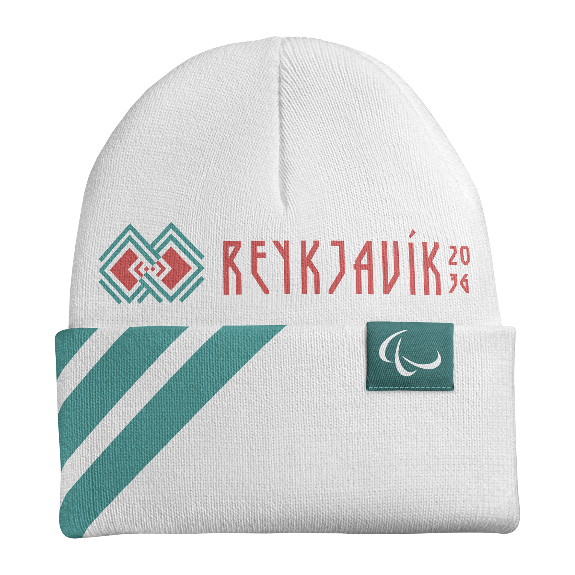
Beanie
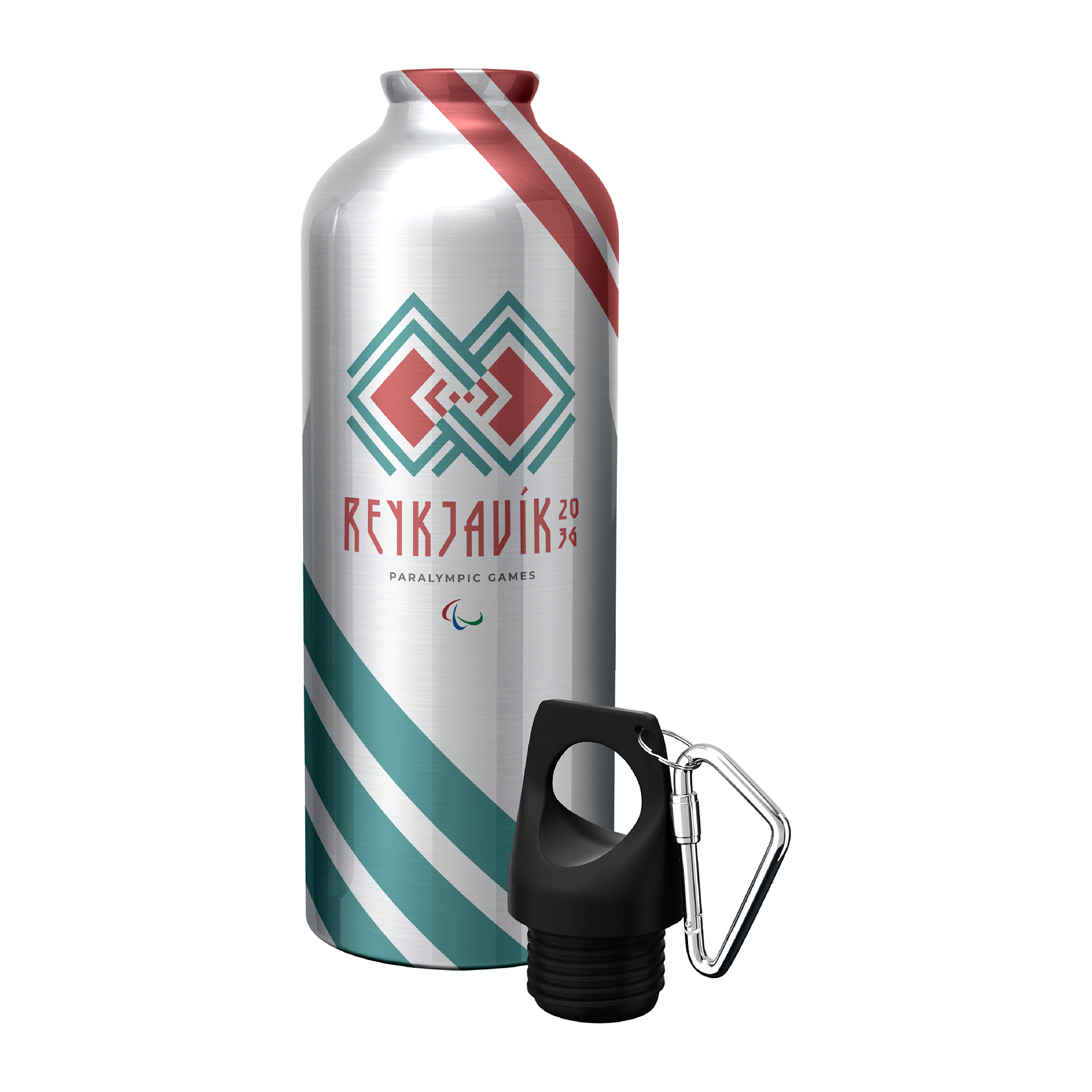
Waterbottle
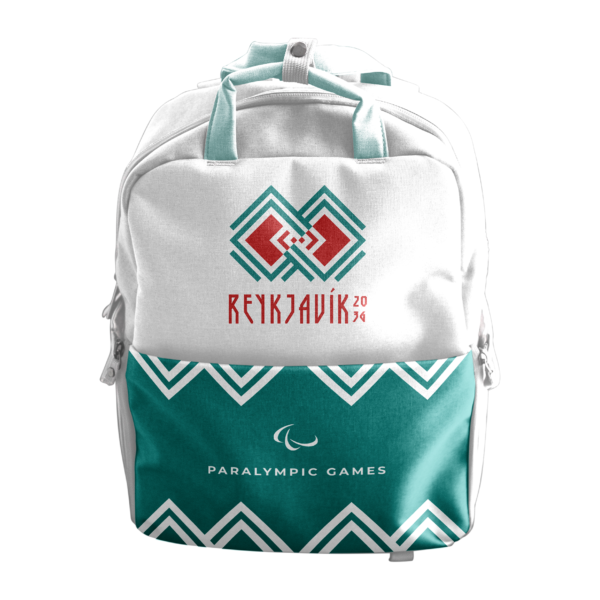
Backpack
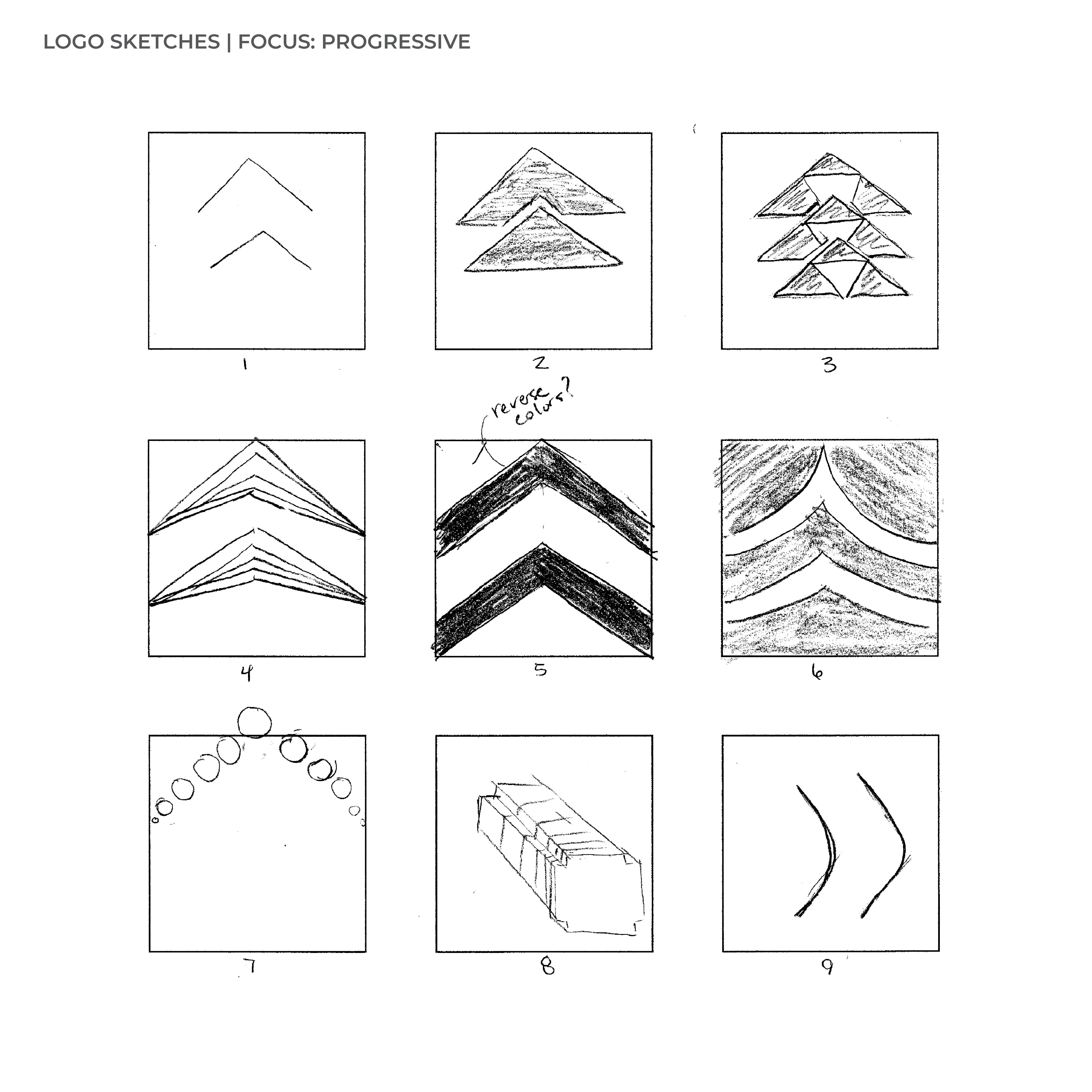
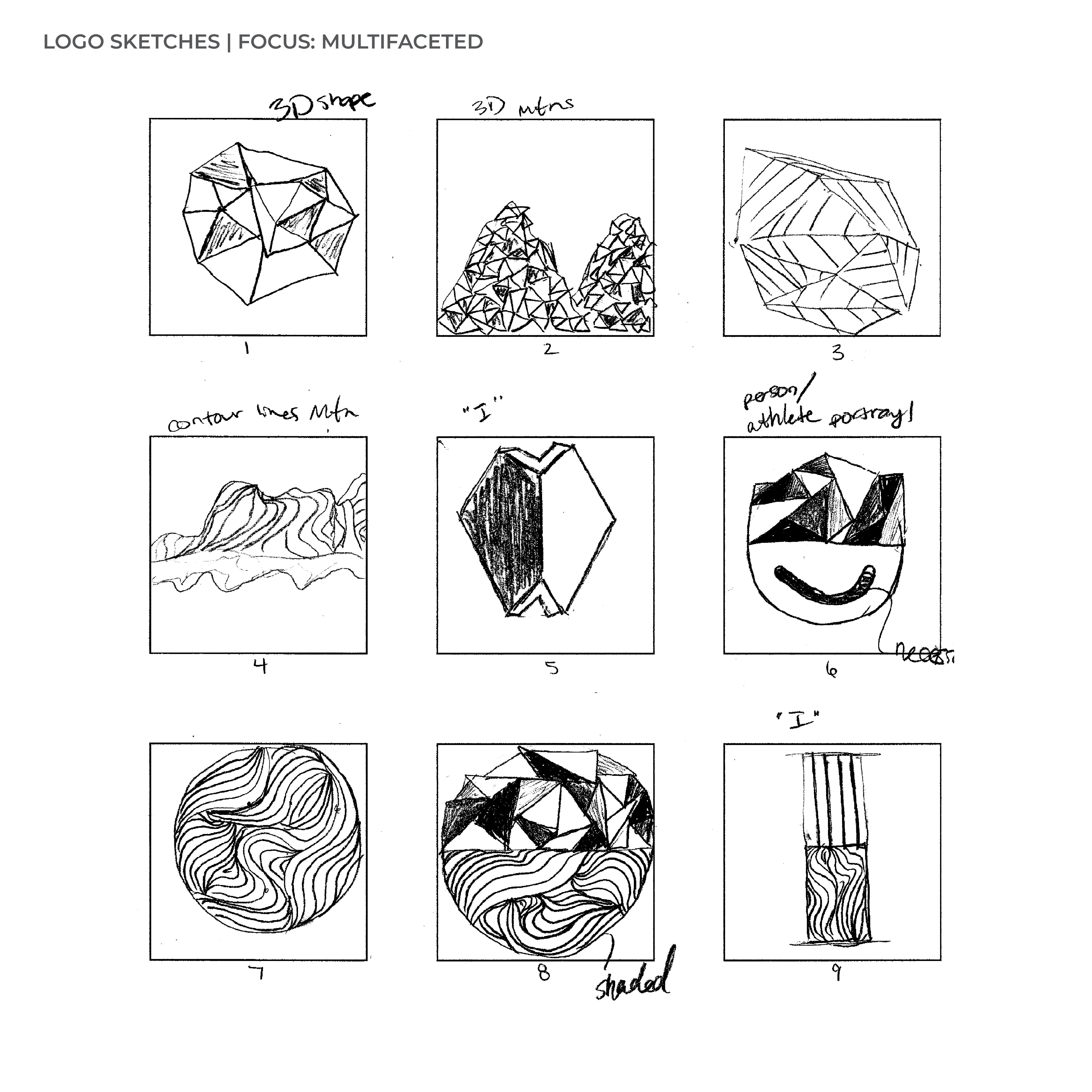
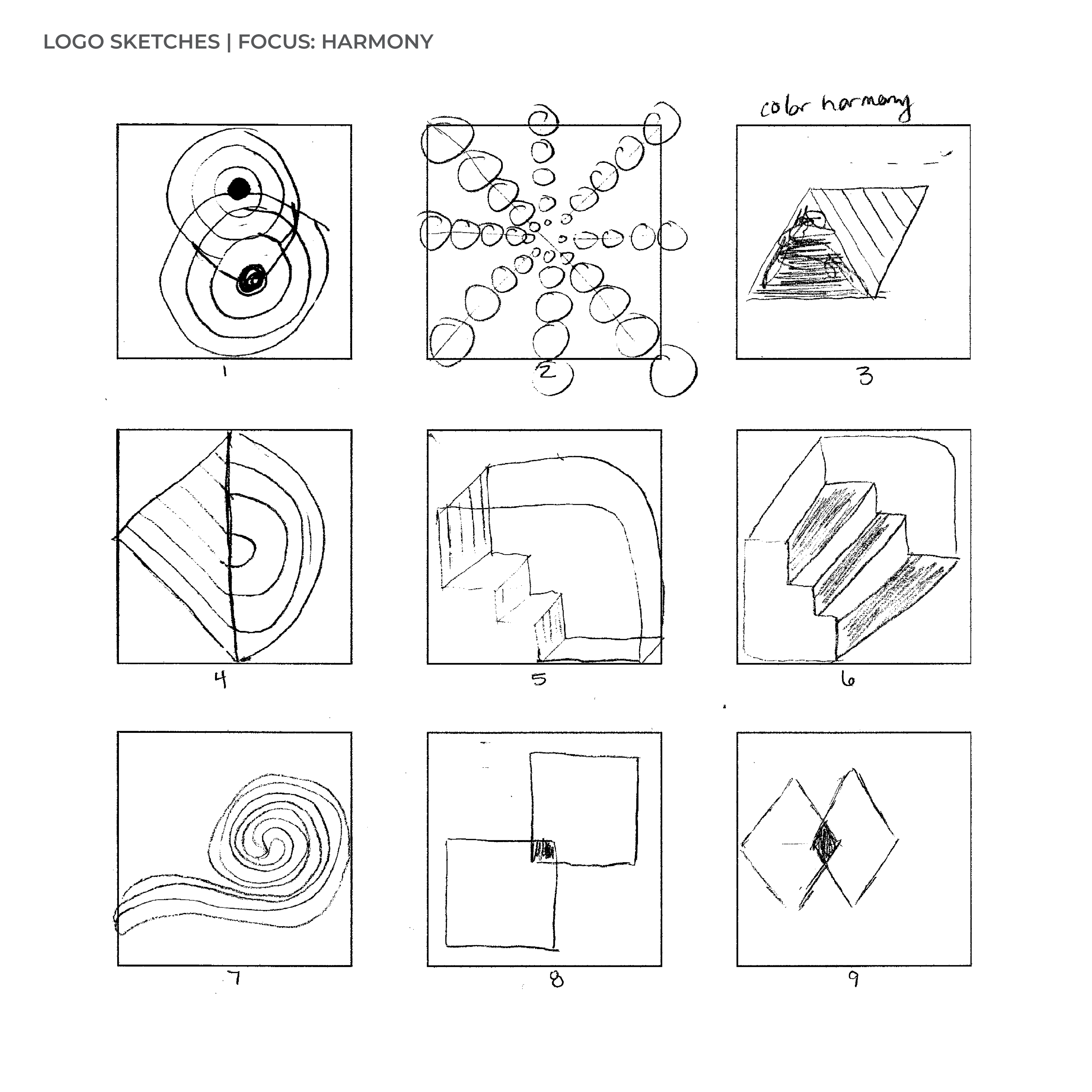
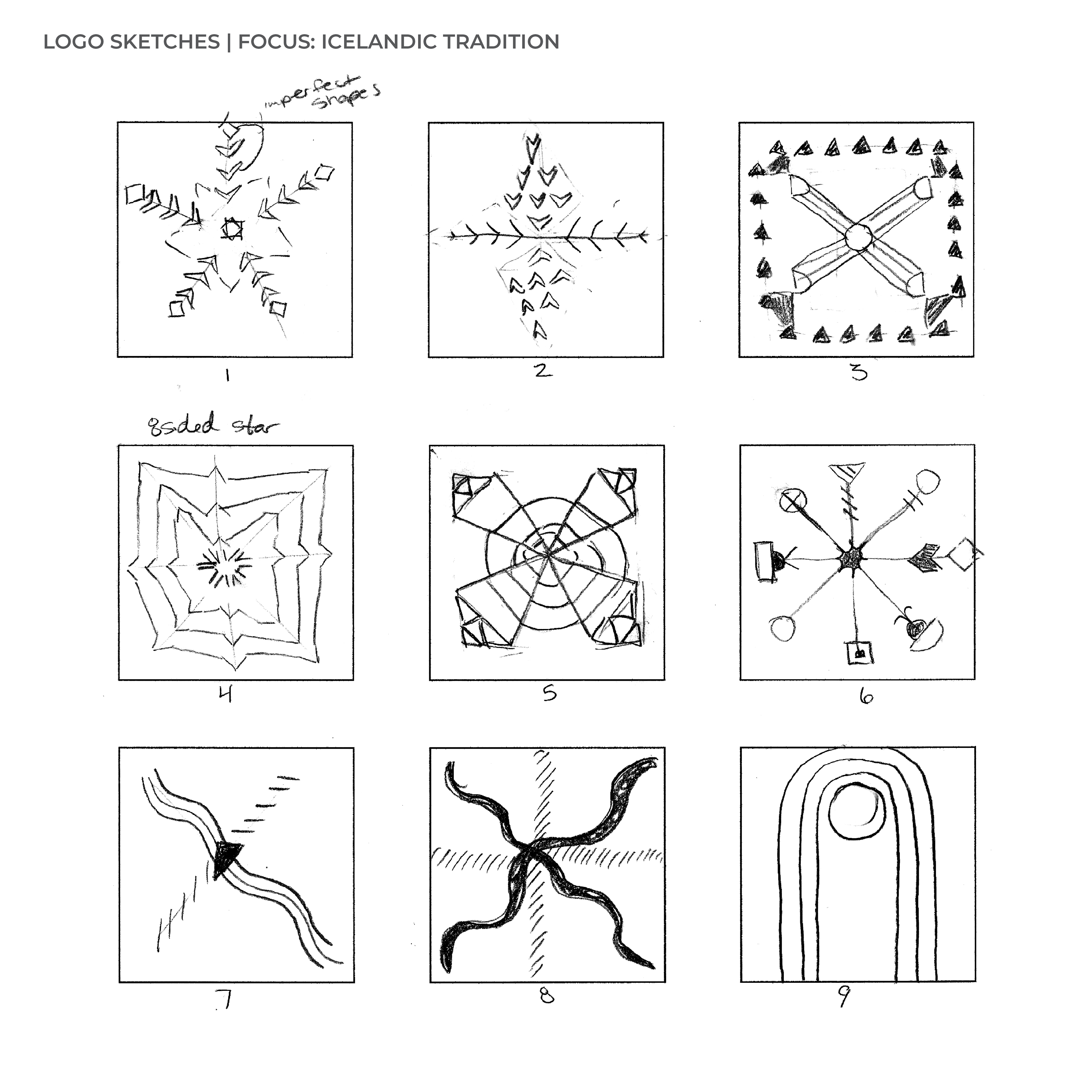
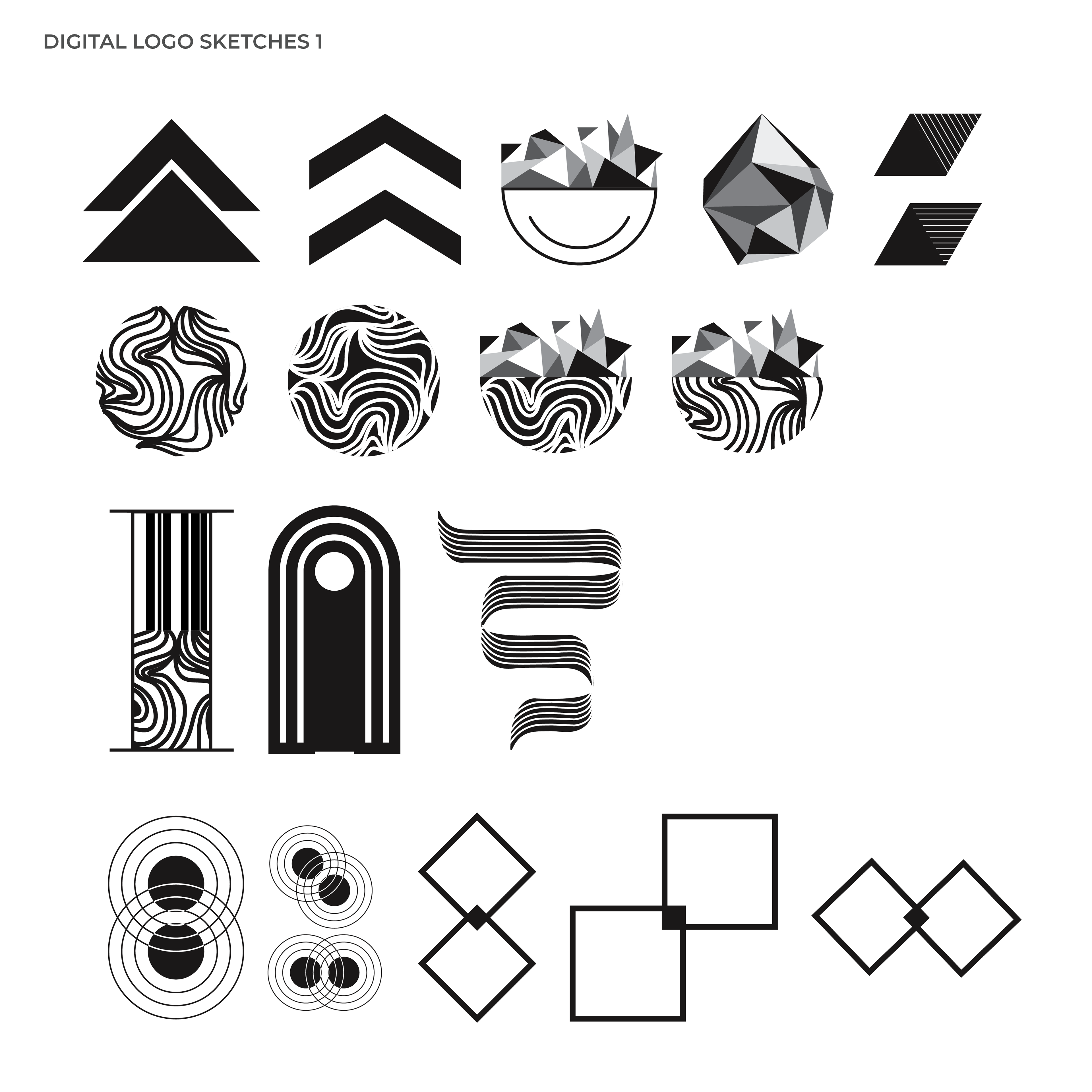
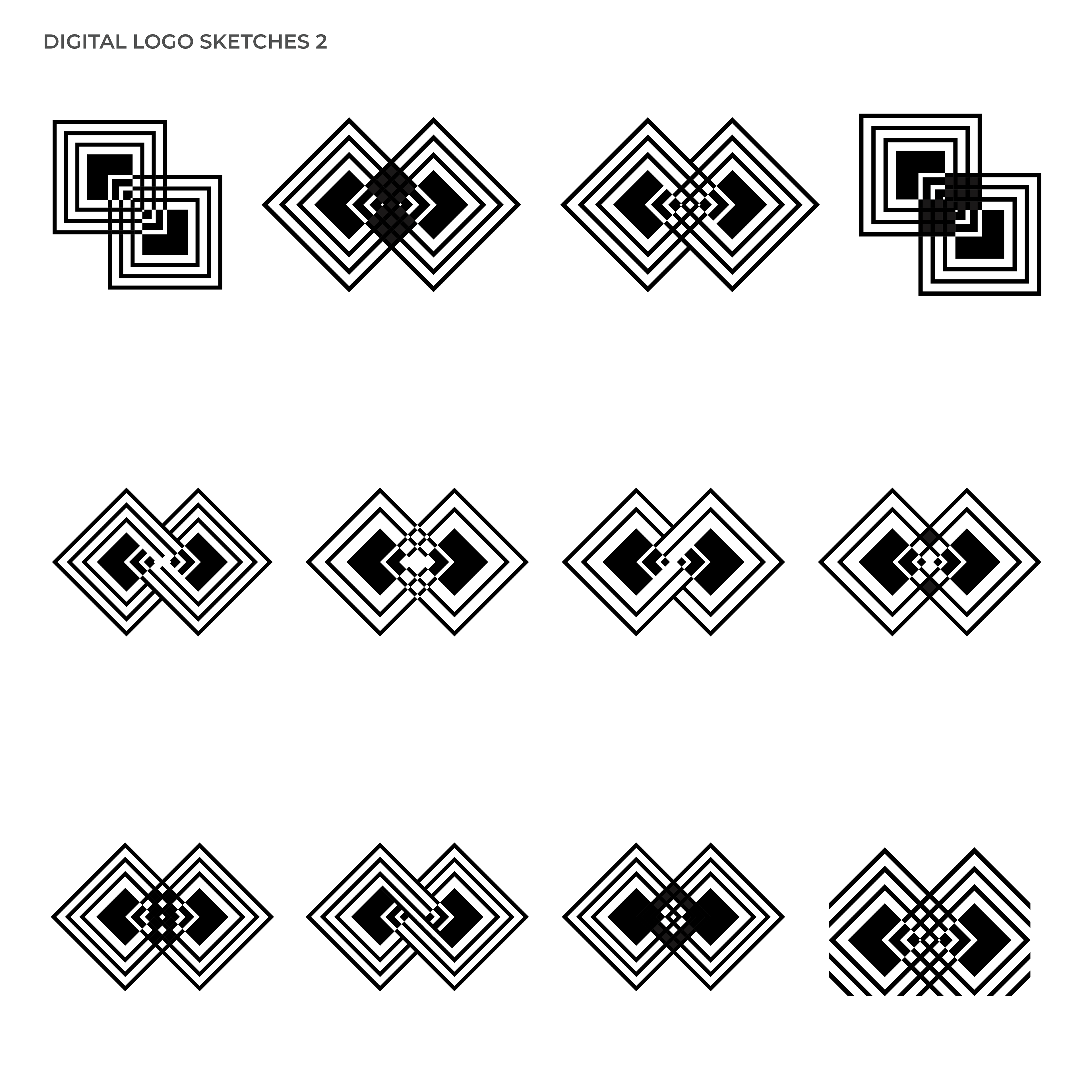
Identity Process
I explored five visual themes—Progress, Northern Lights, Multifaceted Identity, Harmony, and Icelandic Tradition—to understand how abstract forms could express movement, strength, and place. Through an iterative sketching process, I refined these explorations into a cohesive identity system that reflects Icelandic culture while celebrating the resilience, unity, and determination of Paralympic athletes.
I explored five visual themes—Progress, Northern Lights, Multifaceted Identity, Harmony, and Icelandic Tradition—to understand how abstract forms could express movement, strength, and place. Through an iterative sketching process, I refined these explorations into a cohesive identity system that reflects Icelandic culture while celebrating the resilience, unity, and determination of Paralympic athletes.