Brand System
Rather than reinventing the brand, I evolved its visual identity by refining the logo, color palette, typography, and iconography into a more cohesive and scalable system.
Rather than reinventing the brand, I evolved its visual identity by refining the logo, color palette, typography, and iconography into a more cohesive and scalable system.
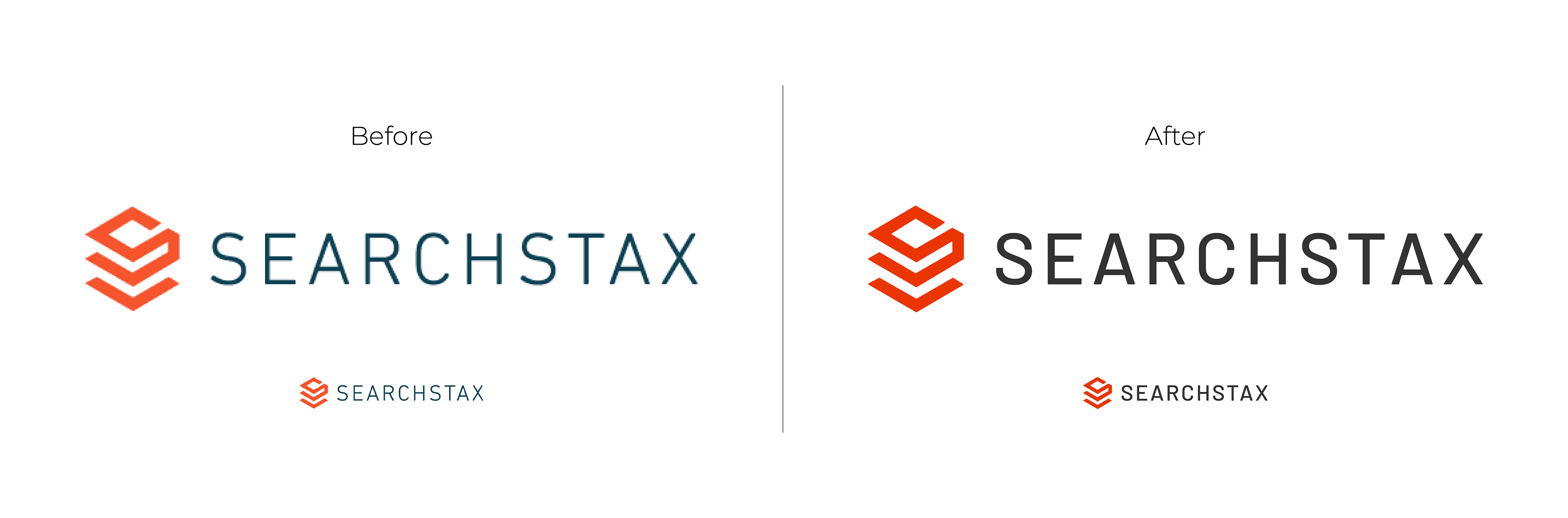
Logo
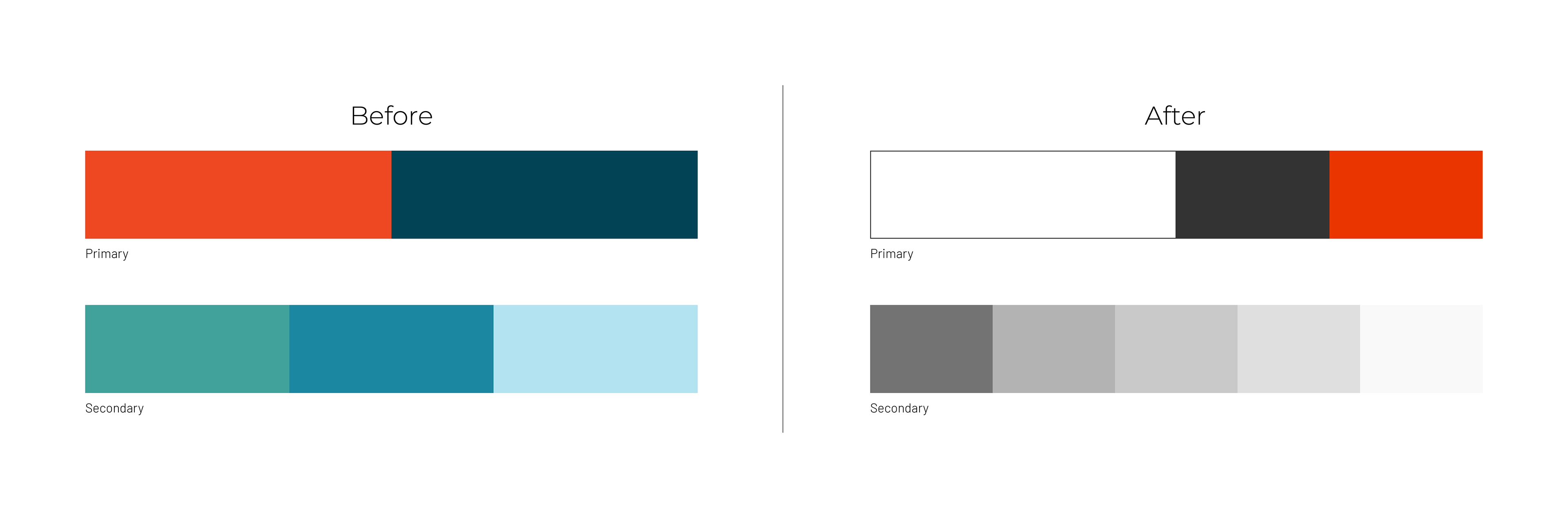
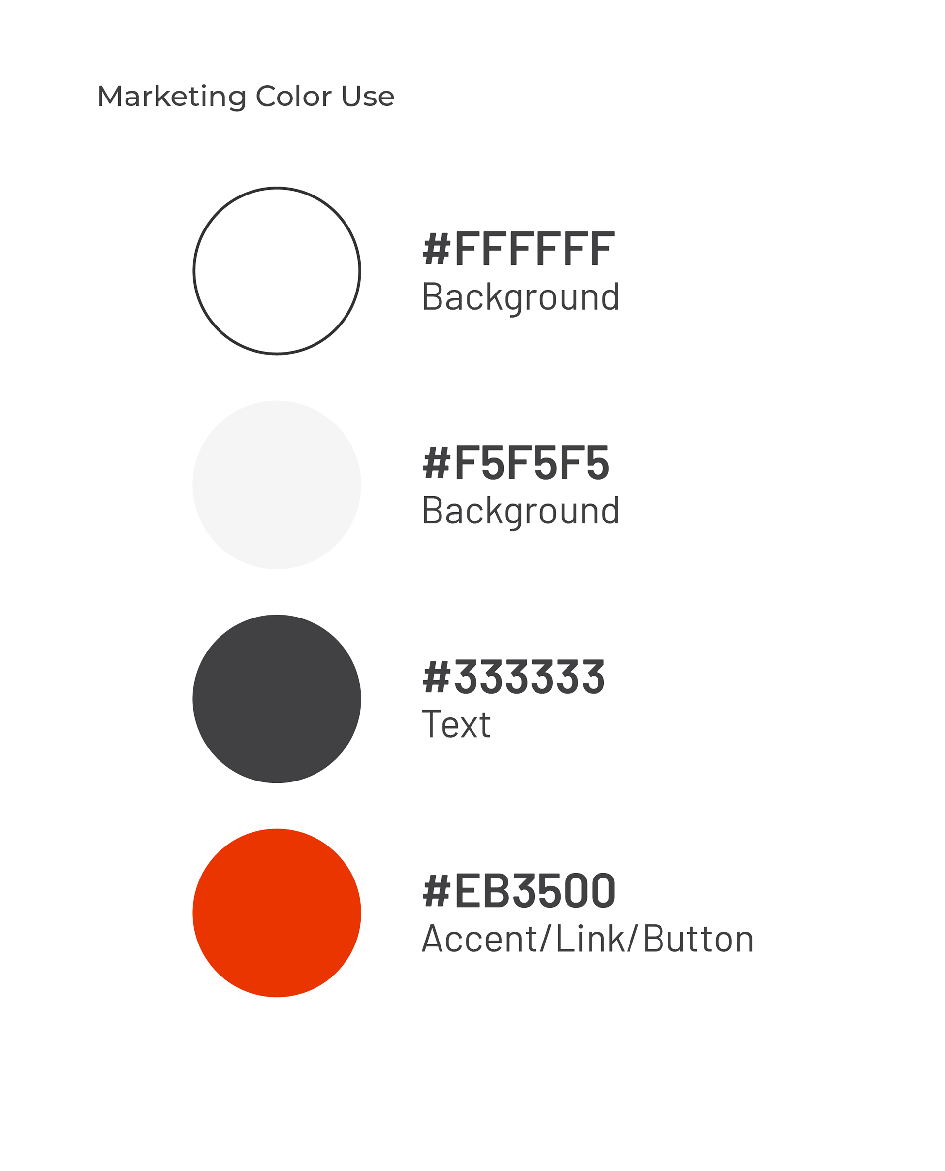
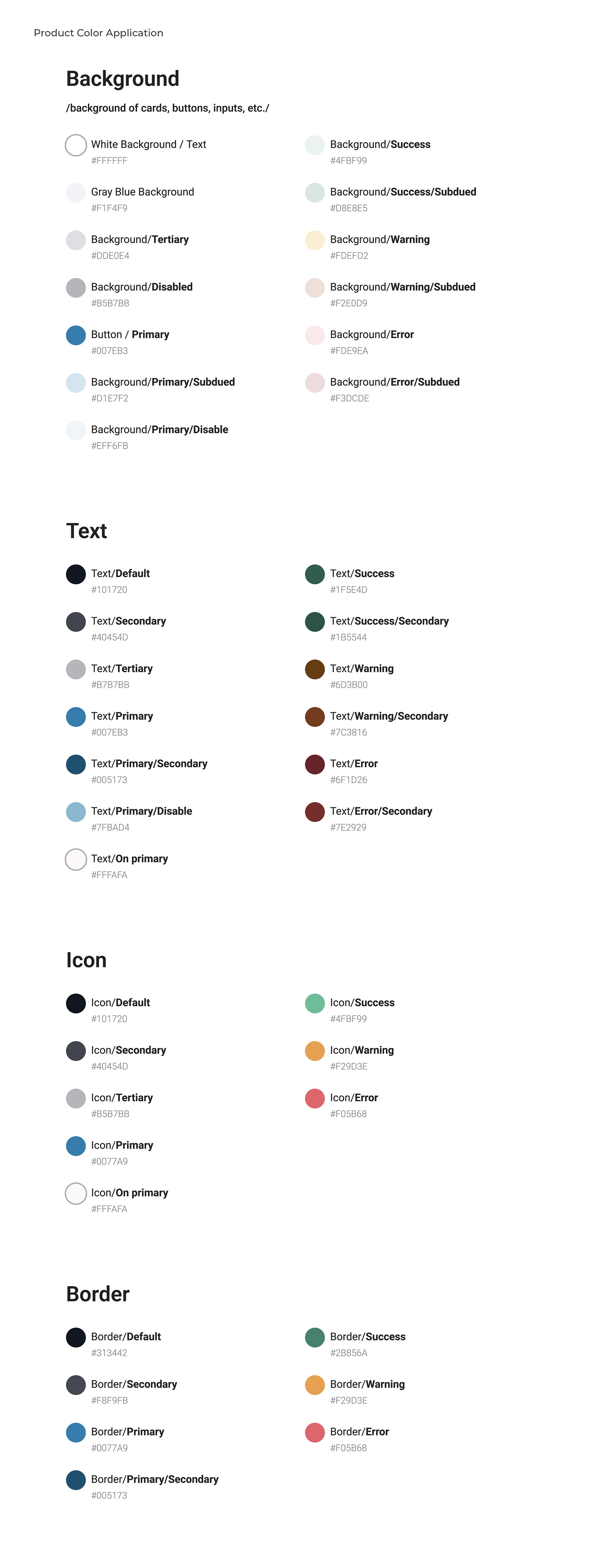
Color: Brand Palette
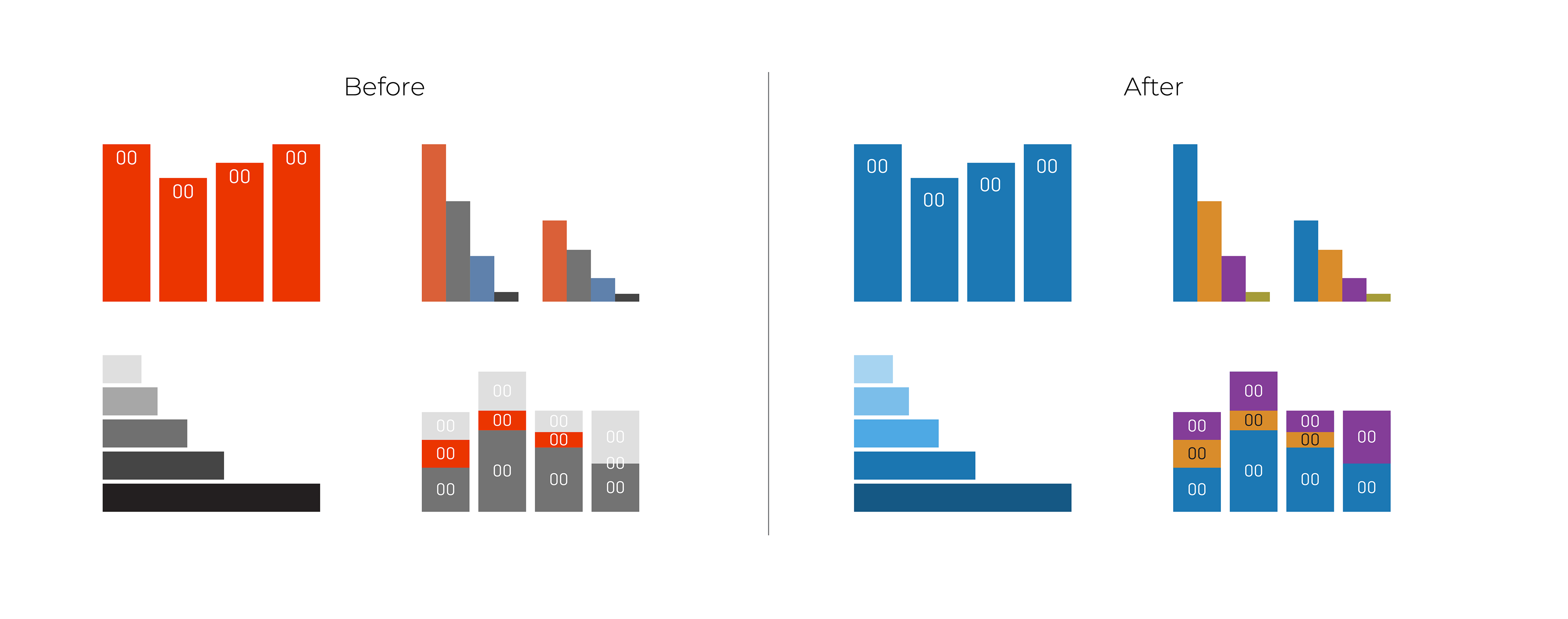
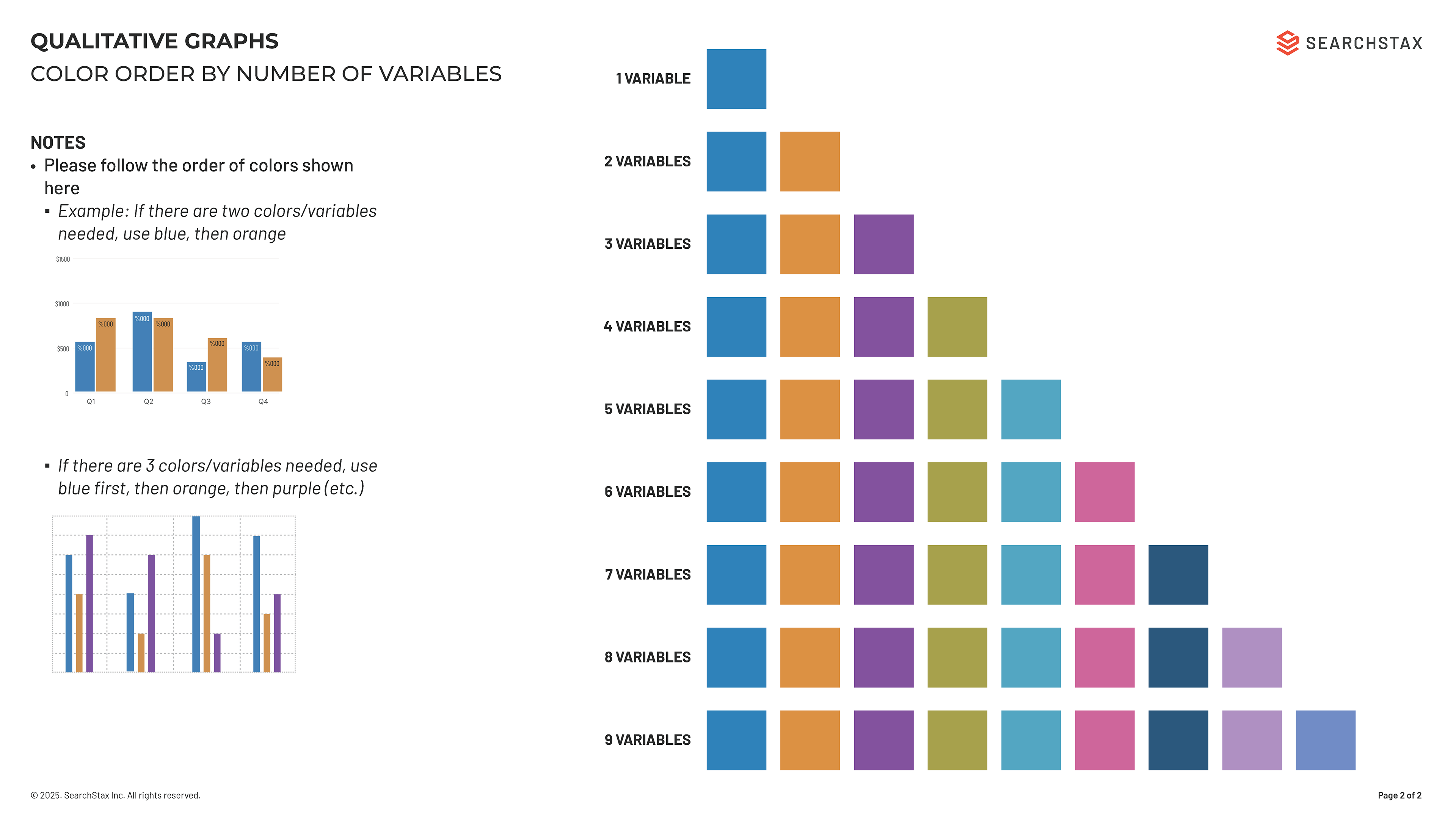
Color: Data Visualization
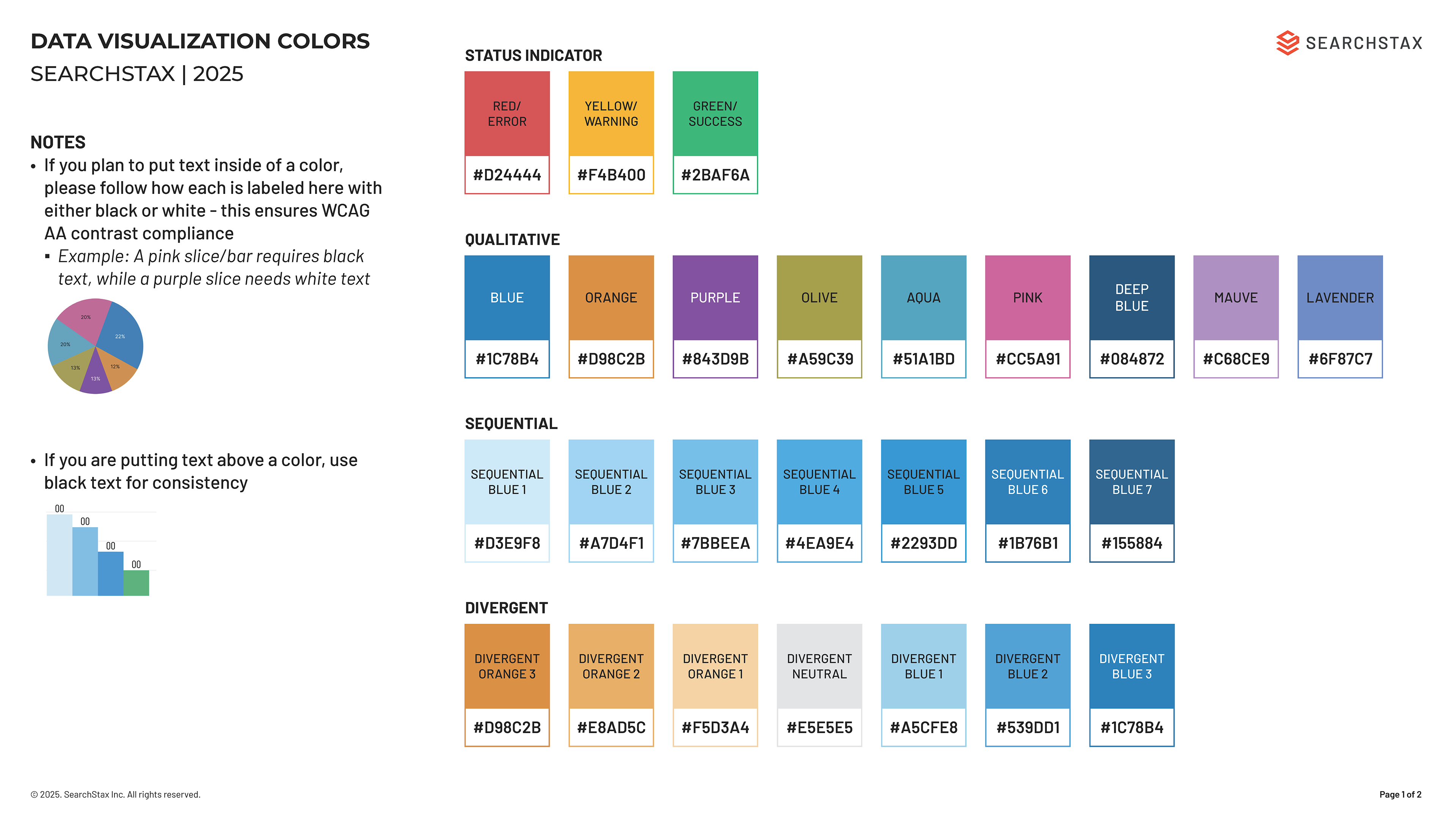
Data Visualization Application Guide
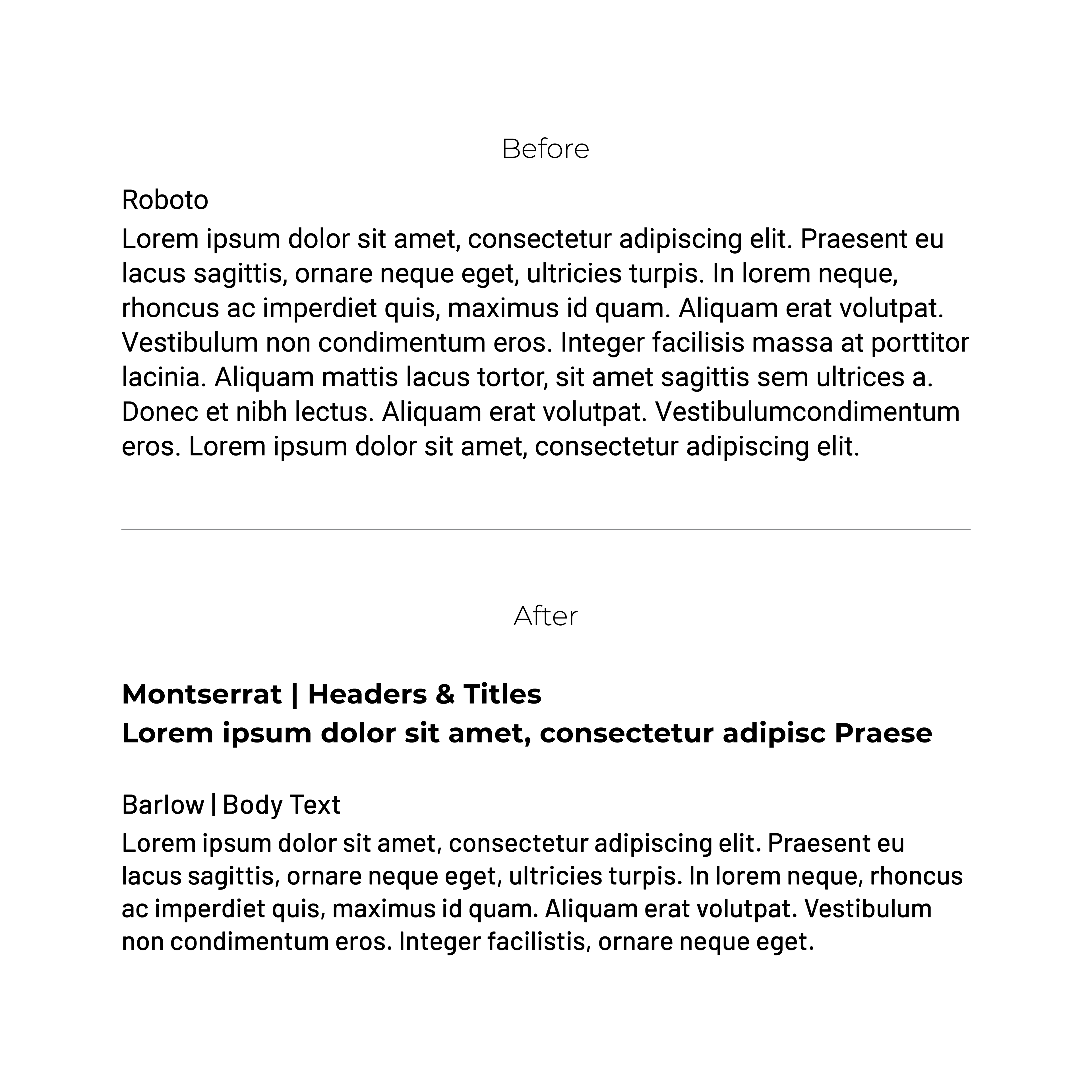
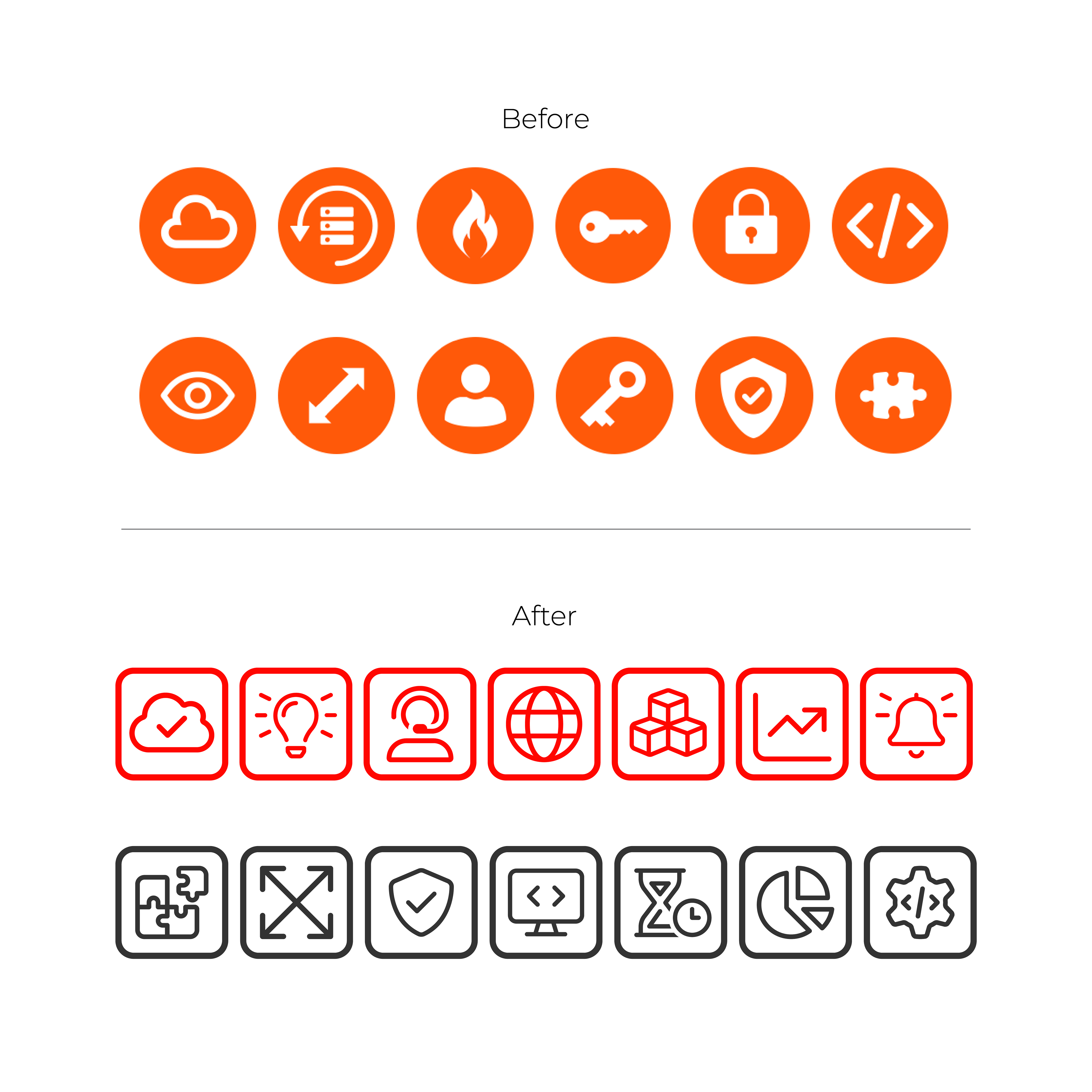
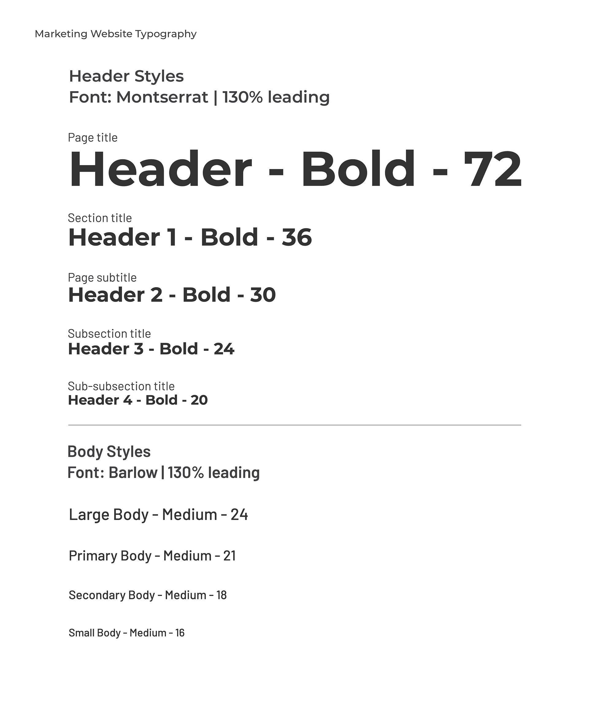
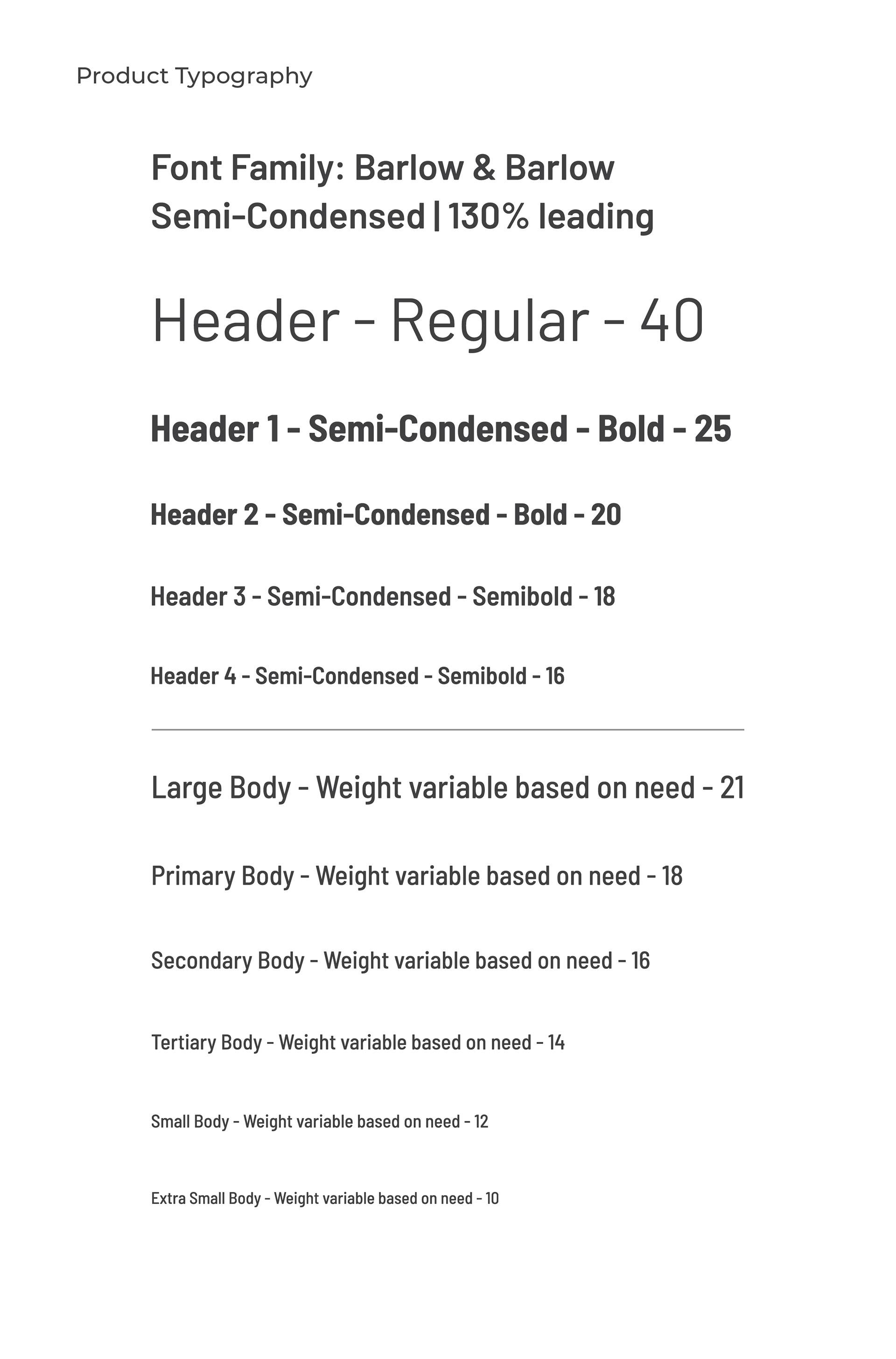
Typography & Iconography
Blog Redesign
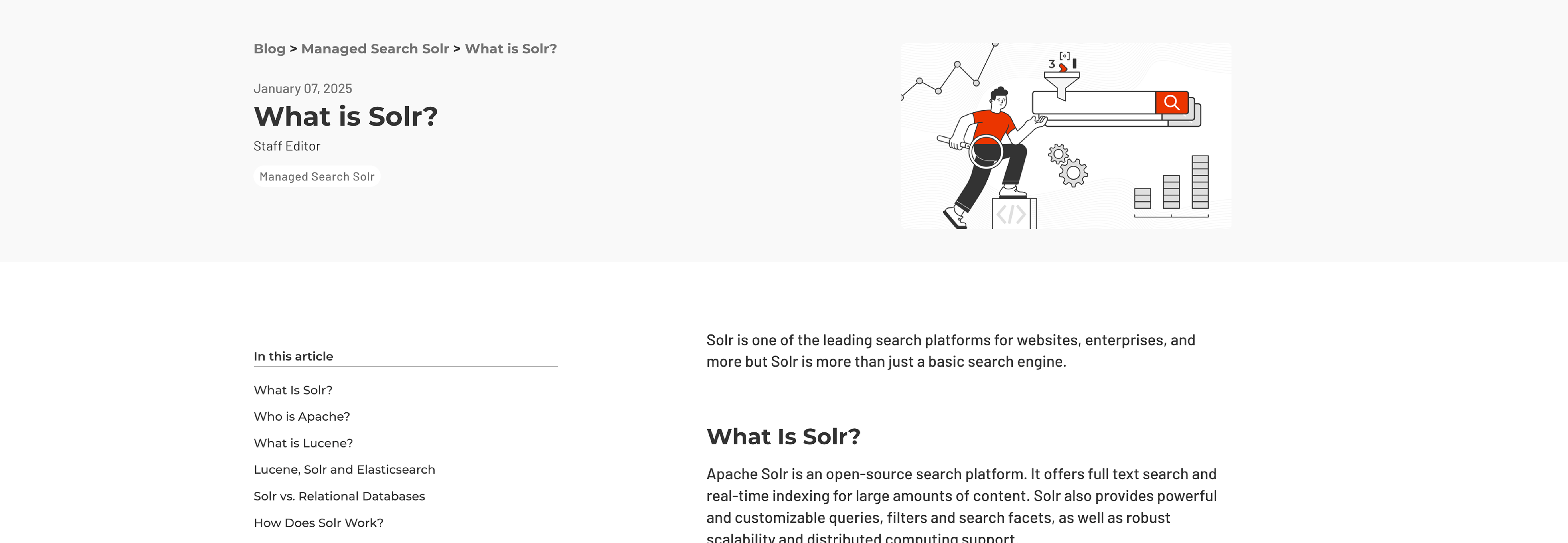
SearchStax's content library had grown significantly, but the experience made it difficult for readers to discover, consume and navigate content effectively. Guided by an SEO and content audit, I redesigned the ecosystem to improve discoverability, readability and navigation.
SearchStax's content library had grown significantly, but the experience made it difficult for readers to discover, consume and navigate content effectively. Guided by an SEO and content audit, I redesigned the ecosystem to improve discoverability, readability and navigation.
discoverability
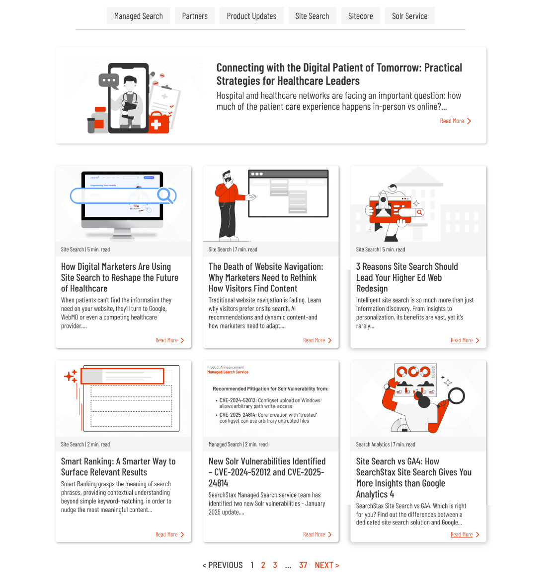
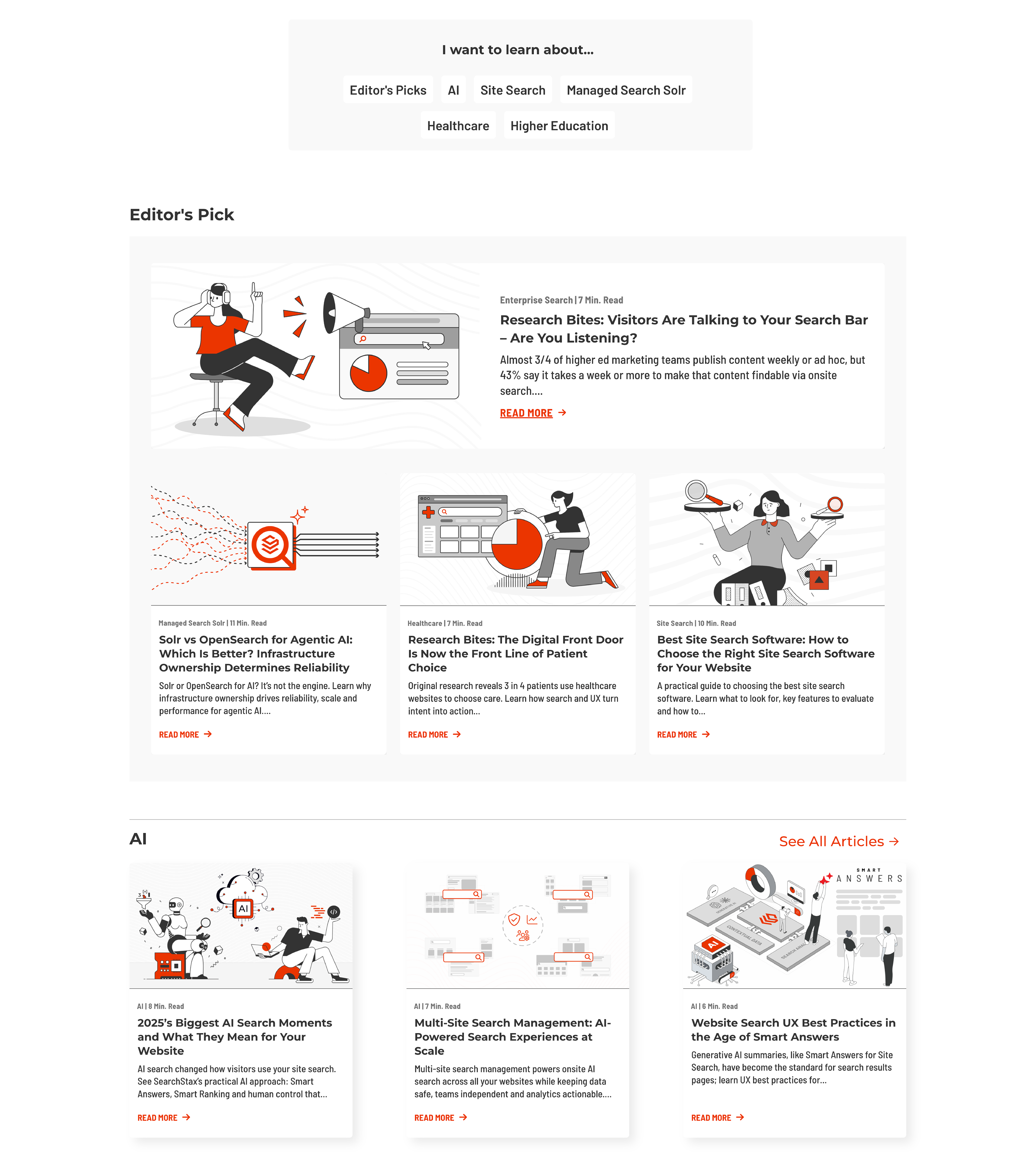
To improve content discovery, I redesigned the collection page around editorial curation and topic-based exploration. Strategic content was surfaced independently of publish date, while topic-based organization made it easier for readers to discover relevant articles and navigate deeper into the content library.
To improve content discovery, I redesigned the collection page around editorial curation and topic-based exploration. Strategic content was surfaced independently of publish date, while topic-based organization made it easier for readers to discover relevant articles and navigate deeper into the content library.
Before
After
exploration
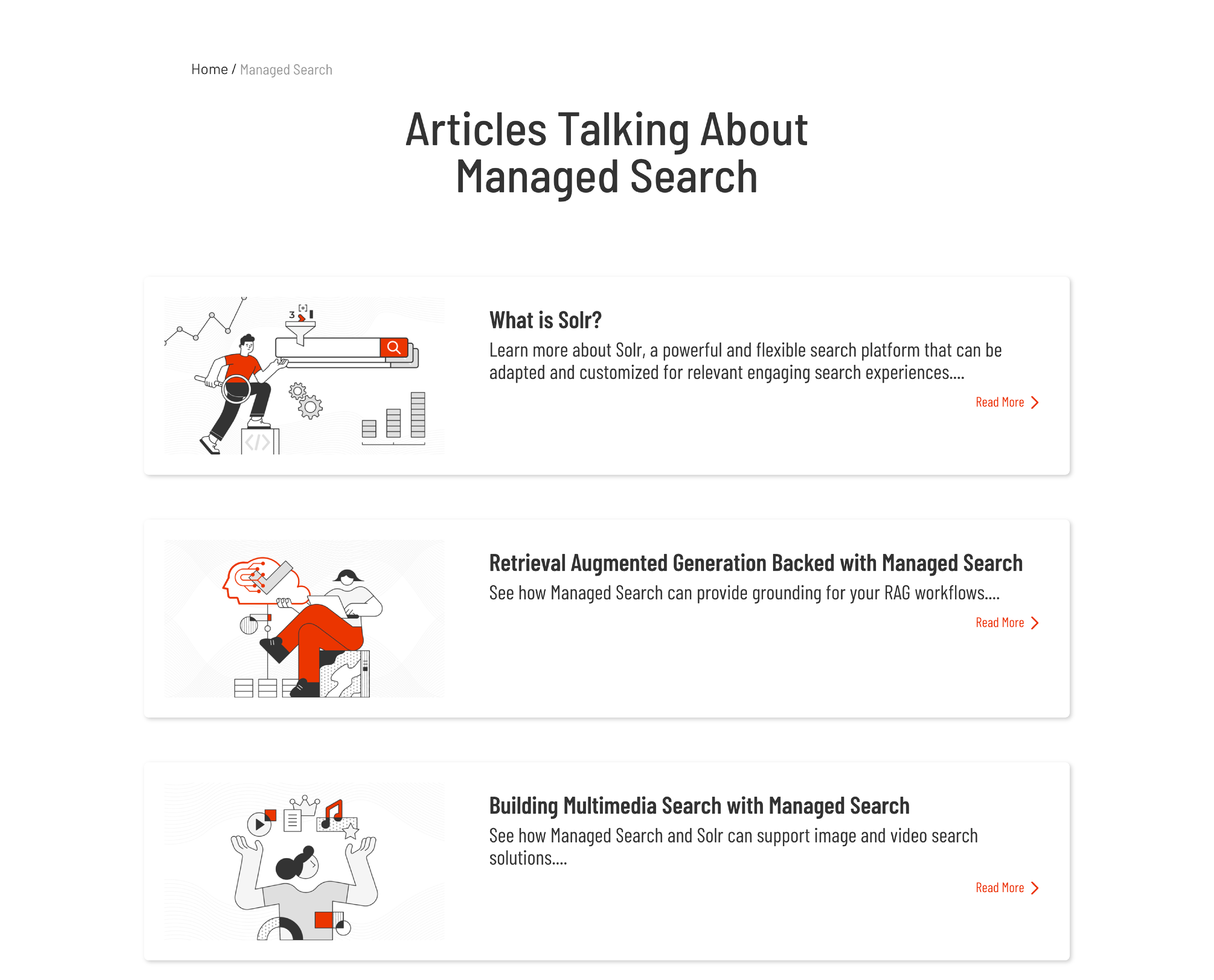
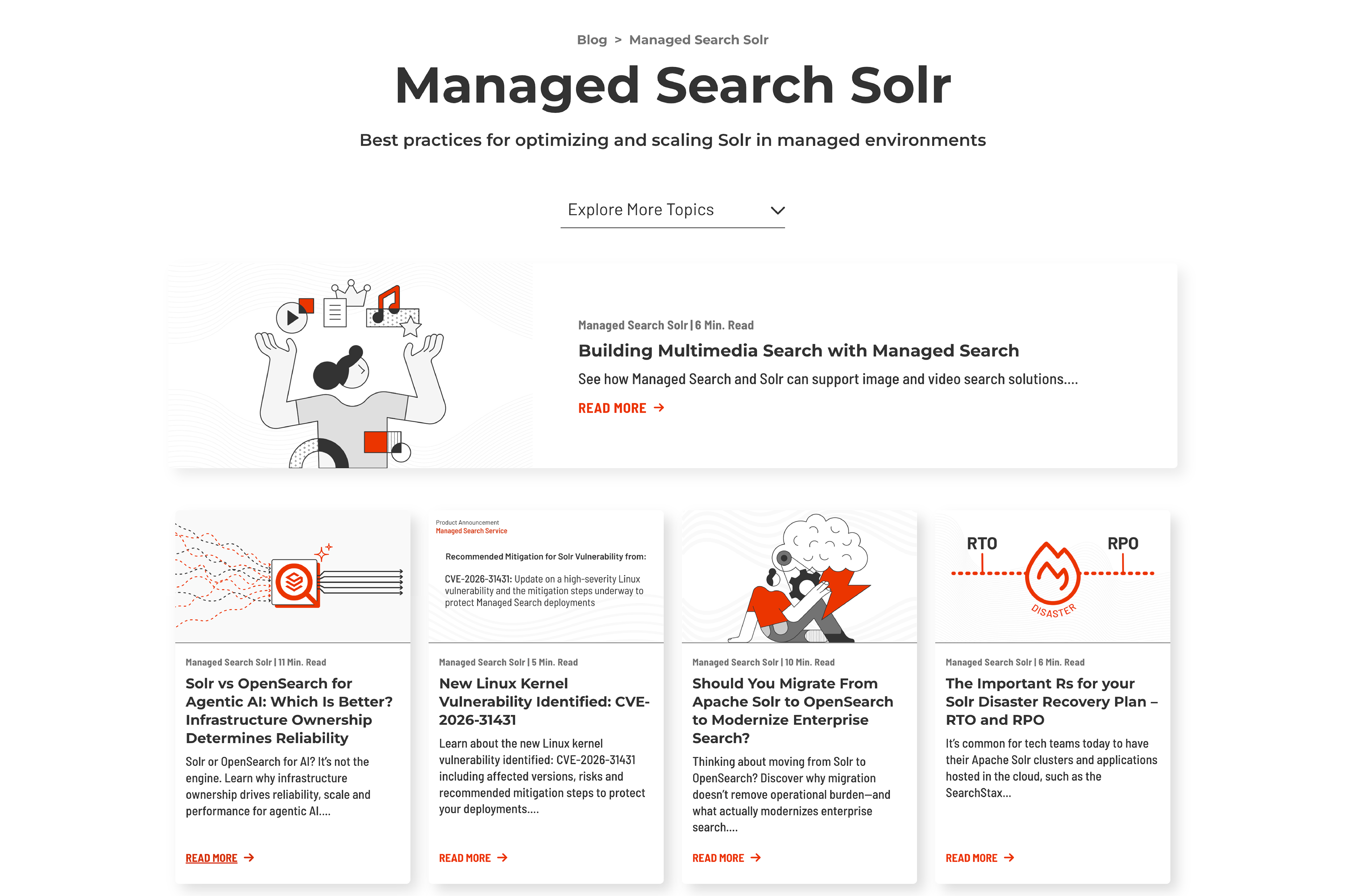
Topic pages were redesigned to support exploration rather than simply list articles. Richer context, featured content, and topic navigation transformed filtered archives into editorial destinations, creating clearer pathways for readers to explore related topics and discover additional resources.
Topic pages were redesigned to support exploration rather than simply list articles. Richer context, featured content, and topic navigation transformed filtered archives into editorial destinations, creating clearer pathways for readers to explore related topics and discover additional resources.
Before
After
readability
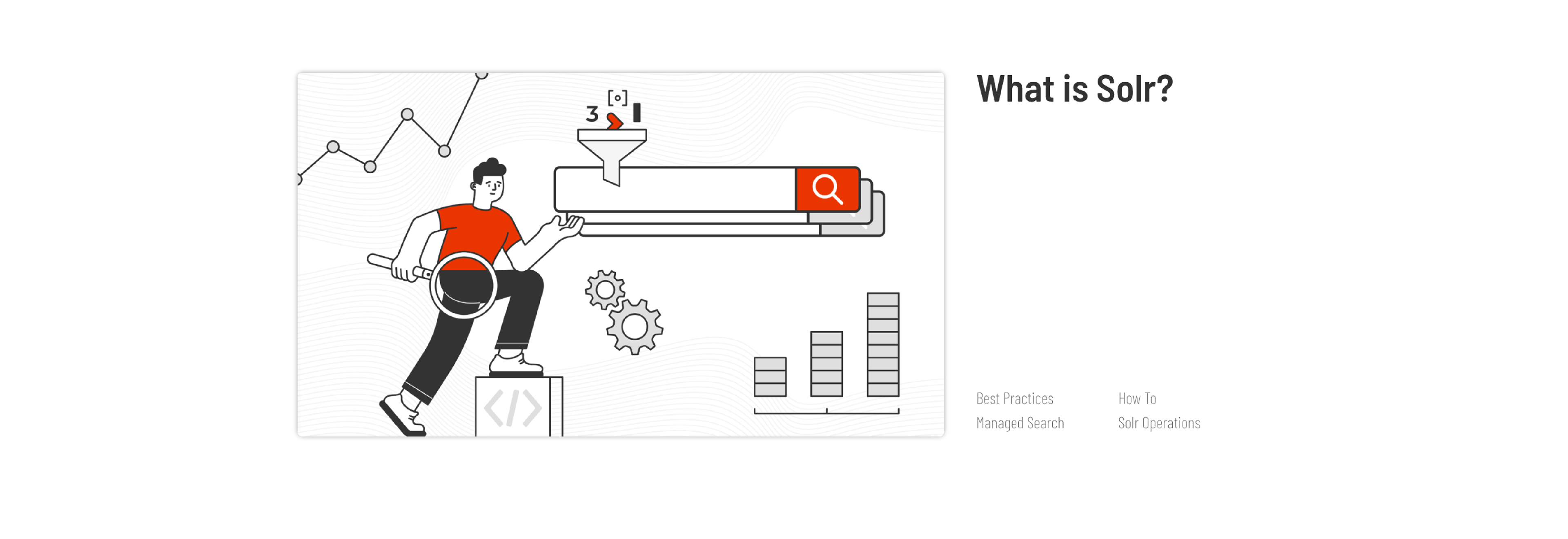
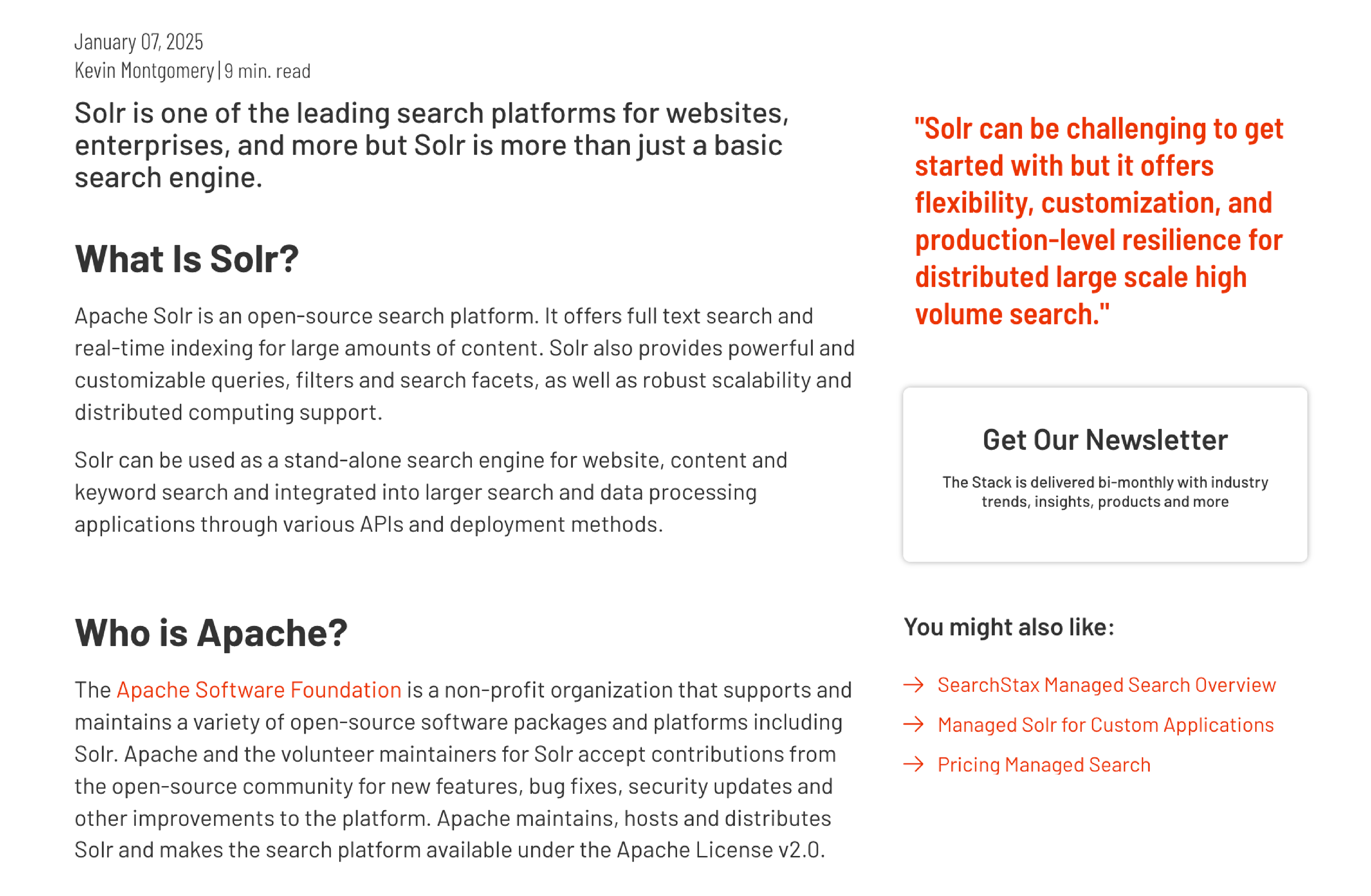
To improve long-form content consumption, I redesigned article pages to create clearer hierarchy, improve readability, and provide supporting content that encouraged deeper engagement.
To improve long-form content consumption, I redesigned article pages to create clearer hierarchy, improve readability, and provide supporting content that encouraged deeper engagement.
A Clearer Starting Point
Before
The page opened with competing elements, making it difficult to quickly orient readers. The introduction began below the fold, requiring users to scroll before reaching the content.
The page opened with competing elements, making it difficult to quickly orient readers. The introduction began below the fold, requiring users to scroll before reaching the content.
After
The article header was reorganized with stronger hierarchy, breadcrumbs, and structured metadata while reducing the height of the hero. Bringing the opening content above the fold helped readers orient themselves quickly and begin reading immediately.
The article header was reorganized with stronger hierarchy, breadcrumbs, and structured metadata while reducing the height of the hero. Bringing the opening content above the fold helped readers orient themselves quickly and begin reading immediately.
Reduced Distractions
Before
The opening of the article competed with multiple promotional elements including a pull quote, newsletter signup, and related links, interrupting the reading flow before readers had engaged with the content.
The opening of the article competed with multiple promotional elements including a pull quote, newsletter signup, and related links, interrupting the reading flow before readers had engaged with the content.
After
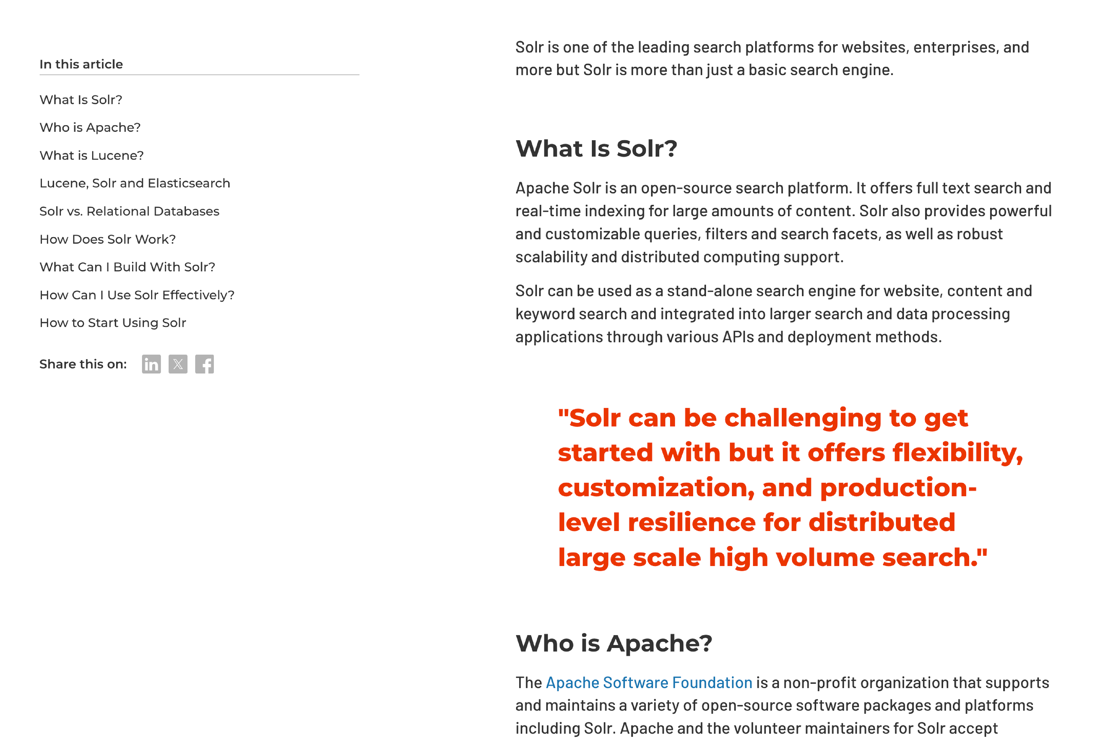
Supporting content was reorganized around the reading experience. Promotional elements were moved further into the article, while a sticky table of contents with anchor links provided contextual navigation without competing with the primary content.
Supporting content was reorganized around the reading experience. Promotional elements were moved further into the article, while a sticky table of contents with anchor links provided contextual navigation without competing with the primary content.
Improved Readability
Before
Typography lacked balance and consistency, creating a dense reading experience that made long-form articles feel visually overwhelming and difficult to comfortably consume.
Typography lacked balance and consistency, creating a dense reading experience that made long-form articles feel visually overwhelming and difficult to comfortably consume.
After
Typography was refined to create a more comfortable reading experience. A balanced type scale, improved spacing, stronger body copy, and more restrained link styling established a clearer visual rhythm and made long-form content easier to consume.
Typography was refined to create a more comfortable reading experience. A balanced type scale, improved spacing, stronger body copy, and more restrained link styling established a clearer visual rhythm and made long-form content easier to consume.
CONTENT ECOSYSTEM
To reduce dead ends and encourage deeper engagement, I introduced pathways that help readers seamlessly discover related articles and learn more from trusted subject-matter experts.
To reduce dead ends and encourage deeper engagement, I introduced pathways that help readers seamlessly discover related articles and learn more from trusted subject-matter experts.
Further Content Discovery
Before
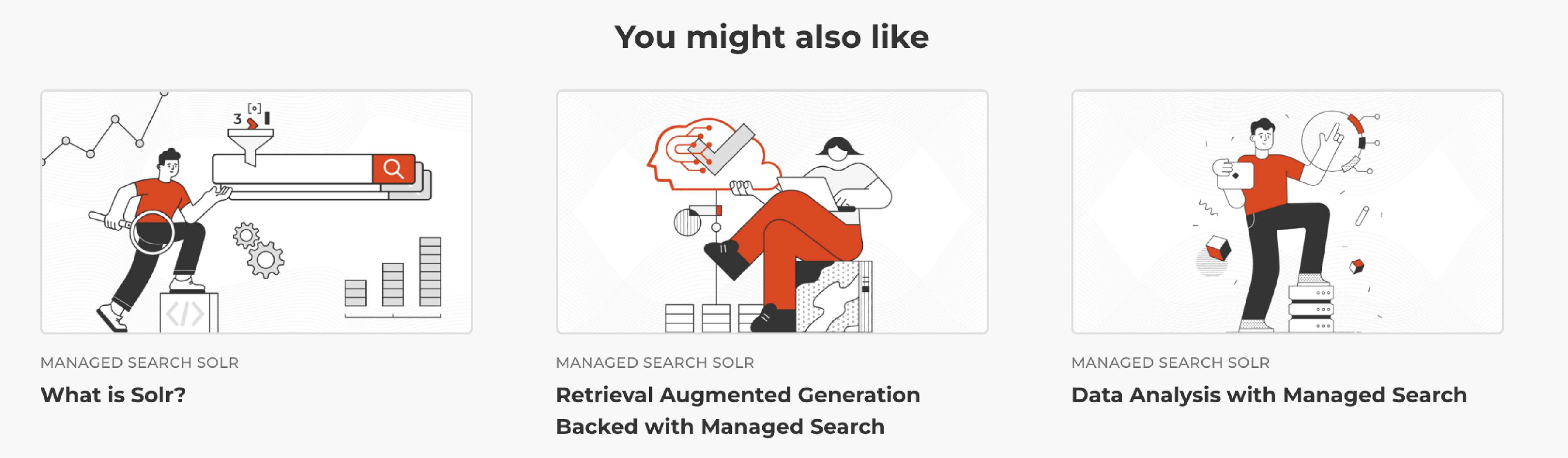
After
Expert Author Profiles
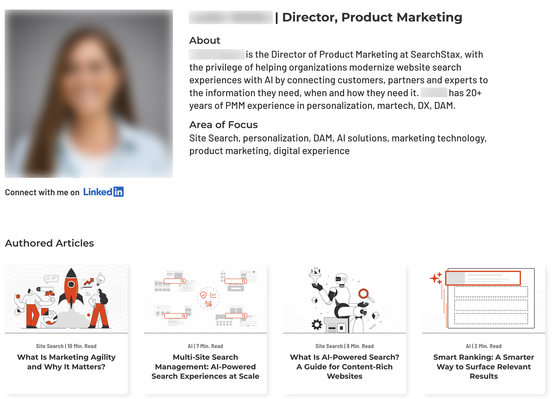
Author profiles give readers greater confidence in the content by introducing the person behind it. Professional biographies, areas of expertise, and a direct LinkedIn connection provide additional context, while authored articles encourage continued exploration.
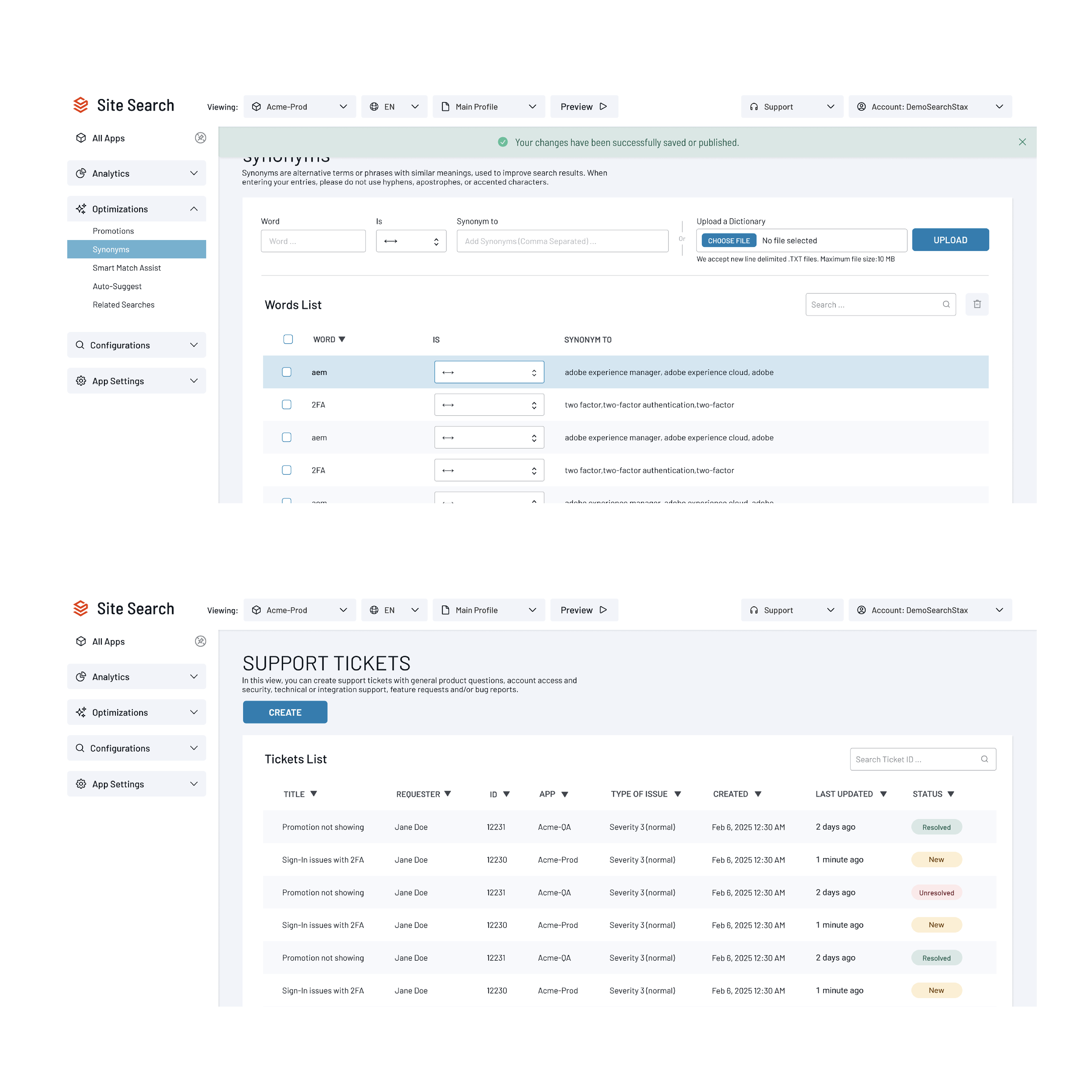
Website Design System
I developed a scalable website design system that standardized UI patterns across the SearchStax website, accelerating new page creation and reducing QA cycles. I collaborated closely with developers from prototype through implementation to ensure responsive, high-quality experiences.
I developed a scalable website design system that standardized UI patterns across the SearchStax website, accelerating new page creation and reducing QA cycles. I collaborated closely with developers from prototype through implementation to ensure responsive, high-quality experiences.
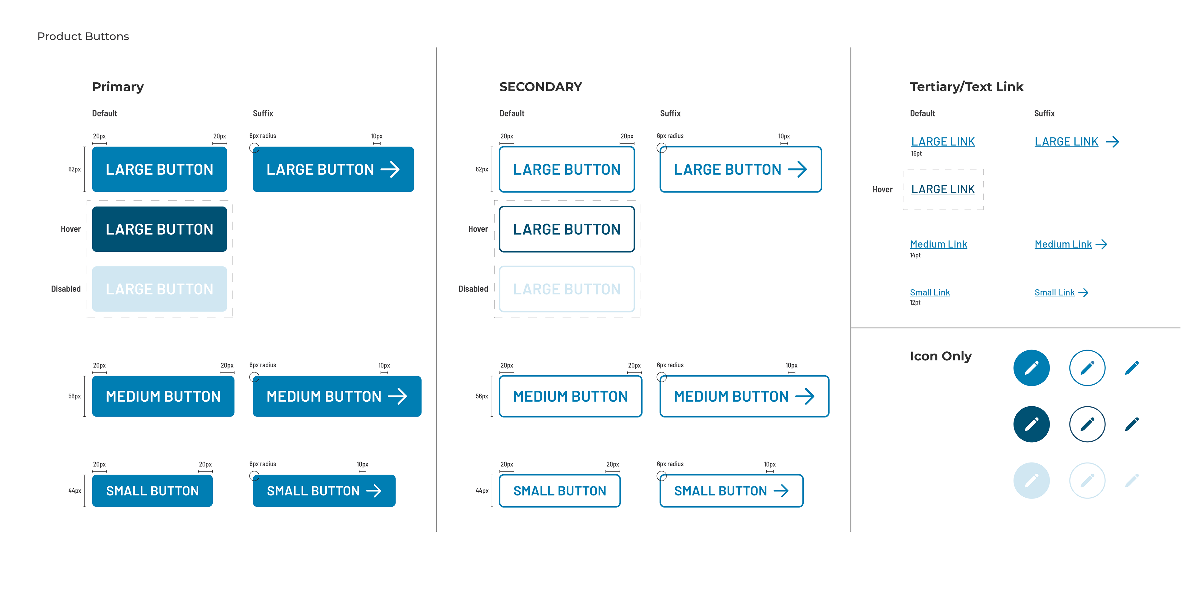
Foundation
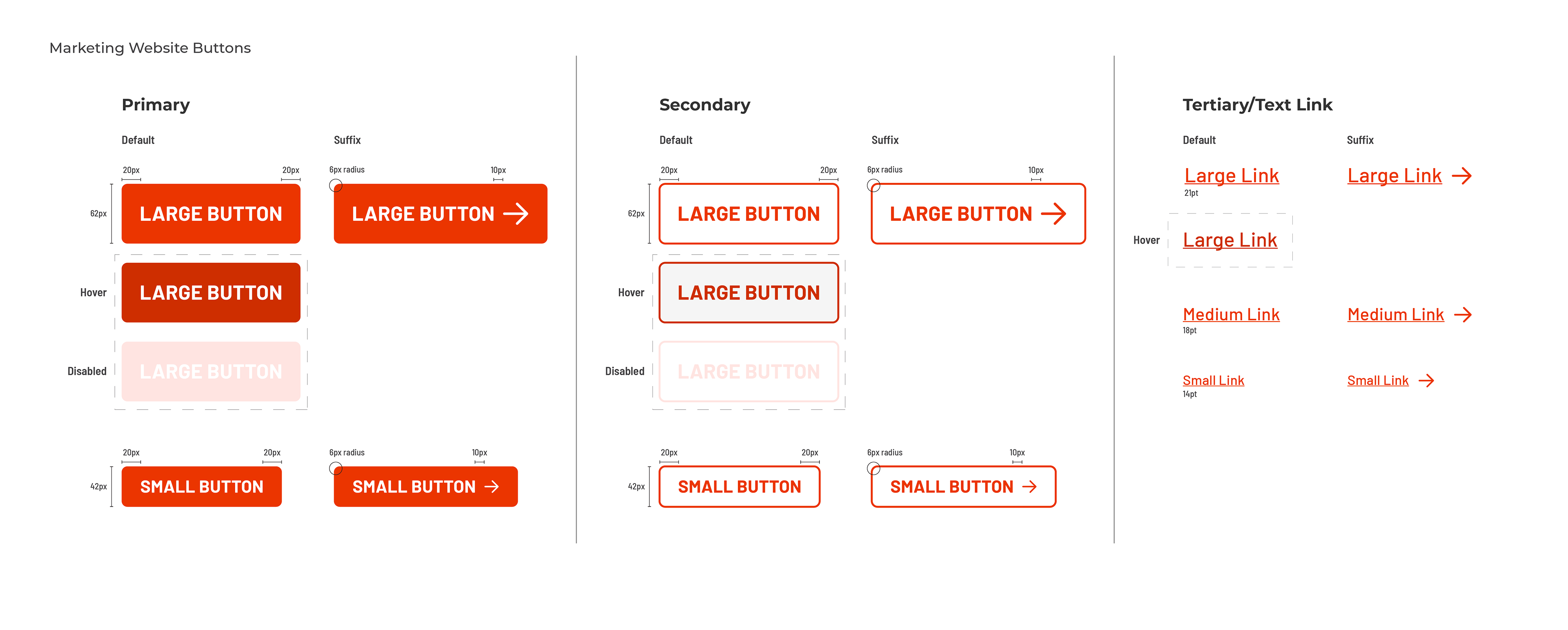
Applied Across the Website
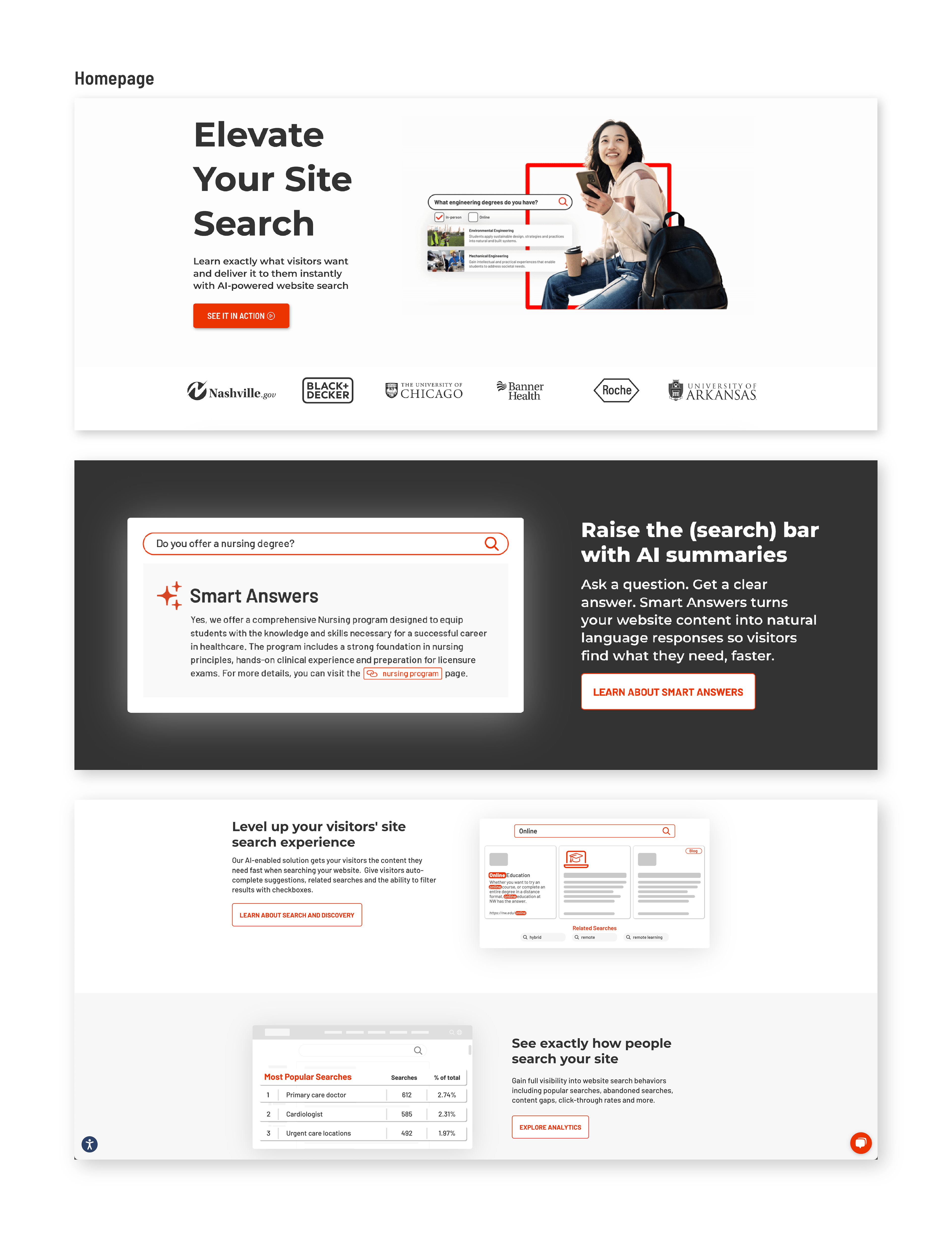
Product UI Support
Working alongside the Director of Product Design & UX, I created the foundational UI system for the SearchStax product. The reusable styles and components established a consistent visual language that supported future product designs.
Working alongside the Director of Product Design & UX, I created the foundational UI system for the SearchStax product. The reusable styles and components established a consistent visual language that supported future product designs.
Foundation
Applied Across the Product
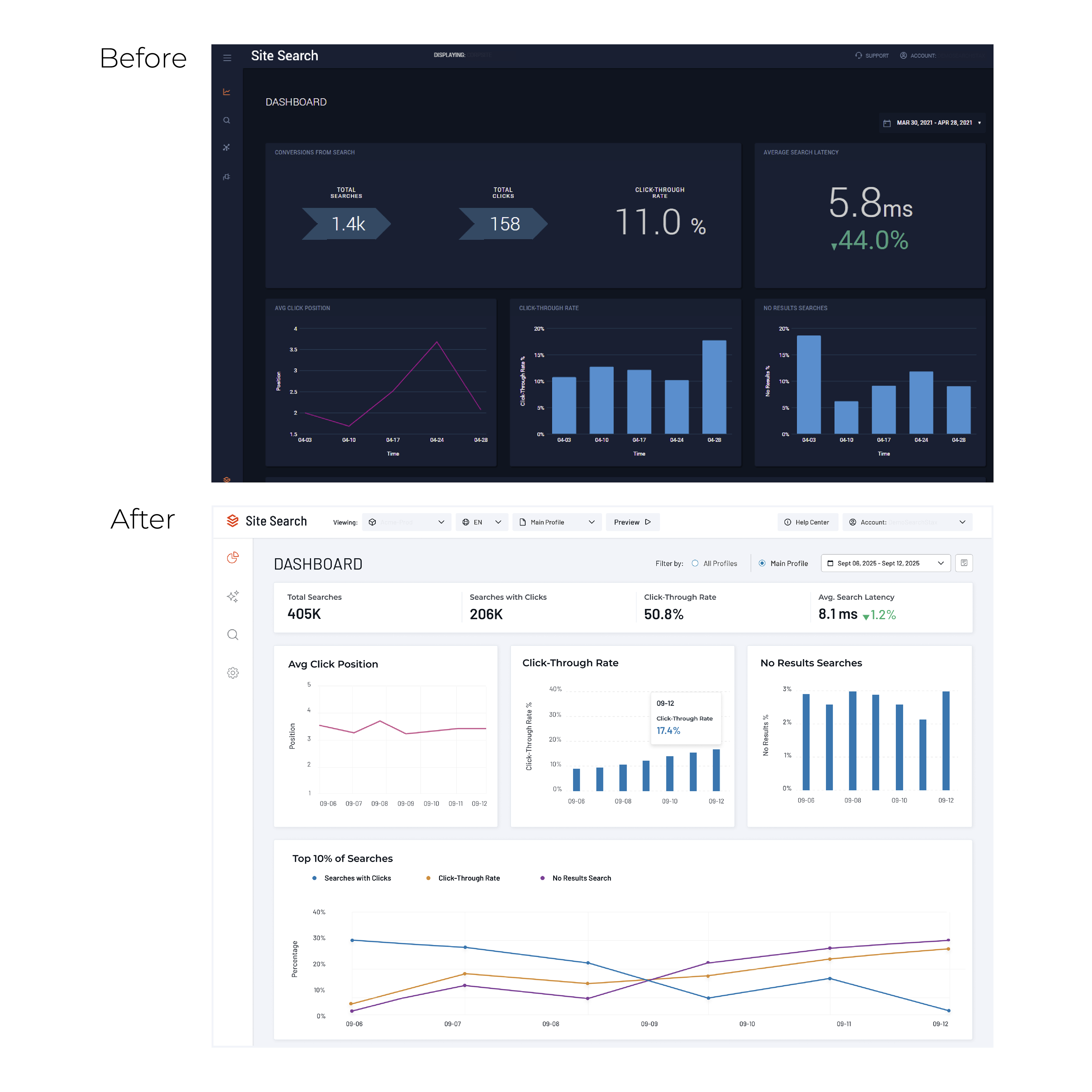
Dashboard before and after
Sample screens
Campaigns and Performance
Smart Answers Linkedin Campaign
Using marketing-provided messaging, I designed a LinkedIn carousel ad that guided users from a common search challenge to the value of SearchStax Smart Answers through a story-driven sequence.
Using marketing-provided messaging, I designed a LinkedIn carousel ad that guided users from a common search challenge to the value of SearchStax Smart Answers through a story-driven sequence.


Performance after one week:
160 total engagements
30.4% click-through rate
(5x higher than any other post on the same topic)
40.9% engagement rate
160 total engagements
30.4% click-through rate
(5x higher than any other post on the same topic)
40.9% engagement rate
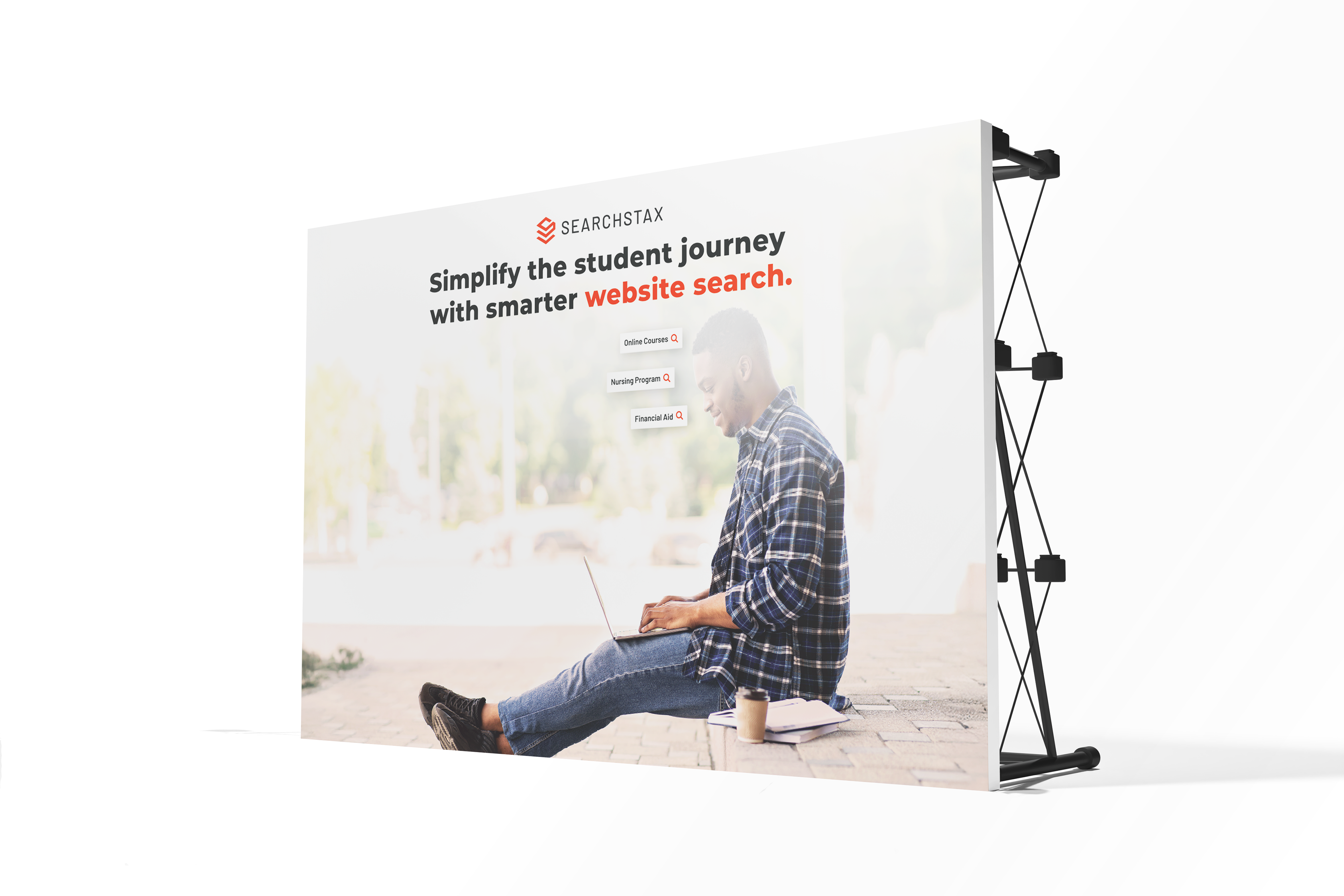
Higher Education Campaign
To support opportunity-stage conversations, this campaign delivers a sharp, benefit-led message: “Better search. Better enrollment.” The visual reinforces how an improved search experience directly supports enrollment goals by depicting a prospective student navigating a program page effortlessly, highlighting the ease, speed, and modern expectations of search today.
To support opportunity-stage conversations, this campaign delivers a sharp, benefit-led message: “Better search. Better enrollment.” The visual reinforces how an improved search experience directly supports enrollment goals by depicting a prospective student navigating a program page effortlessly, highlighting the ease, speed, and modern expectations of search today.

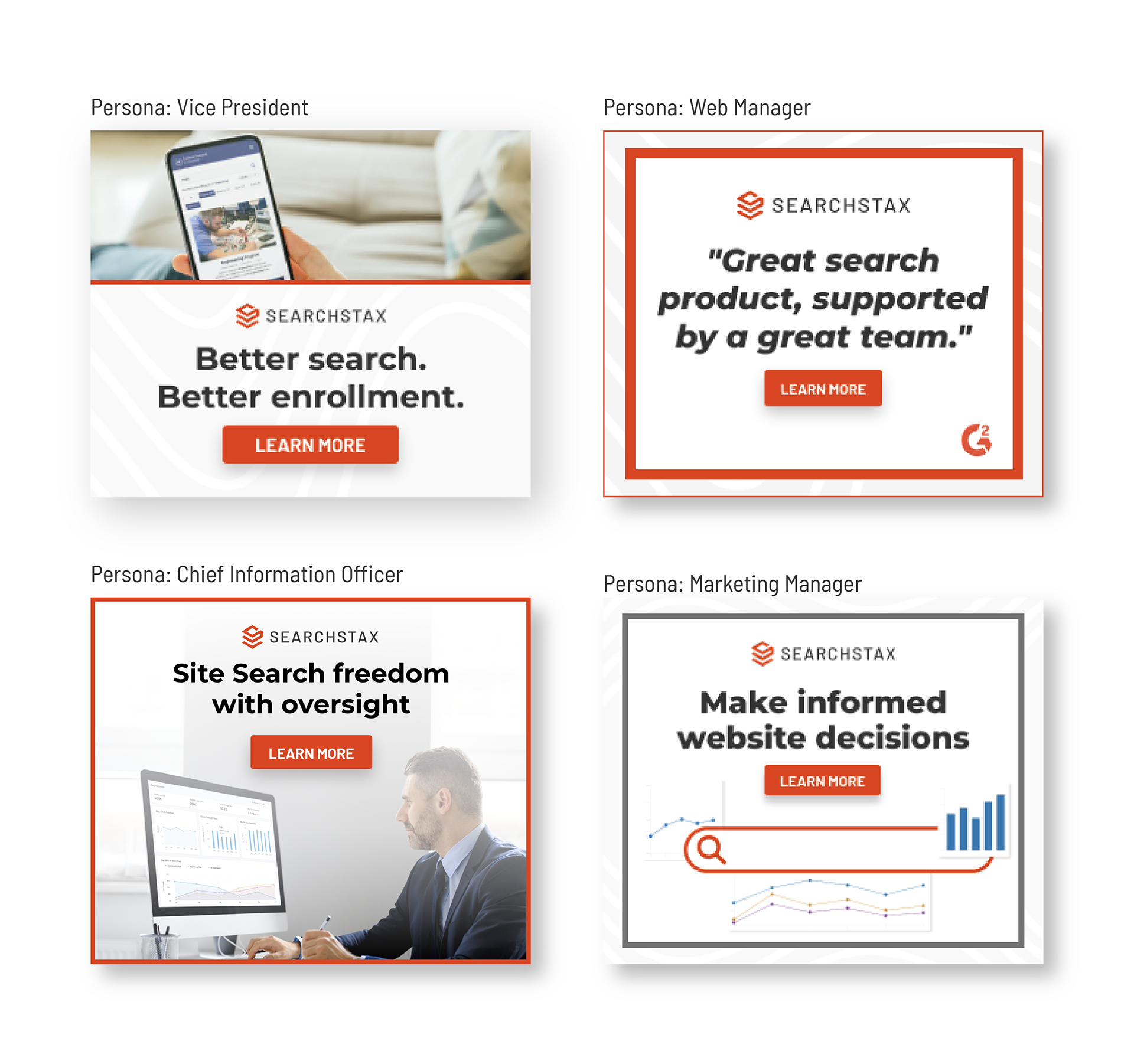
Contributed to $92K in pipeline generation through ABM creative tailored to four key personas
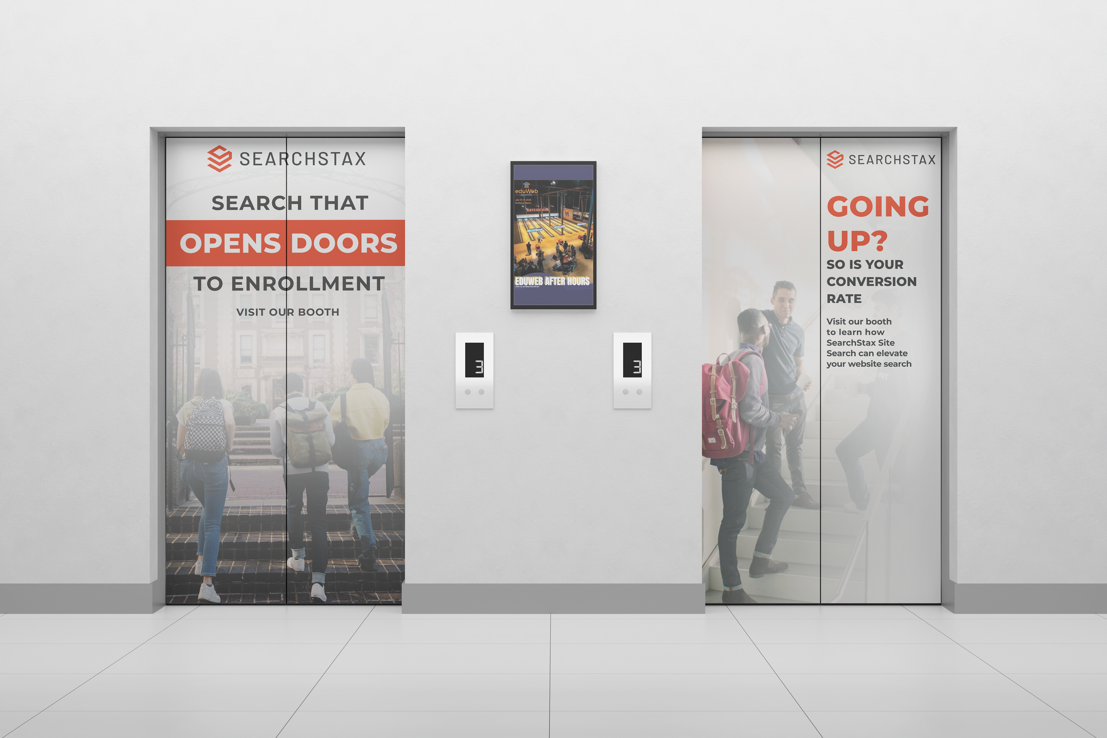
Trade Show Experience
Designed the visual identity for SearchStax's presence at the EduWeb Summit, creating a cohesive event experience across large-format graphics, promotional materials, and branded collateral. The work extended our brand into a physical environment while maintaining consistency across every attendee touchpoint.
Designed the visual identity for SearchStax's presence at the EduWeb Summit, creating a cohesive event experience across large-format graphics, promotional materials, and branded collateral. The work extended our brand into a physical environment while maintaining consistency across every attendee touchpoint.
Booth Design
Environmental Graphics
Supporting Assets

Stickers
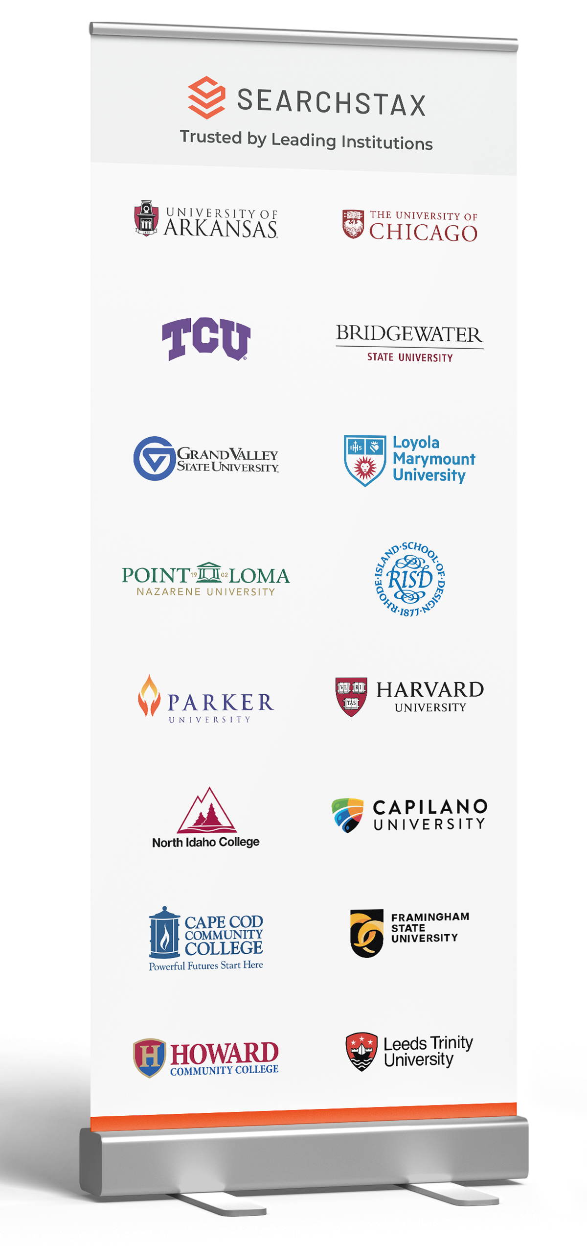
Customer Logo Banner
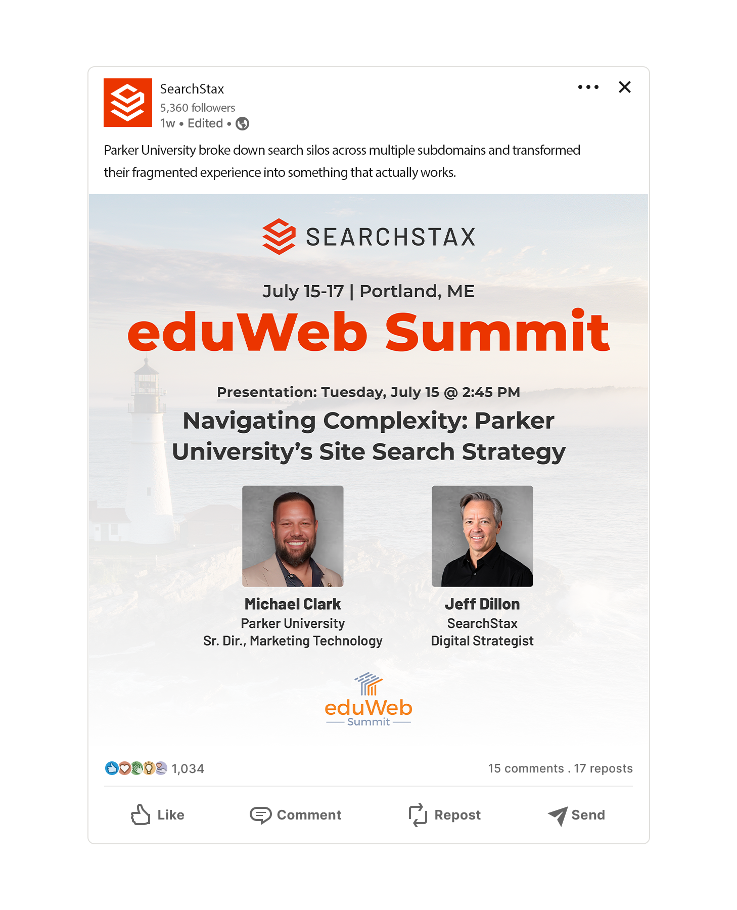
Linkedin Post
Creative Direction
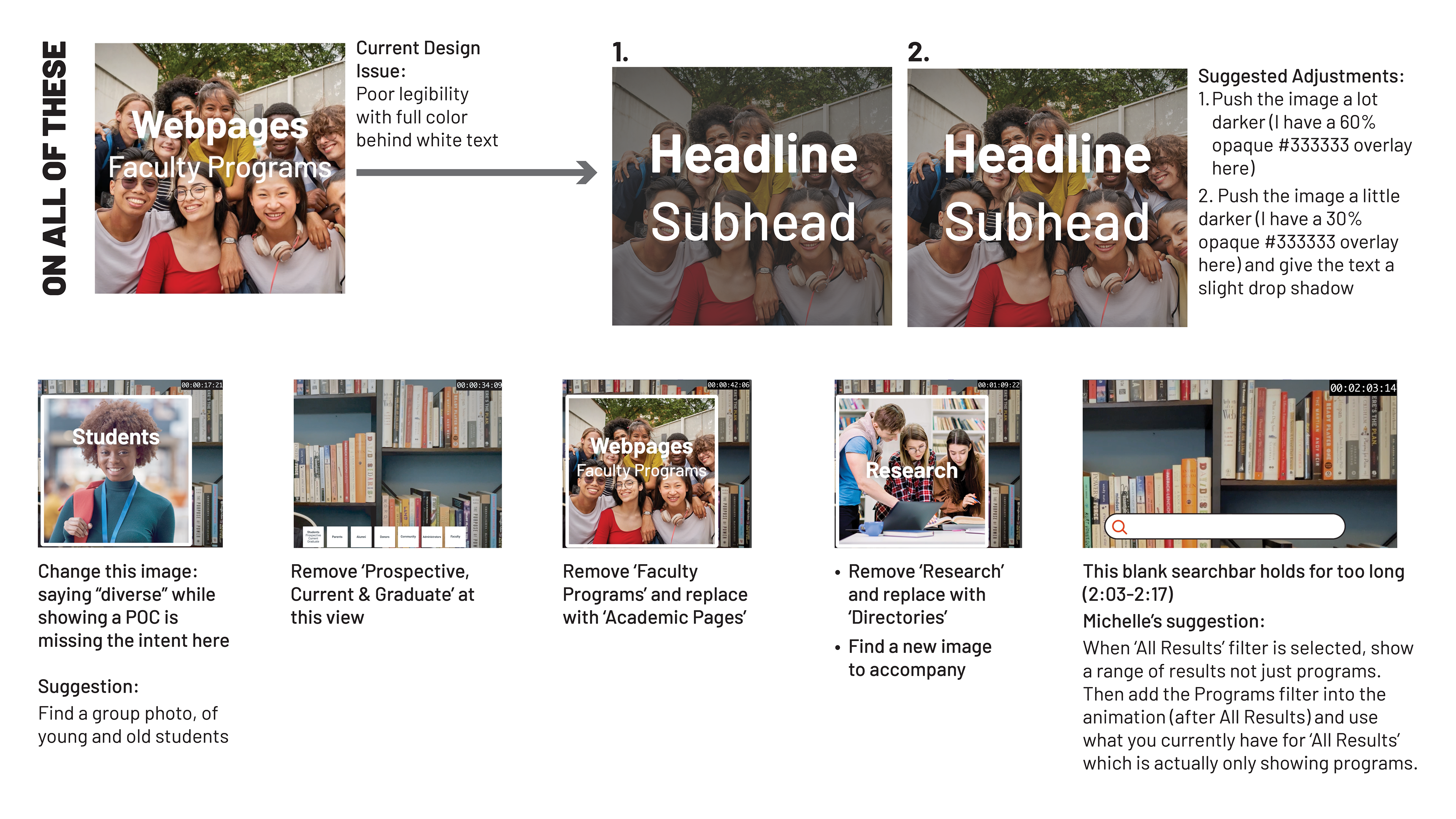
As the creative director for contracted video and motion work, I established a clear process for prioritizing projects, defining responsibilities, and guiding assets from concept to delivery. I lead visual direction and provide feedback at key stages. While stakeholders handle scripting and contractors handle production, I stay closely involved in storyboarding, reviews, and ensuring alignment with brand voice, goals, and timelines.
As the creative director for contracted video and motion work, I established a clear process for prioritizing projects, defining responsibilities, and guiding assets from concept to delivery. I lead visual direction and provide feedback at key stages. While stakeholders handle scripting and contractors handle production, I stay closely involved in storyboarding, reviews, and ensuring alignment with brand voice, goals, and timelines.
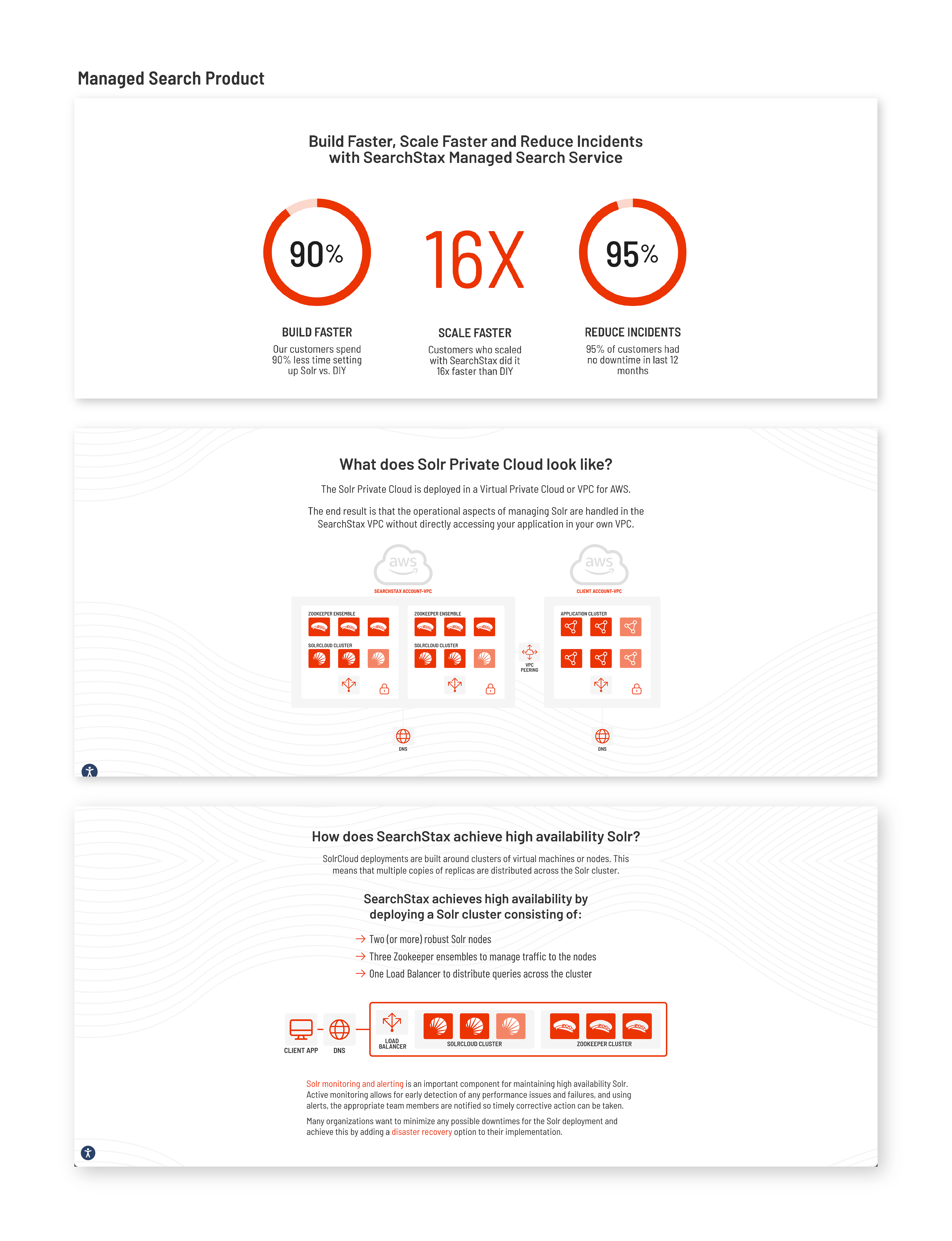
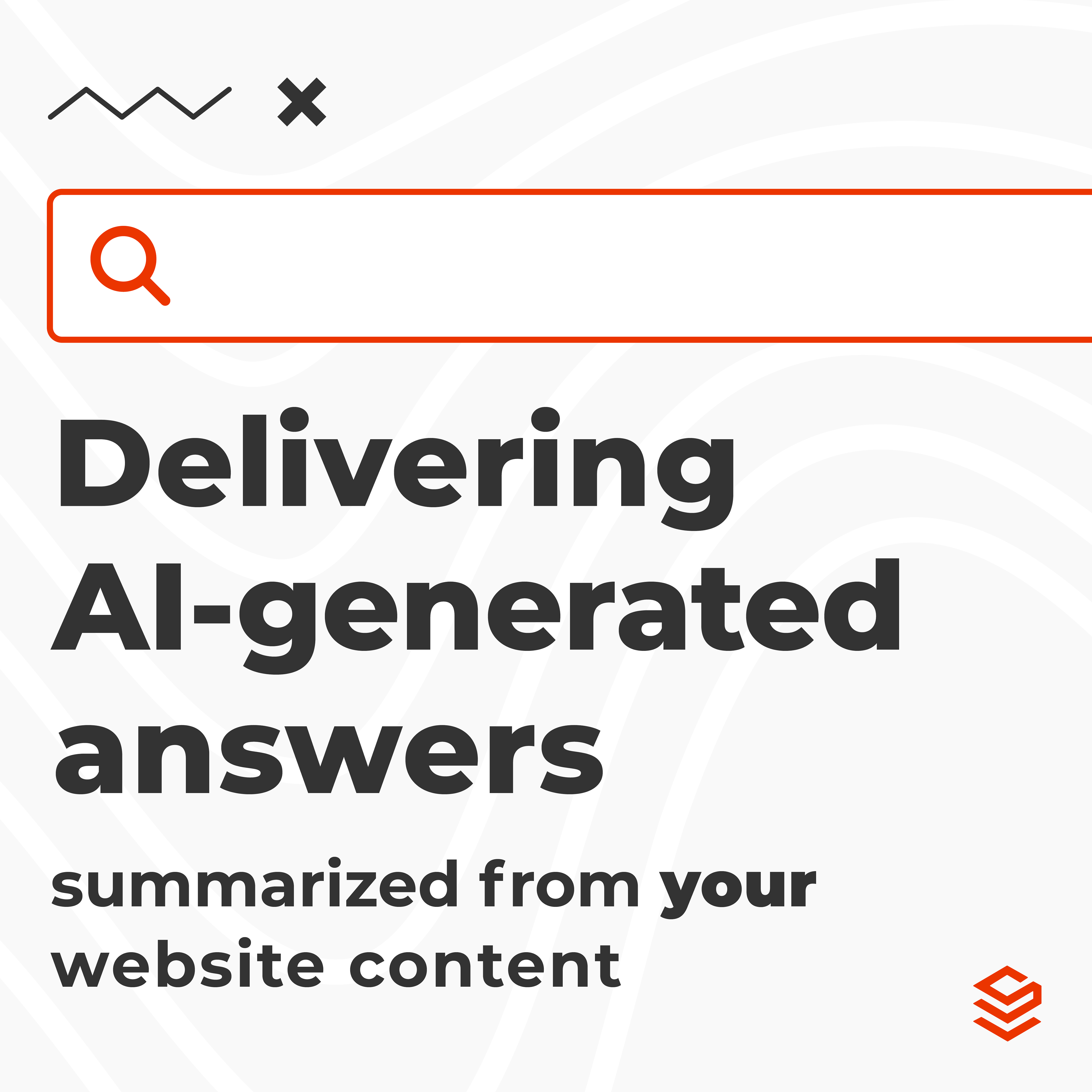
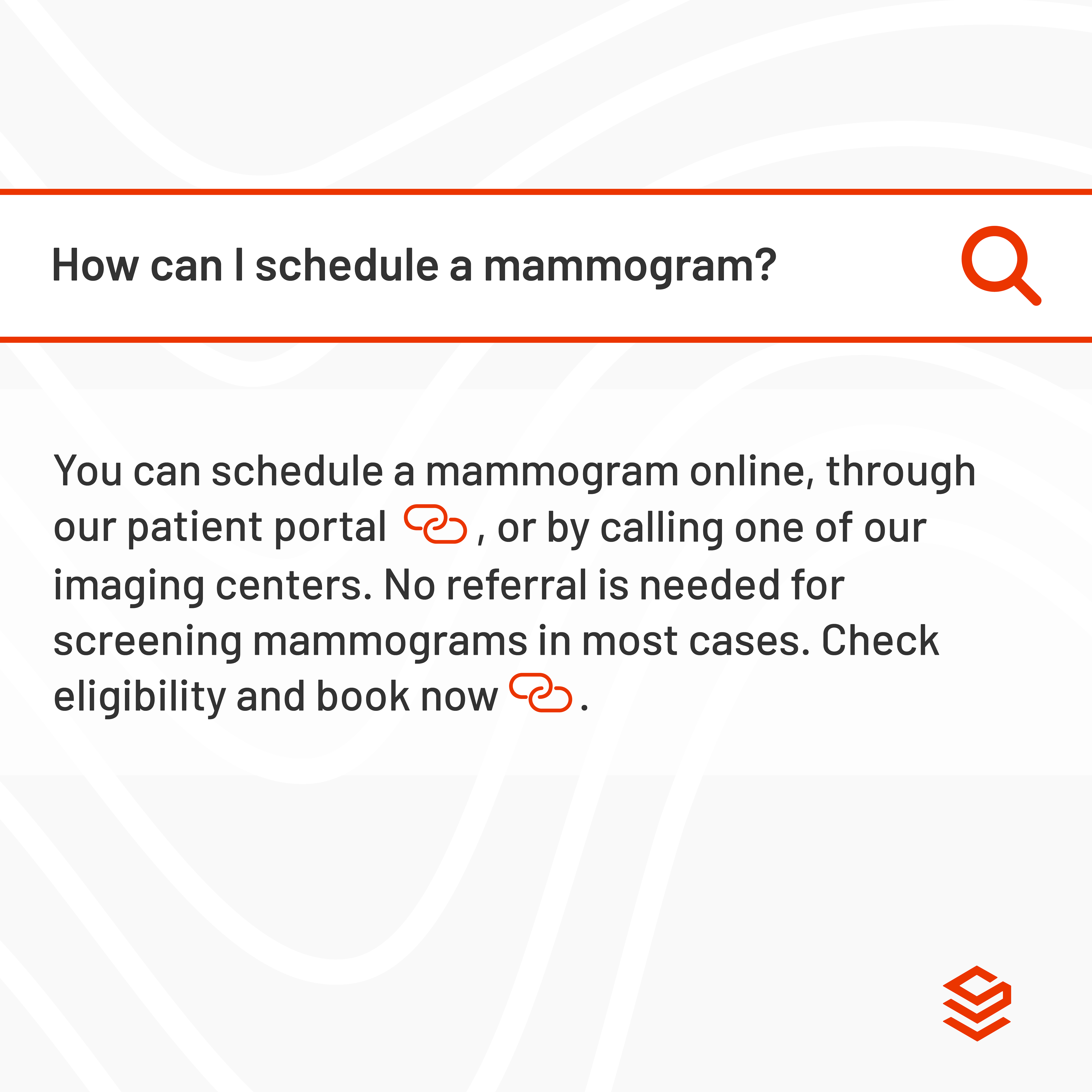
Managed Search Product Overview
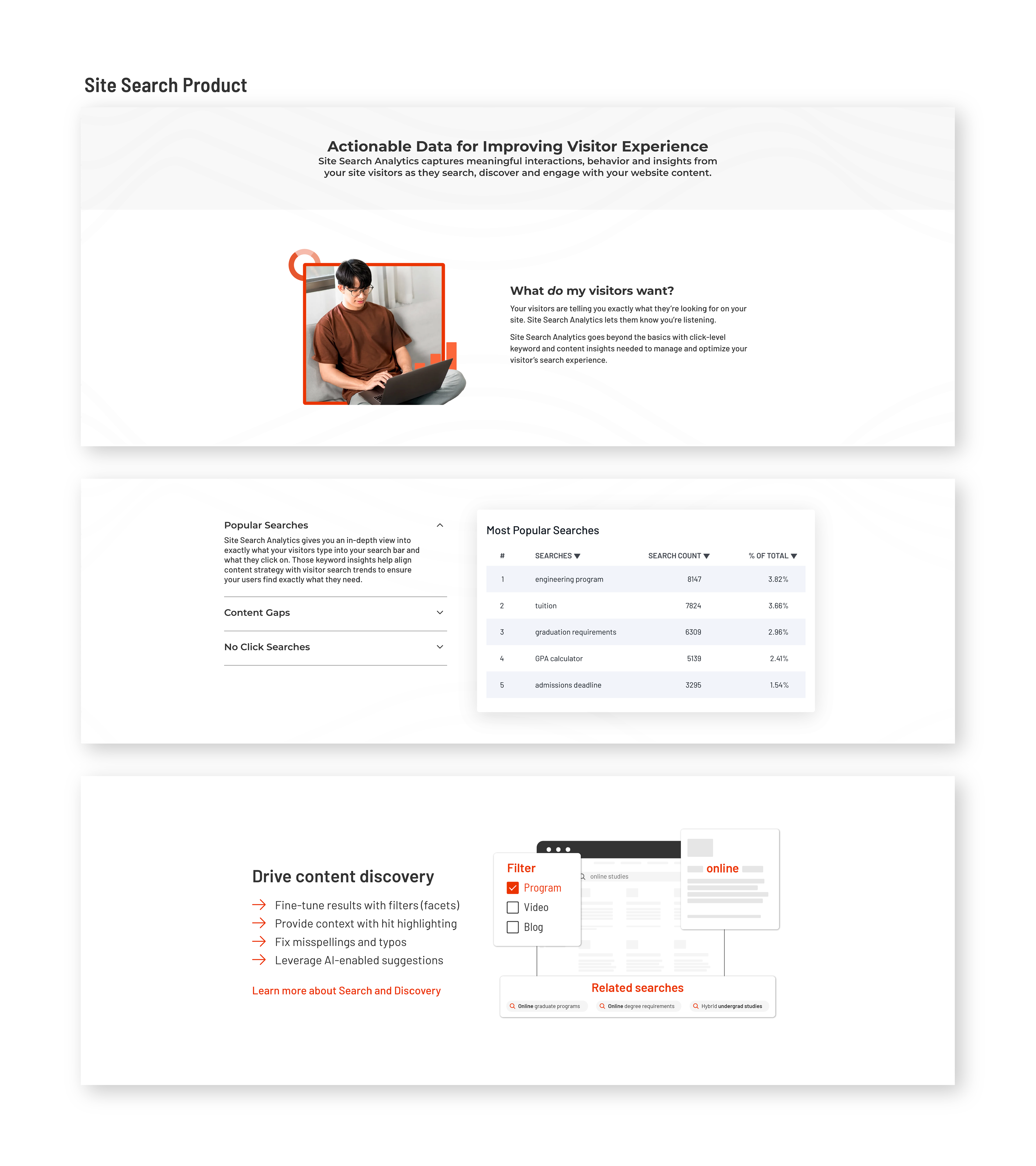
Site Search Product Overview