Brand Foundations


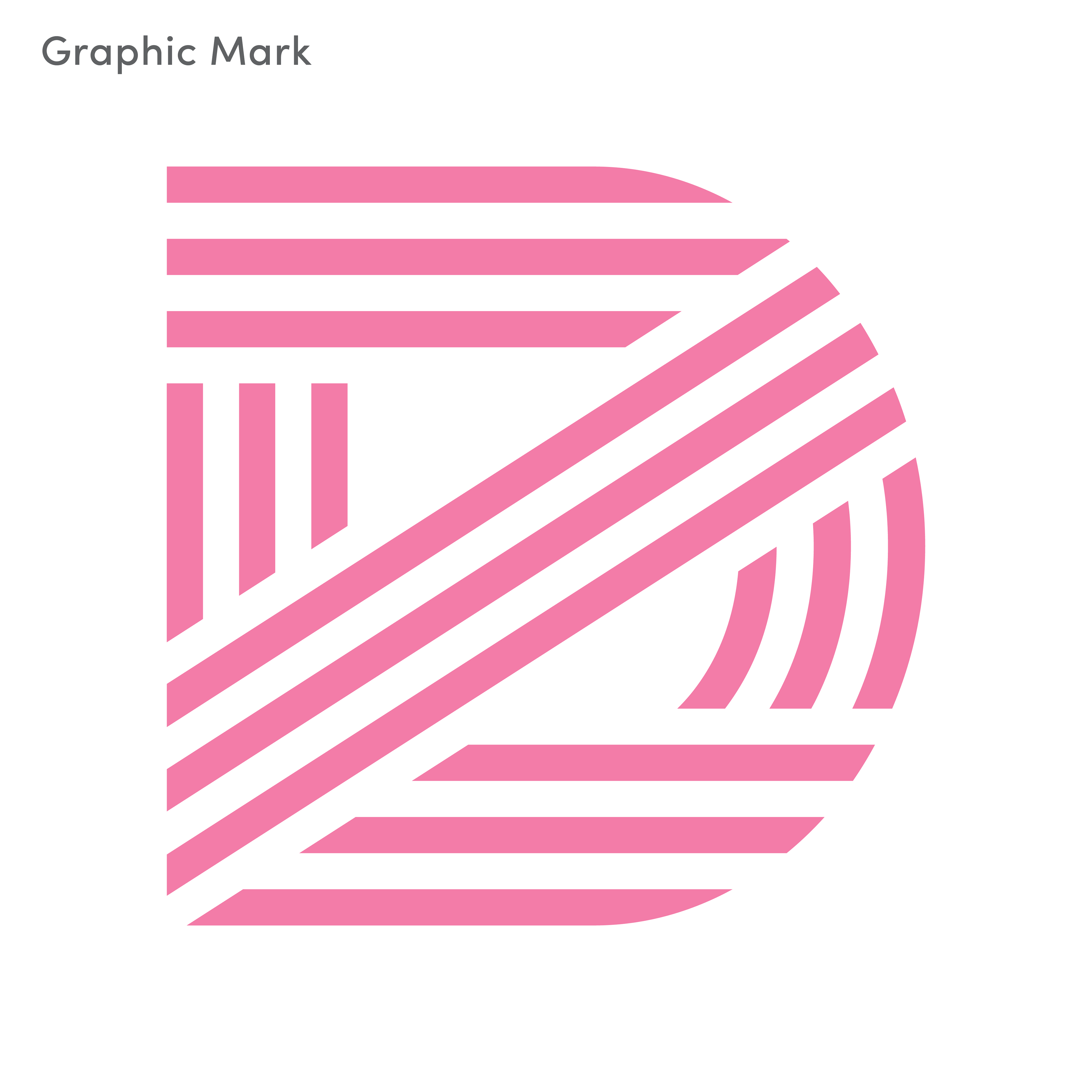
The logo and graphic mark use bold lines and modern shapes to create a strong, recognizable identity. The design reflects Dr. Zanovia’s mix of warmth, clarity, and professionalism.


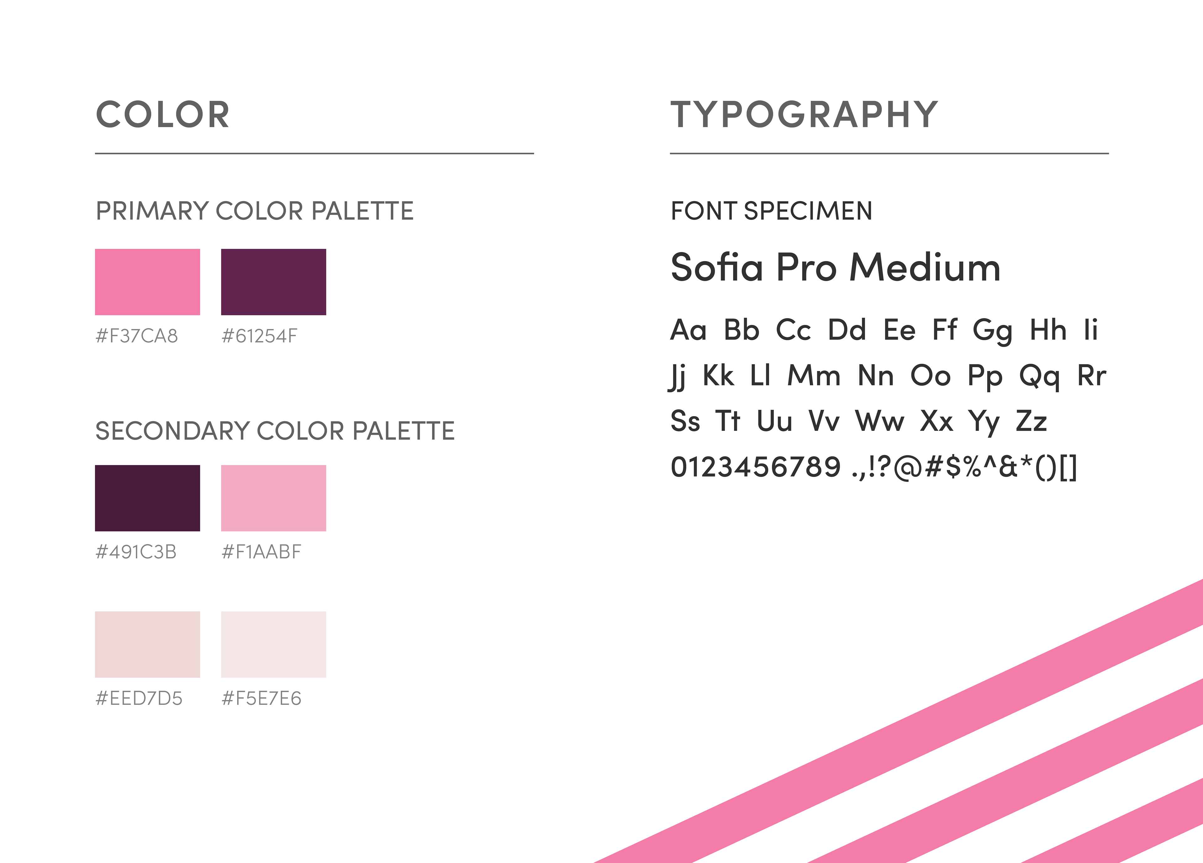
A bright, friendly palette pairs with a clean, approachable typeface to create a brand that feels confident and welcoming across print and digital.
Social Media Collateral
Podcast Cover


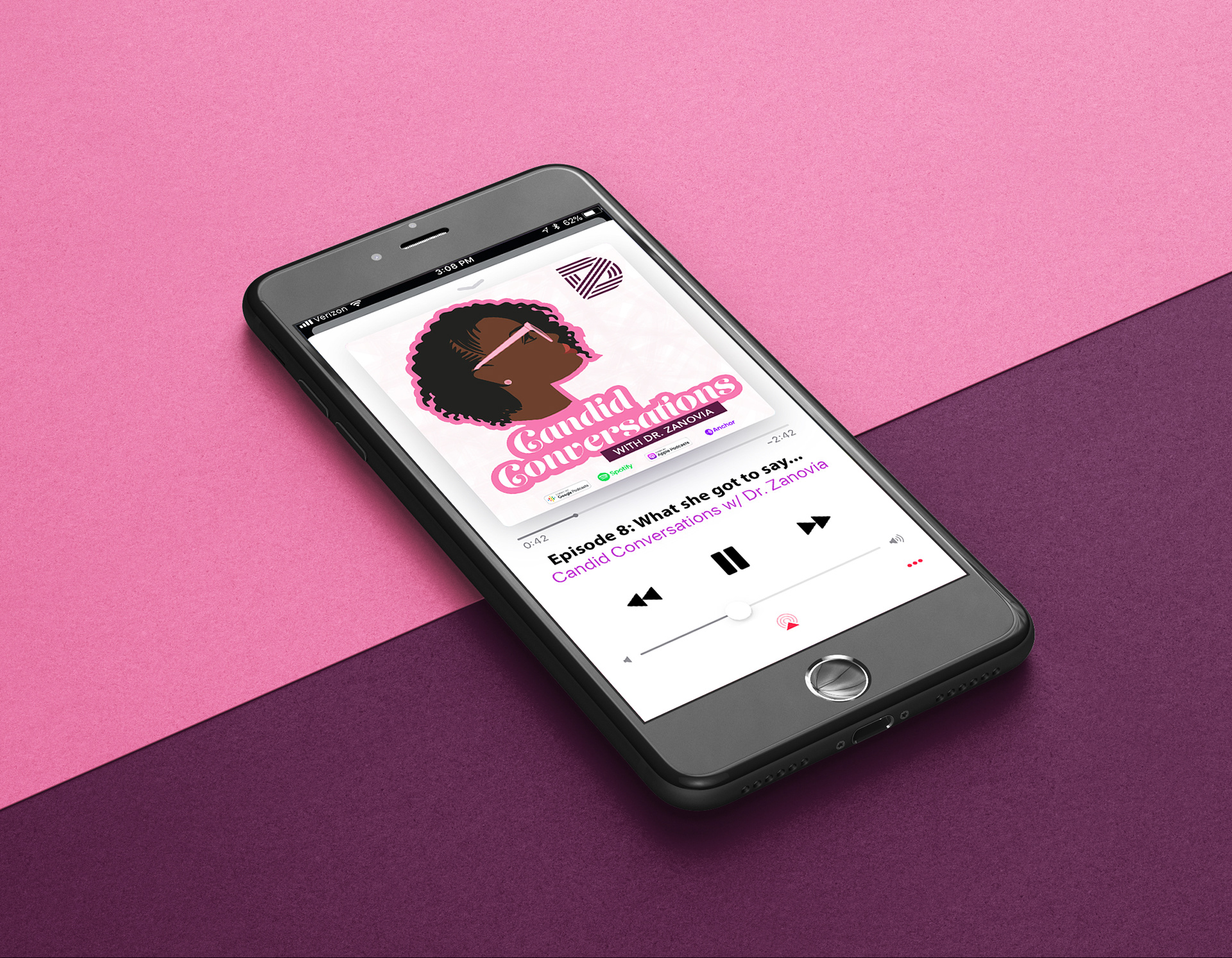
The podcast cover builds brand recognition through consistent colors and style, while the illustration brings a personal, human touch.
Instagram
Highlights Icons
Each icon was custom-illustrated to reflect key content areas—like mental health and self-care—using the brand’s colors and style. The goal was to make the profile feel organized, welcoming, and visually consistent.
Post backgrounds/templates


These layouts use a mix of solid color blocks and brand pattern overlays to keep posts visually engaging while reinforcing brand recognition. Designed for easy reuse, they help maintain a polished and cohesive feed.
This project was a chance to craft a brand identity that feels both personal and professional, one that could evolve with Dr. Zanovia’s growing platform and connect meaningfully with her community. It brought together strategy, aesthetics, and storytelling in a way that reflects how I approach brand design at any scale.