Finished Spreads
Handmade Type
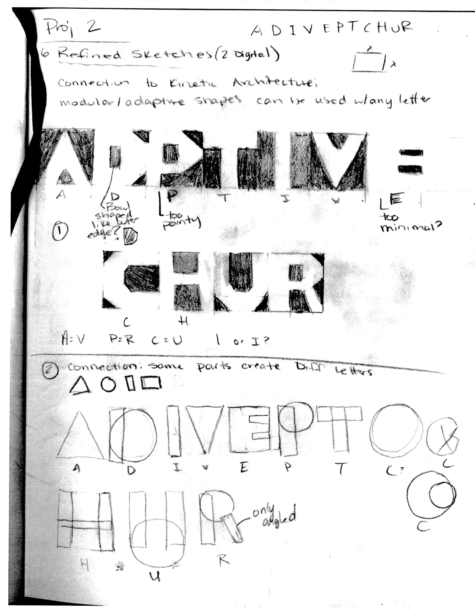
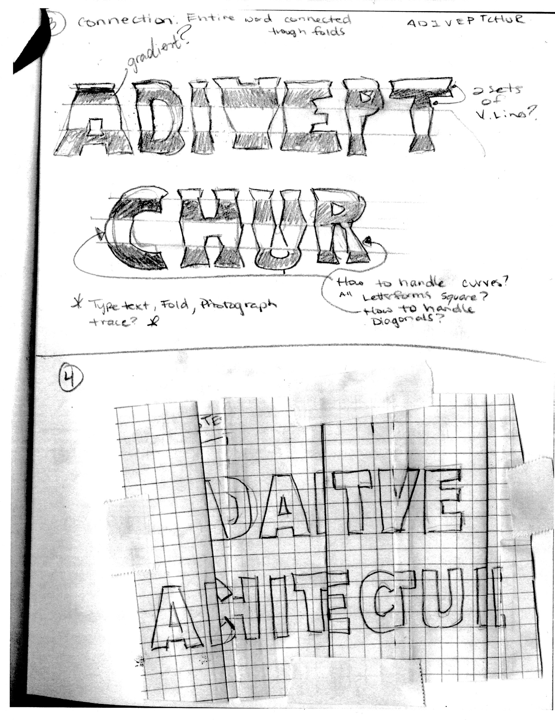
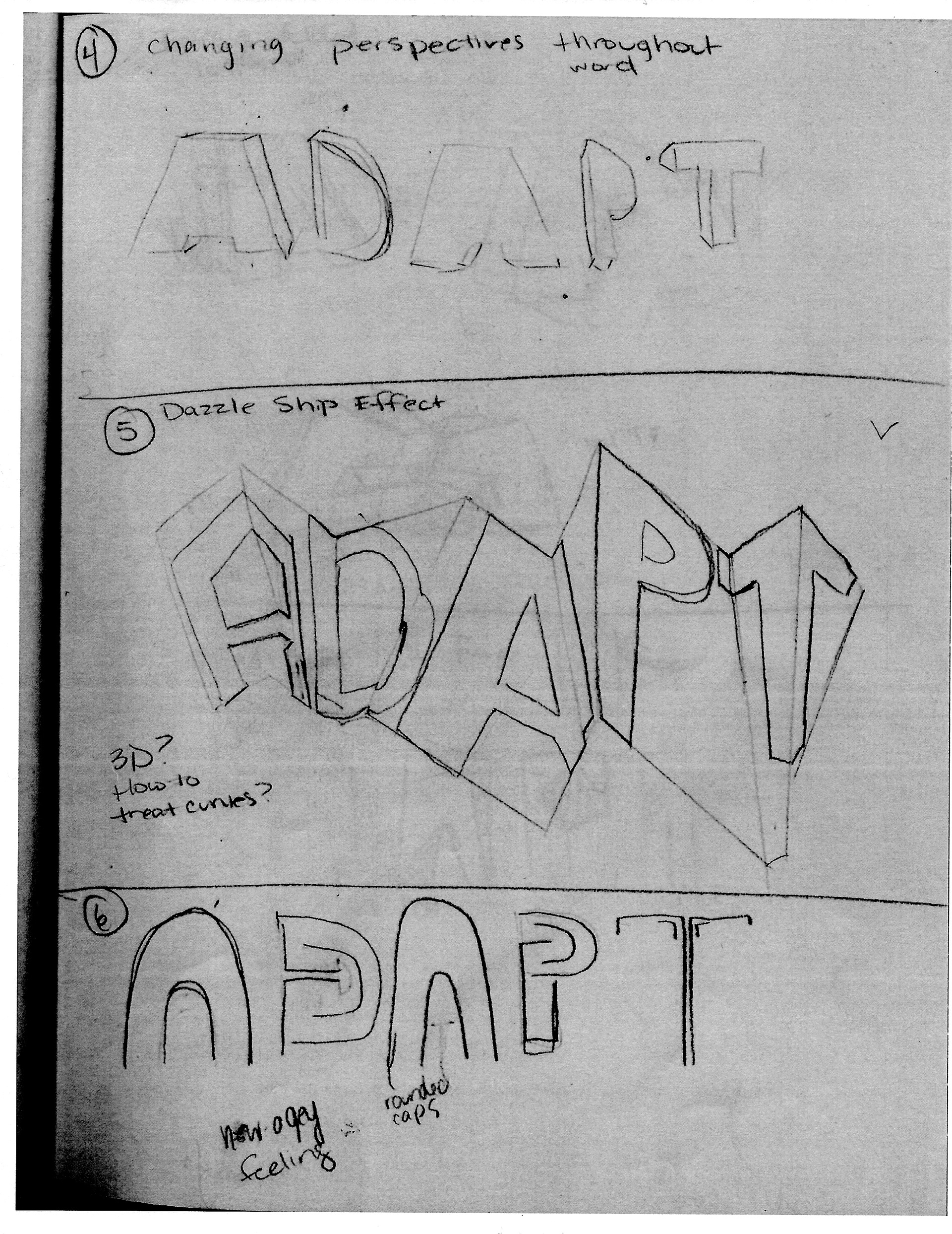
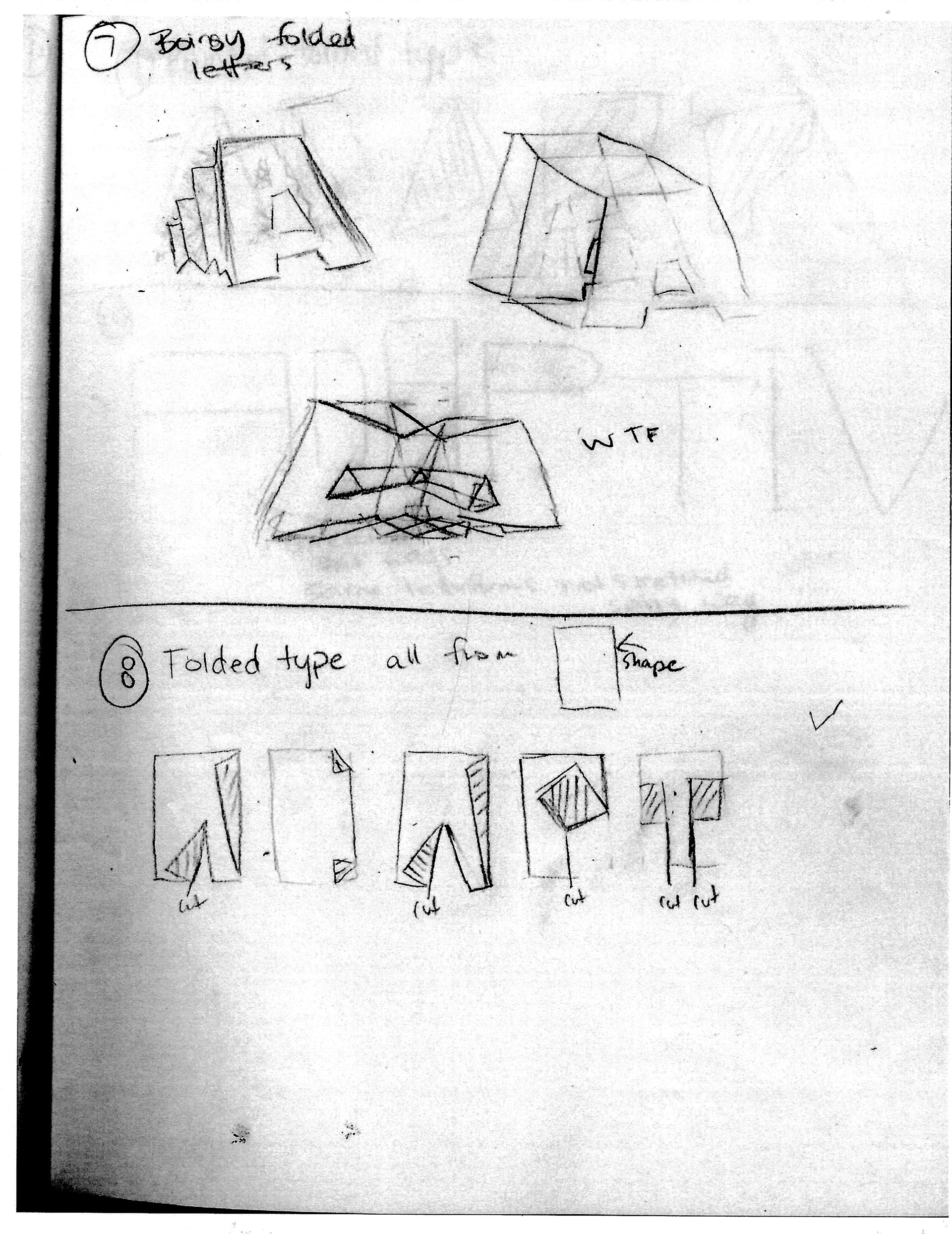
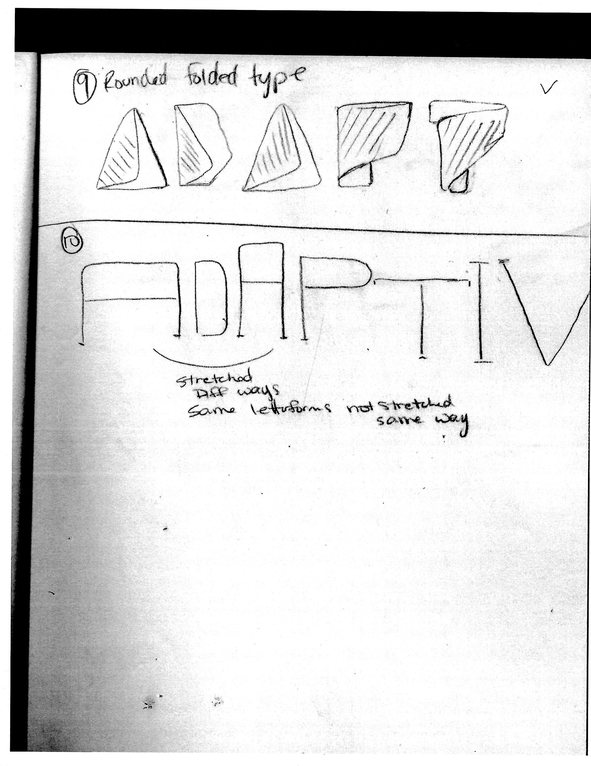
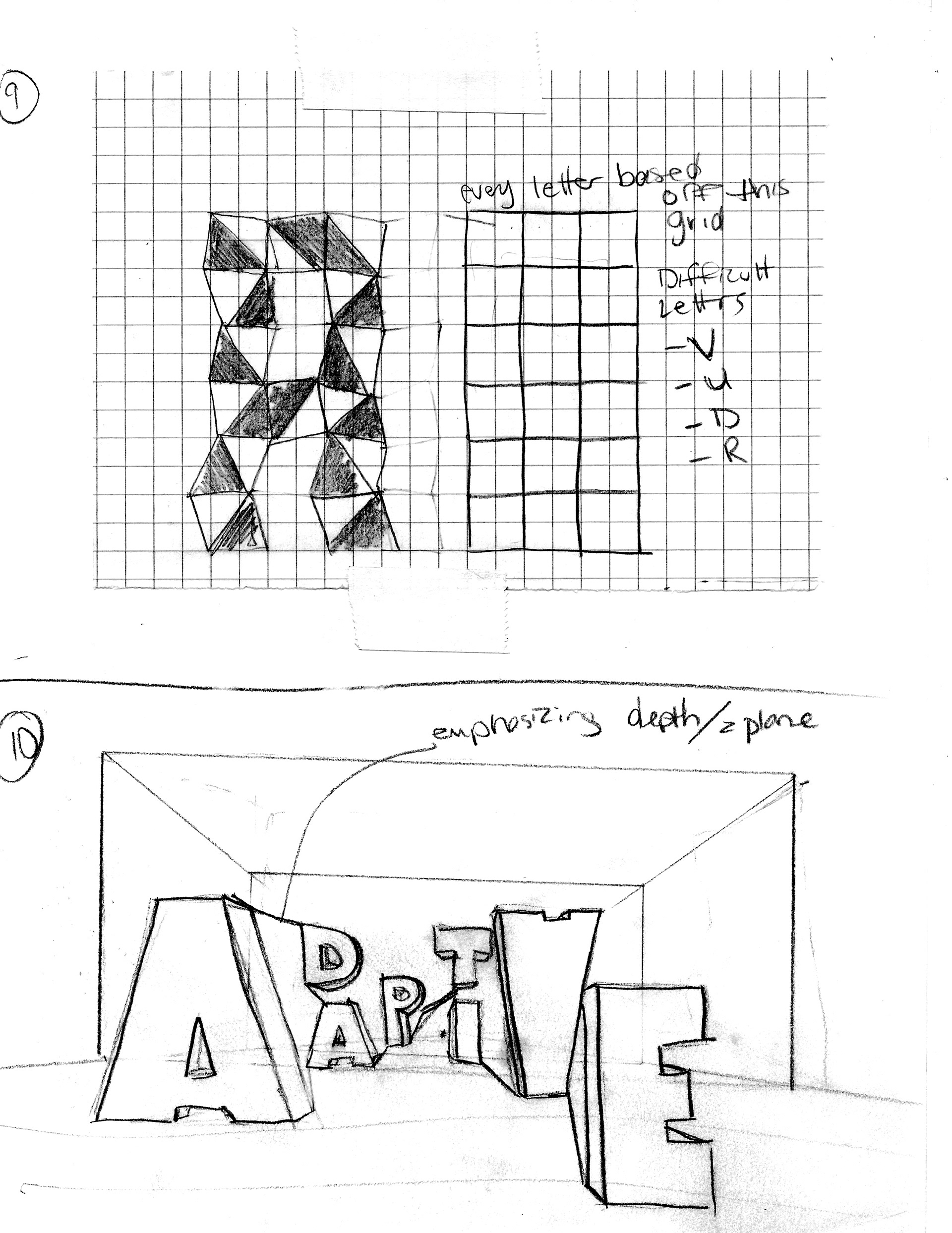
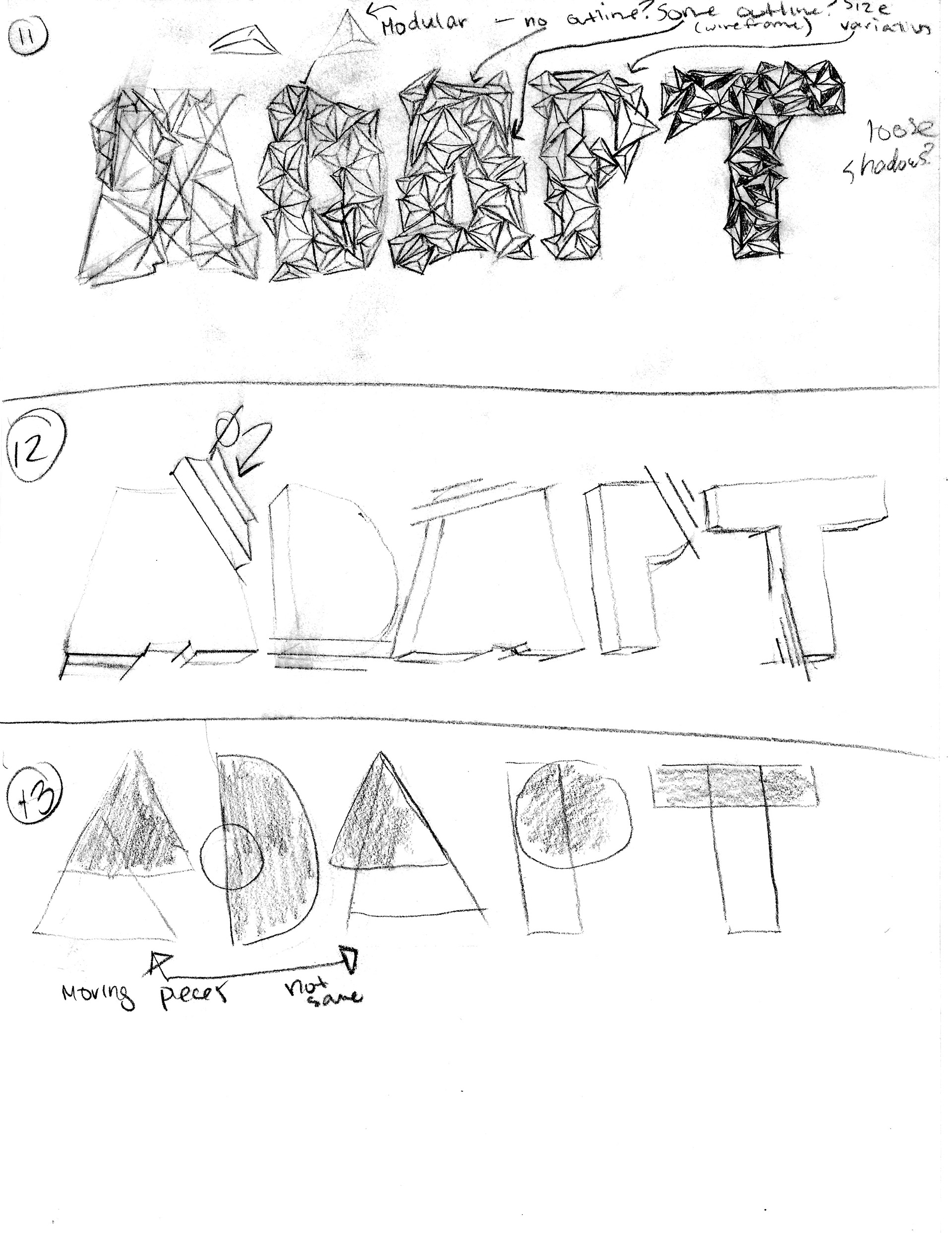
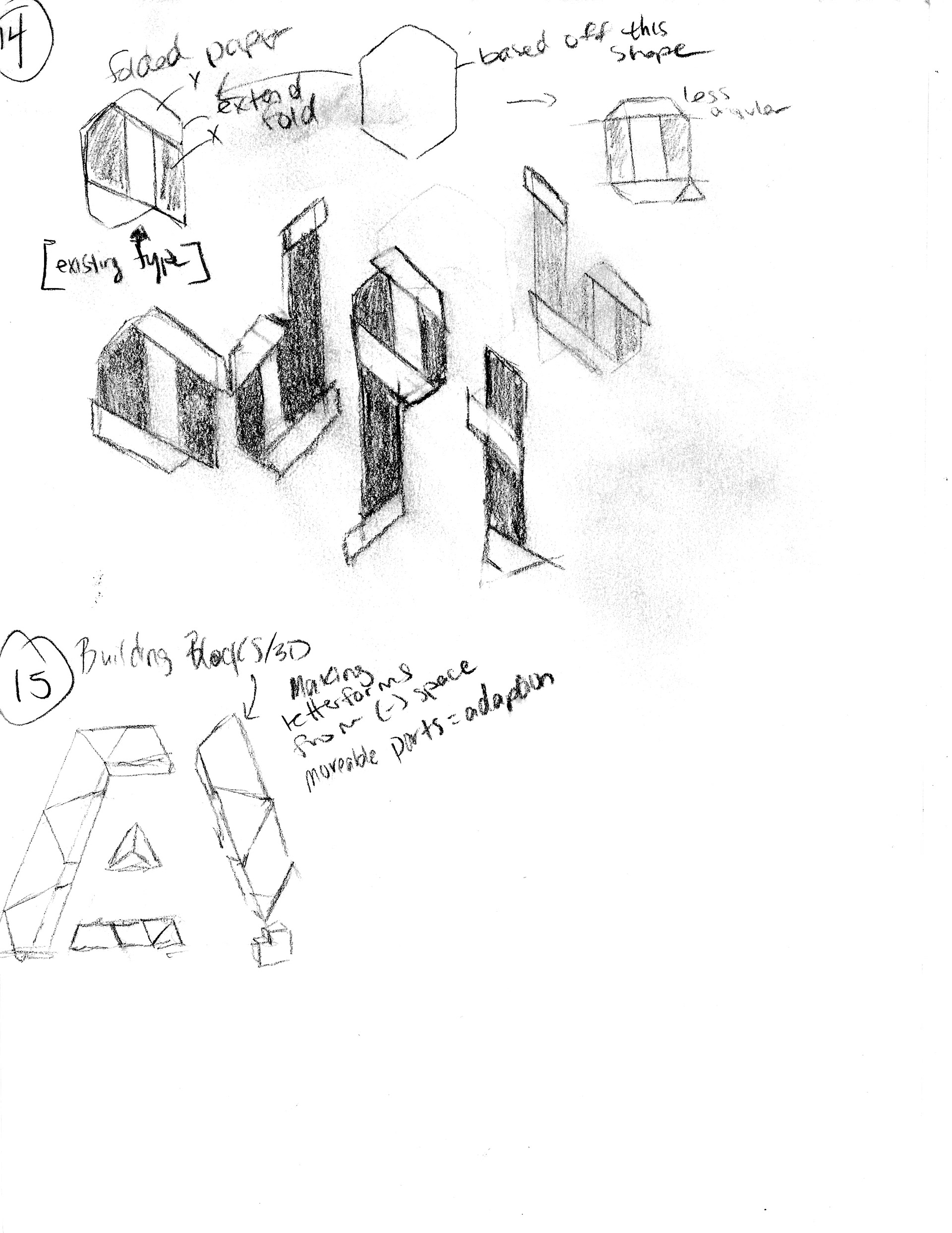
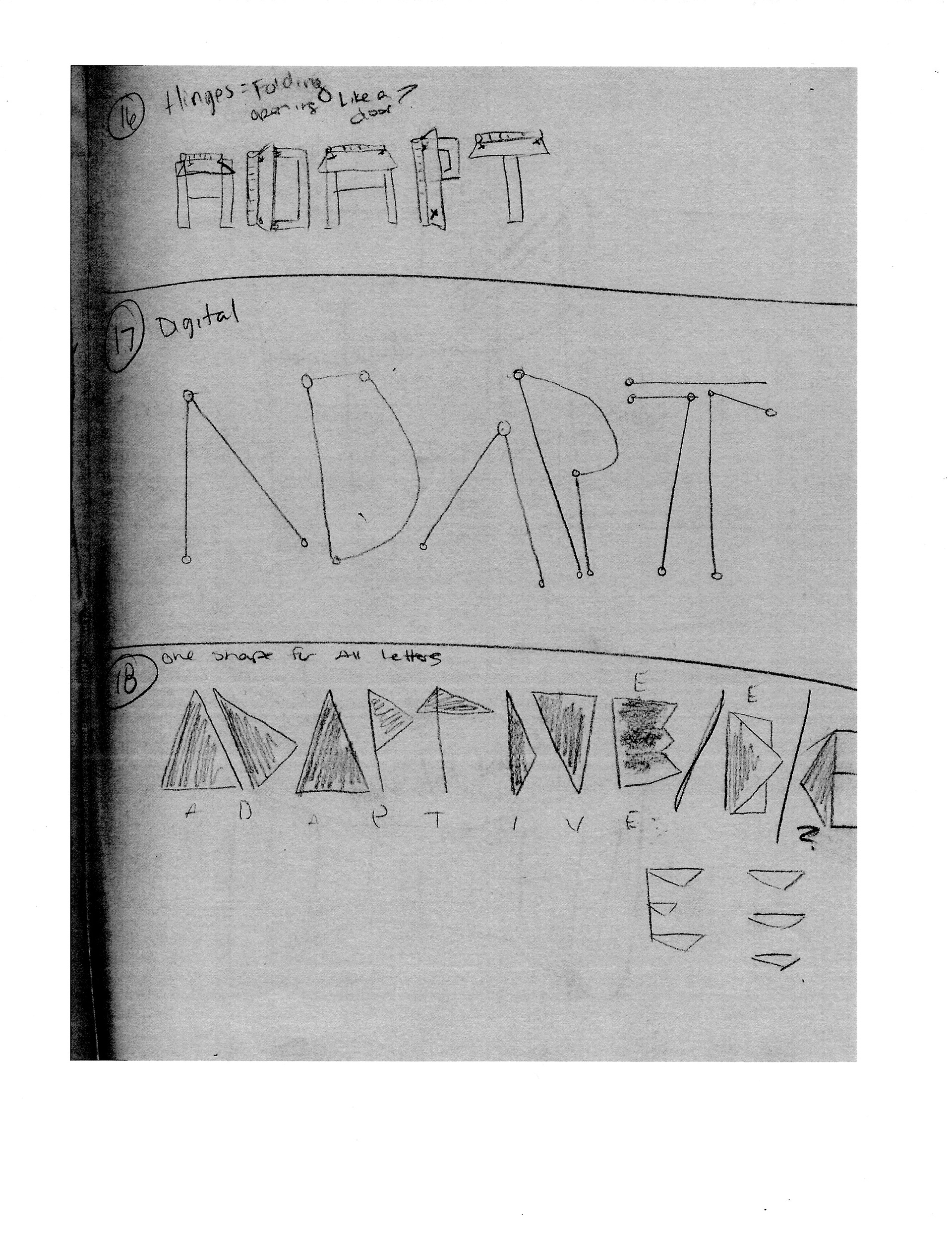
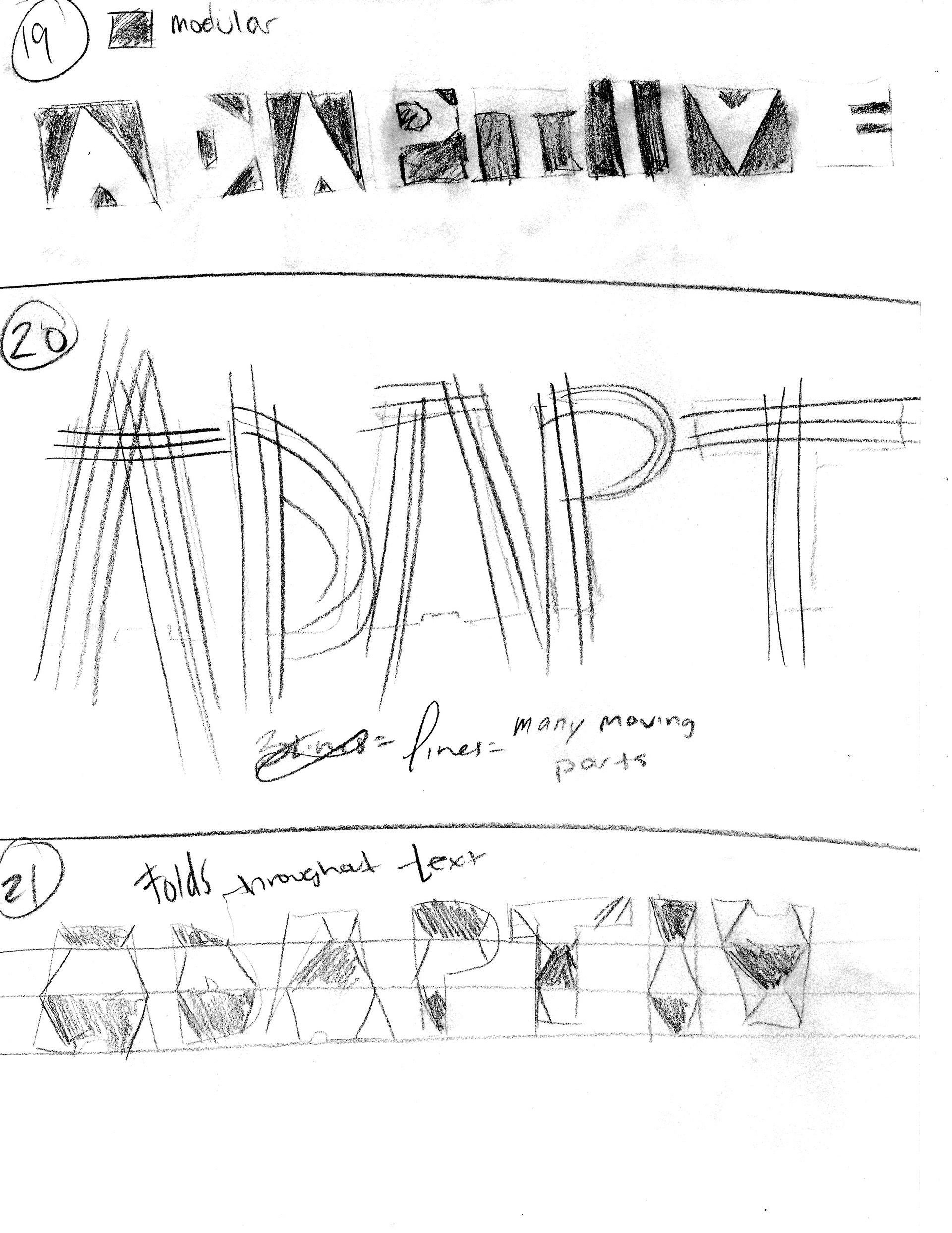
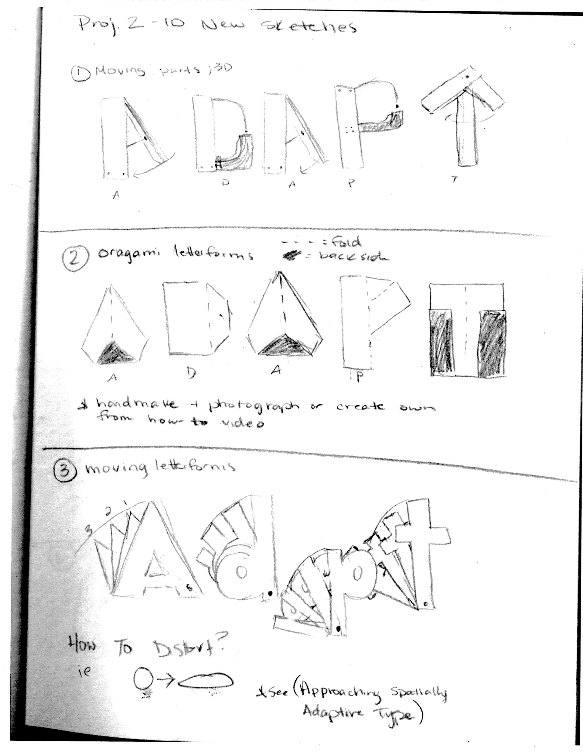
The title spread features a custom, handmade display type created by folding and cutting paper—an approach that directly mirrors the concepts of material manipulation and spatial transformation central to the project’s theme.
Sketching Process
Type System
Adelle Sans is used throughout the layout for its clean, contemporary character and legibility at small sizes. Body text is set at 10/13 and aligned to a 13pt baseline grid to ensure visual consistency across columns. Justified alignment reinforces the sense of architectural structure and rhythm, while headlines are set in Heavy weight with expanded tracking to emphasize clarity, hierarchy, and spatial precision.
Grid System
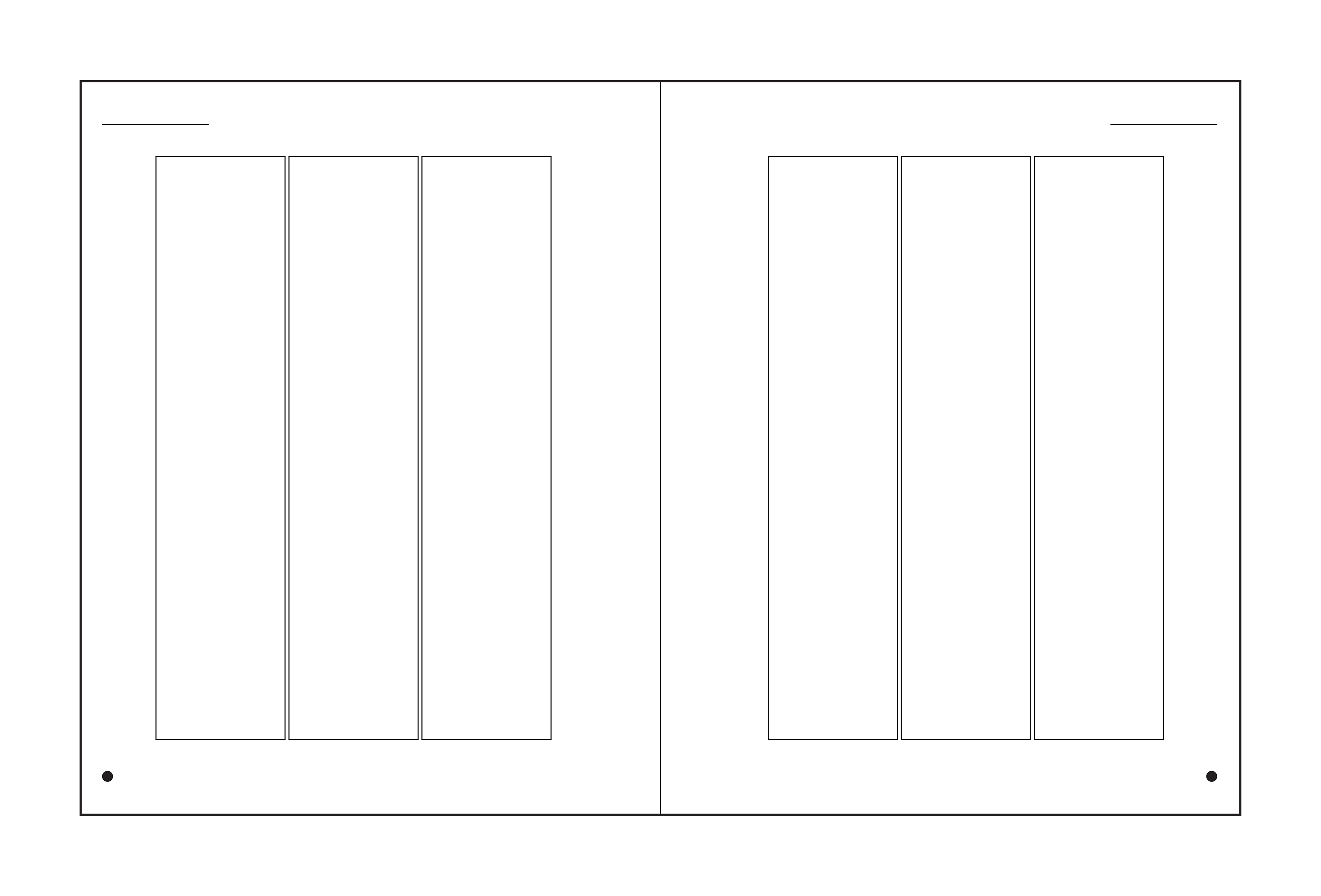
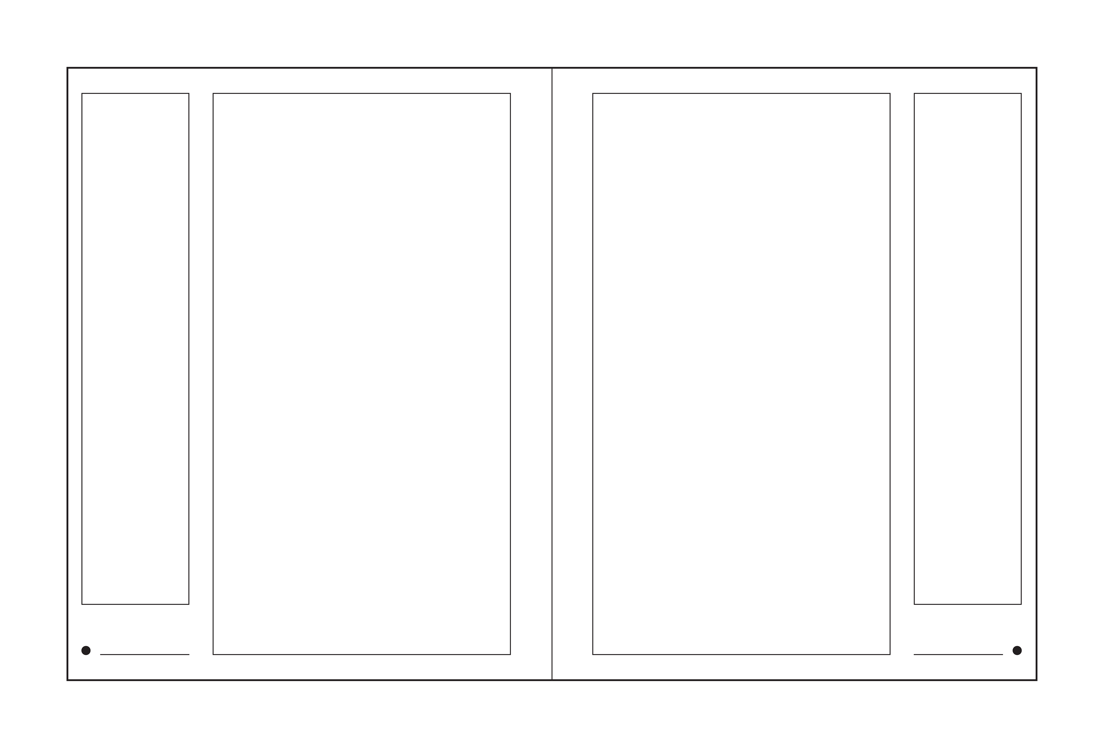
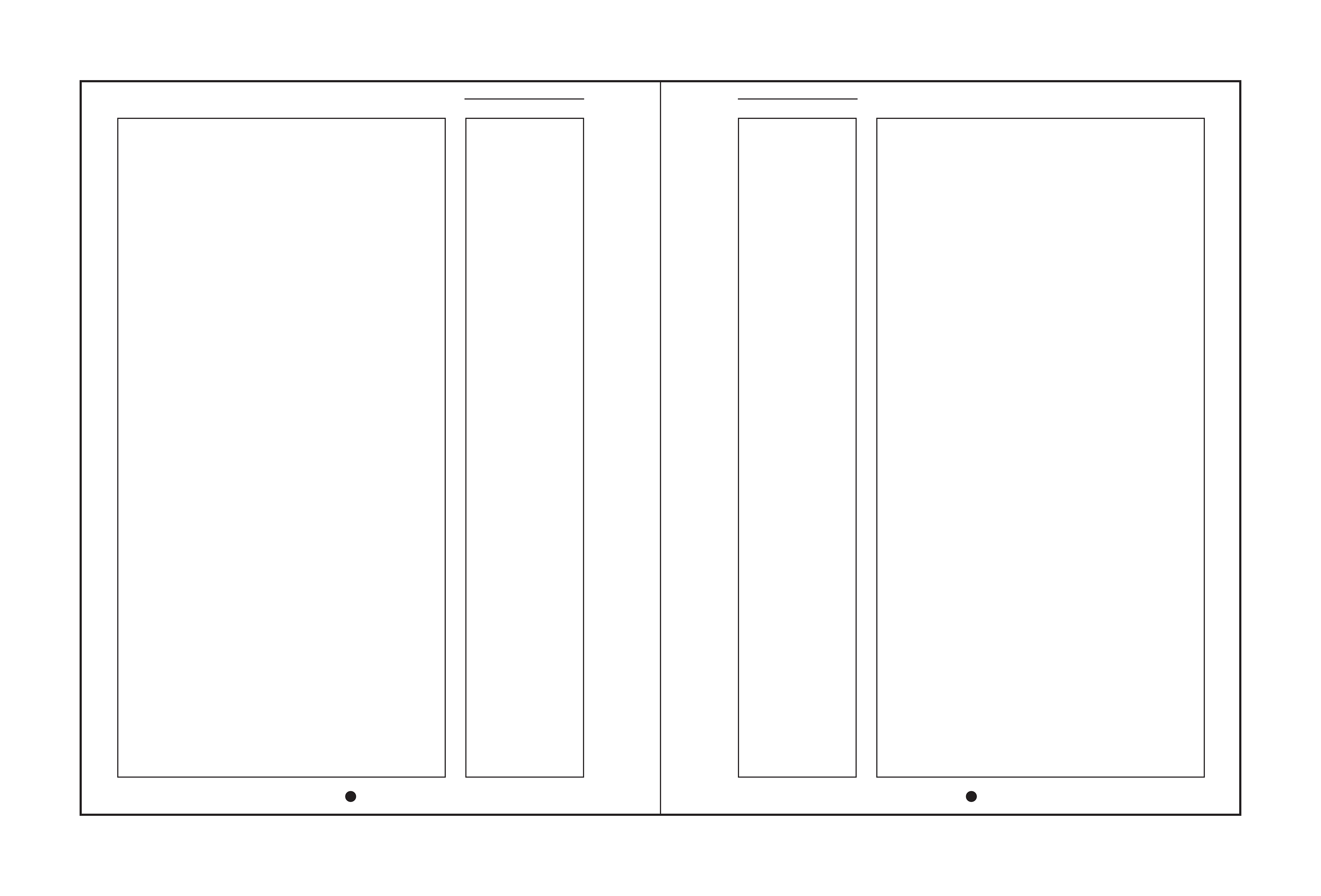
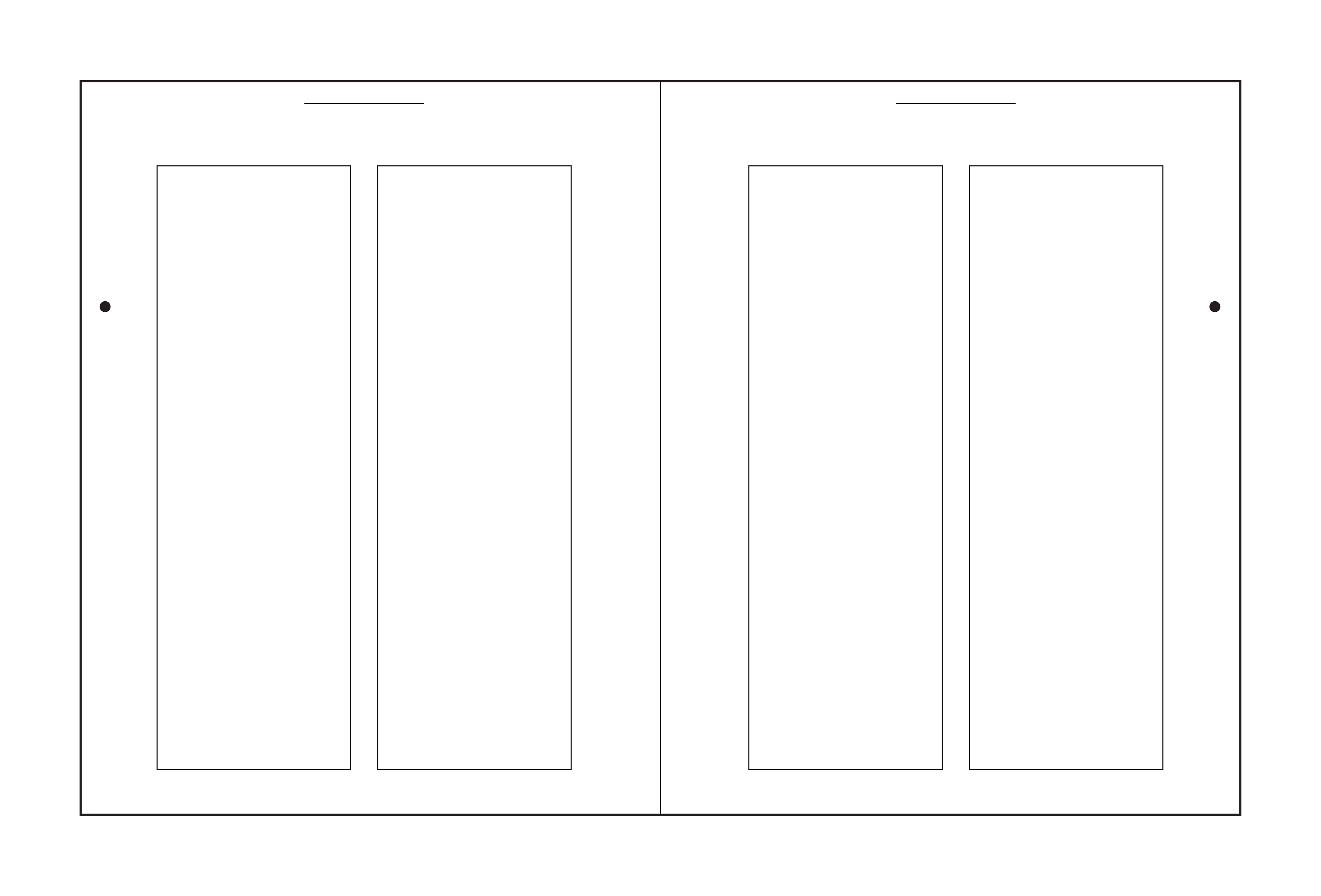
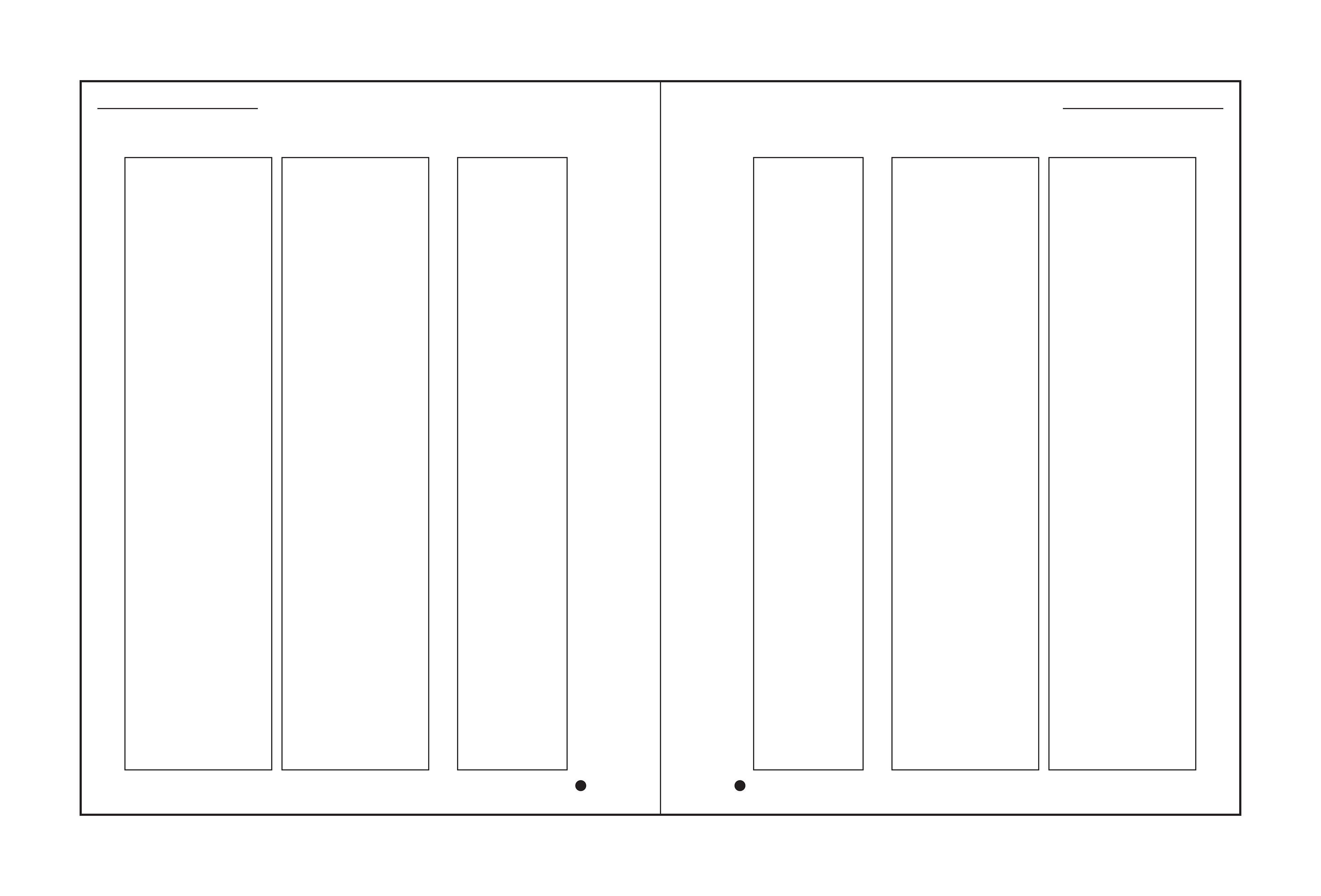
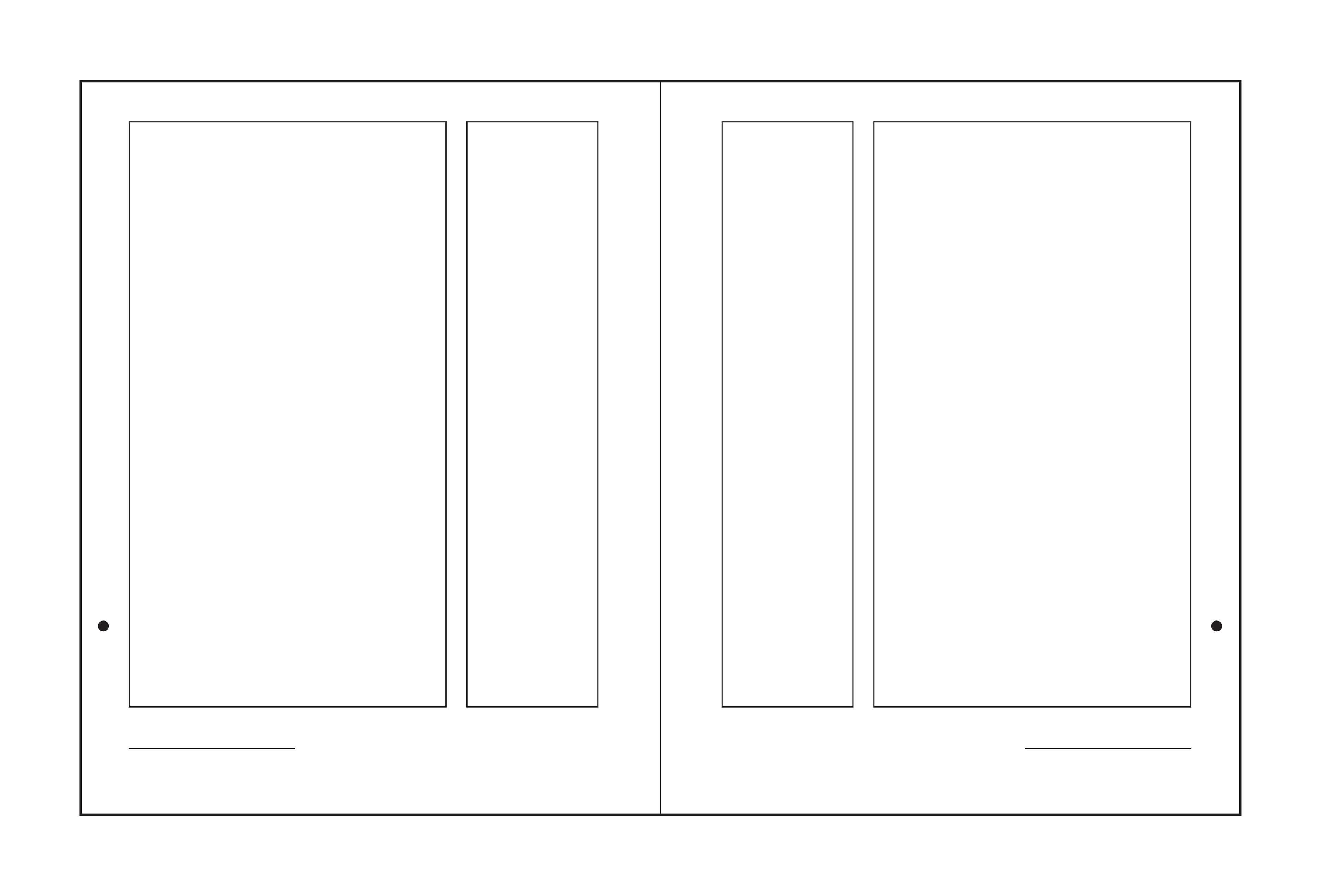
The layout is built on a four-column grid with a 13pt baseline to maintain strong vertical rhythm and structure across spreads. Margins are slightly asymmetric to support binding and visual balance. While the system provides consistency, elements like pull quotes, images, captions, and headers intentionally break the grid to improve hierarchy, pacing and flexibility within the layout.
Digital Grid Sketches
This project was an opportunity to explore how structure and clarity in editorial design can reflect the themes of the content itself. It was also a study in restraint, using type and layout rather than heavy visuals to shape tone and guide the reader.